[Edit since initial post]
I think I have a better understanding of what I am asking. I need to know how to make a prediction interval using nls() rather than a confidence interval. I would like to know how to do this manually.
I have a non linear regression model that is based on an exponential decay function. When I try to add a confidence interval, instead of using the models in built 'confidence interval' prediction, I wanted to do so manually. I get my model params and their standard errors, then calculate the prediction using the param +/- 2 standard errors. The plot I work on in the code below shows my final result. Expectation was to have a upper and lower confidence interval line encompassing most of the data, but instead it looks like it just passes through the middle ![]()
Example data:
library(tidyverse)
example_data <- dput(example_data)
structure(list(cohort_id = structure(c(1L, 1L, 1L, 1L, 1L, 1L,
1L, 1L, 1L, 1L, 1L, 1L, 2L, 2L, 2L, 2L, 2L, 2L, 2L, 2L, 2L, 2L,
2L, 2L, 3L, 3L, 3L, 3L, 3L, 3L, 3L, 3L, 3L, 3L, 3L, 3L, 4L, 4L,
4L, 4L, 4L, 4L, 4L, 4L, 4L, 4L, 4L, 4L, 5L, 5L, 5L, 5L, 5L, 5L,
5L, 5L, 5L, 5L, 5L, 5L, 6L, 6L, 6L, 6L, 6L, 6L, 6L, 6L, 6L, 6L,
6L, 6L, 7L, 7L, 7L, 7L, 7L, 7L, 7L, 7L, 7L, 7L, 7L, 7L, 8L, 8L,
8L, 8L, 8L, 8L, 8L, 8L, 8L, 8L, 8L, 8L, 9L, 9L, 9L, 9L, 9L, 9L,
9L, 9L, 9L, 9L, 9L, 9L, 10L, 10L, 10L, 10L, 10L, 10L, 10L, 10L,
10L, 10L, 10L, 10L, 11L, 11L, 11L, 11L, 11L, 11L, 11L, 11L, 11L,
11L, 11L, 11L, 12L, 12L, 12L, 12L, 12L, 12L, 12L, 12L, 12L, 12L,
12L, 12L), levels = c("1", "2", "3", "4", "5", "6", "7", "8",
"9", "10", "11", "12"), class = "factor"), billing_cycle = c(1L,
2L, 3L, 4L, 5L, 6L, 7L, 8L, 9L, 10L, 11L, 12L, 1L, 2L, 3L, 4L,
5L, 6L, 7L, 8L, 9L, 10L, 11L, 12L, 1L, 2L, 3L, 4L, 5L, 6L, 7L,
8L, 9L, 10L, 11L, 12L, 1L, 2L, 3L, 4L, 5L, 6L, 7L, 8L, 9L, 10L,
11L, 12L, 1L, 2L, 3L, 4L, 5L, 6L, 7L, 8L, 9L, 10L, 11L, 12L,
1L, 2L, 3L, 4L, 5L, 6L, 7L, 8L, 9L, 10L, 11L, 12L, 1L, 2L, 3L,
4L, 5L, 6L, 7L, 8L, 9L, 10L, 11L, 12L, 1L, 2L, 3L, 4L, 5L, 6L,
7L, 8L, 9L, 10L, 11L, 12L, 1L, 2L, 3L, 4L, 5L, 6L, 7L, 8L, 9L,
10L, 11L, 12L, 1L, 2L, 3L, 4L, 5L, 6L, 7L, 8L, 9L, 10L, 11L,
12L, 1L, 2L, 3L, 4L, 5L, 6L, 7L, 8L, 9L, 10L, 11L, 12L, 1L, 2L,
3L, 4L, 5L, 6L, 7L, 8L, 9L, 10L, 11L, 12L), sample_survival_rate = c(0.630375321185327,
0.467011817658967, 0.365716219971609, 0.320696843452609, 0.289715829574683,
0.274138331734878, 0.263859709445232, 0.257975988868186, 0.25428803817773,
0.253349513689708, 0.251974683159173, 0.25087864807282, 0.626381321766971,
0.457700237294344, 0.37100891459414, 0.322040406927193, 0.294130414649021,
0.273224287881716, 0.264008524367158, 0.257890204475791, 0.254600100163038,
0.252665019457592, 0.250872931127164, 0.249283495816814, 0.617466244254771,
0.463682683415105, 0.371605156168376, 0.320962165438288, 0.294378622257423,
0.272094922902315, 0.263553461969235, 0.258151398805649, 0.254228898501473,
0.252721988646528, 0.250957888359671, 0.250678608369381, 0.625842284676012,
0.475715043015969, 0.364457416055596, 0.326485932788029, 0.287971100886182,
0.272805038087397, 0.263982745776158, 0.258071343467853, 0.254782618390382,
0.252538854336153, 0.251931200298009, 0.250189014687092, 0.614958361152235,
0.474023154666957, 0.37790296469348, 0.321305725376115, 0.288431205767636,
0.273448941036557, 0.265221683162653, 0.257977862090824, 0.254402493942438,
0.252262229858011, 0.252482170616736, 0.250167038793874, 0.615276997378503,
0.462251124297695, 0.379117488405097, 0.320048927623227, 0.286479327627075,
0.277112140101815, 0.264517062972436, 0.257970078541396, 0.254324910083164,
0.253199527200694, 0.250985688661134, 0.251435584163309, 0.626165857232067,
0.457716584851464, 0.380706922662529, 0.32214396867372, 0.28725348189702,
0.274217428106078, 0.262850951863544, 0.258008309979443, 0.253982997355457,
0.252432836066219, 0.252955446219195, 0.250173801962517, 0.626248558471049,
0.474358329360571, 0.369797644382662, 0.324484196652504, 0.292835709935179,
0.274812679385776, 0.264902105112049, 0.257920928121361, 0.254293689364316,
0.252094179645866, 0.25146035913424, 0.251382845450947, 0.619935506915612,
0.472368360759675, 0.376906826285281, 0.322622472724279, 0.294056956175115,
0.2762753843963, 0.263543866656661, 0.257911561154227, 0.254082172527871,
0.252479306436864, 0.25092022041681, 0.25147680046597, 0.620940410953731,
0.458684083447818, 0.367775959111921, 0.31955299117994, 0.290834501870578,
0.273073930174107, 0.264099158034426, 0.258049918137067, 0.254097282656084,
0.252593088721244, 0.251201515264958, 0.249725999038376, 0.6178781171174,
0.480537380689229, 0.370305282109615, 0.321910535895373, 0.295165049355668,
0.274898706563092, 0.264775605155201, 0.257970685836666, 0.254379583052875,
0.25230912983428, 0.251323575117219, 0.250613209856686, 0.627625590735999,
0.470453669107974, 0.361352411452518, 0.329163446065758, 0.293046687979046,
0.275398723193211, 0.263940477049976, 0.257914465199765, 0.254451201344154,
0.251946651930126, 0.251414402429264, 0.252082405269007)), row.names = c(NA,
-144L), class = c("tbl_df", "tbl", "data.frame"))
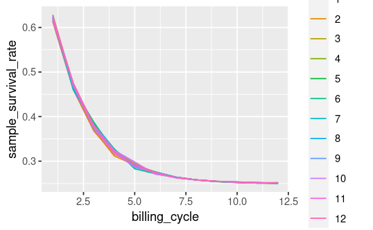
The above block creates a data frame example_data. Here's a plot of the fields of interest:
survival_plot <- example_data |>
  ggplot(aes(x = billing_cycle, y = sample_survival_rate, color = cohort_id)) +
  geom_line()
survival_plot
Then I fit a model. After fitting I retrieve the model params i, a and lambda along with their standard errors, then I (attempt to) add an upper and lower bound confidence interval:
mod.nls <- nls(sample_survival_rate ~
                 exponential_decay(i, a, lambda, billing_cycle), data = example_data, start = list(i = 0.5, a = 0.5, lambda = 0.15))

mod_summary <- mod.nls |> summary()

mod_i <- coef(mod.nls)['i']
mod_i_se <- mod_summary$coefficients["i", "Std. Error"]
mod_a <- coef(mod.nls)['a']
mod_a_se <- mod_summary$coefficients["a", "Std. Error"]
mod_lambda <- coef(mod.nls)['lambda']
mod_lambda_se <- mod_summary$coefficients["lambda", "Std. Error"]

# add 95% CI to example data
example_data <- example_data |>
  mutate(
    mod_upper_ci = exponential_decay(mod_i + 2*(mod_i_se), mod_a + 2*(mod_a_se), mod_lambda + 2*(mod_lambda_se), billing_cycle),
    mod_lower_ci = exponential_decay(mod_i - 2*(mod_i_se), mod_a - 2*(mod_a_se), mod_lambda - 2*(mod_lambda_se), billing_cycle)
    )
But when I add the upper/lower interval to my plot I get this:
example_data |>
  ggplot(aes(x = billing_cycle, y = sample_survival_rate, color = cohort_id)) +
  geom_line() +
  geom_line(aes(x = billing_cycle, y = mod_upper_ci), color = 'black') +
  geom_line(aes(x = billing_cycle, y = mod_lower_ci), color = 'black')
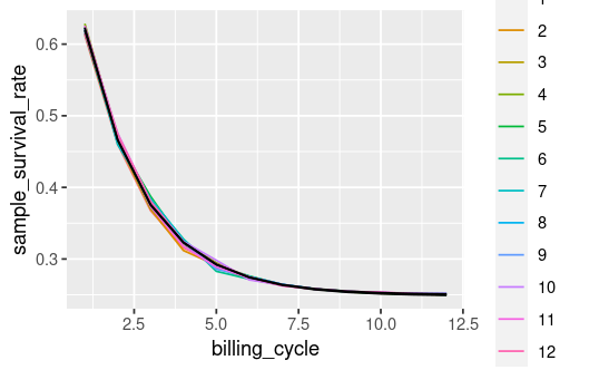
Does this look 'right'? I expected the black lines to encompass the cohort_ids, instead it looks like it's just going through the middle.
Is my approach flawed (presumably yes)? How can I correctly add a 95% confidence interval to my plot using the model params and their standard errors?