It would help to have a bit more information about what you want to know but the most obvious start is probably a barchart
I used the data.table package to make the example so you probably will need to do
install.packages("data.table)
before running the code below
## load required libraries
library(data.table)
library(ggplot2)
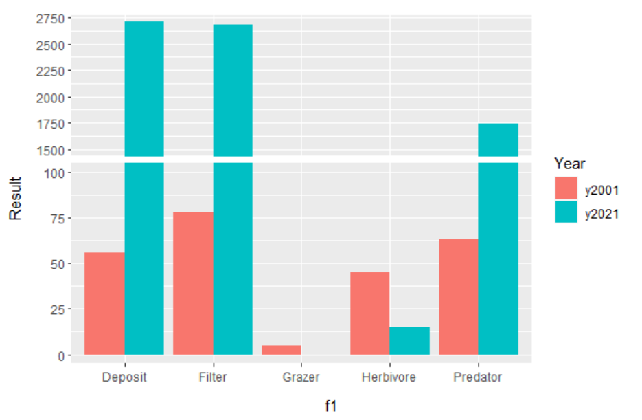
# Wrangle data into a data.table.
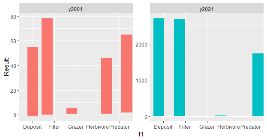
dat1 <- data.table(f1 = c("Deposit","Filter","Herbivore","Grazer","Predator"),
y2001 = c(56, 78, 45, 5, 63),
y2021 = c(2708, 2681, 15, 0, 1742)
)
# Convert data from *wide* to *long* form.
dat2 <- melt.data.table(dat1, id.vars = "f1", measure.vars = c("y2001", "y2021"),
variable.name = "Year", value.name = "Result")
# plot data.
ggplot(dat2, aes(f1, Result, fill = Year)) + geom_col(position = "jitter", width = .5)
If you prefer the tidyverse approach you can get the same results with
dat <- dat1  %>%  pivot_longer(!f1, names_to = "Year", values_to = "Result")

ggplot(dat, aes(f1, Result,  fill  = Year)) + geom_col(position = "jitter", width = .5)