What package to highlight one value in X axis using R?

Dear all,

I would like to highlight one of value on X axis with color like in this graph,
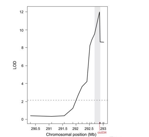
Capture (2)

Some people recommend me to use, geom_vline, but it was not my target.
Could you please tell me what the package to make it?

here are my script


data <- read.csv("test.csv", header=T)

library(tidyverse)
library(ggplot2)

data %>%
  mutate(row = row_number()) %>%
  pivot_longer(cols = -row, values_drop_na = TRUE) %>%
  ggplot(aes(value)) + aes(row, value, color=name)  +
  geom_jitter()+ geom_hline(yintercept=1.4, linetype="dashed") + xlab("") + 
  theme(panel.grid.major = element_blank(), panel.grid.minor = element_blank(), 
        panel.background = element_blank(), axis.line = element_line(colour = "black")) +  scale_color_manual(values = "purple") +
  theme(axis.ticks.x = element_blank(),axis.text.x = element_blank()) + theme(legend.title=element_blank()) +
  theme(axis.title.x = element_text(size = 15)) + 
  theme(axis.title.y = element_text(size = 15))  + 
  geom_vline(xintercept = 60, linetype="dotted",color = "black", size=1) +  geom_vline(xintercept = 300, linetype="dotted", color = "black", size=1) + geom_rect( aes(xmin = 30, xmax = 50),  ymin = -Inf, ymax = Inf, color="grey", fill="grey", alpha= 0.3)


Thank you so much.
Hi there,

It would help a lot if we can know which sort of graph that is. Is it a ggplot? If so look here: How to annotate a plot in ggplot2 – the R Graph Gallery

Otherwise you will have to provide more details about the plot for us.

Hi there,
Thank you so much.
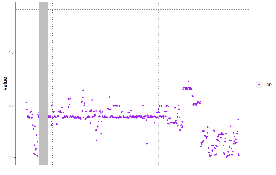
I tried to use "geom_react" and got the result like this.

however, the highlight point covers my data. Do you have suggestion how to solve this?

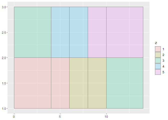
Hi! You can fix that grey bar by giving geom_react the alpha argument which will change to what degree that object should be transparent (so 1 is no transparency whereas 0.2 in my example is quite transparent). See below:

library(tidyverse)

df <- data.frame(
  x = rep(c(2, 5, 7, 9, 12), 2),
  y = rep(c(1, 2), each = 5),
  z = factor(rep(1:5, each = 2)),
  w = rep(diff(c(0, 4, 6, 8, 10, 14)), 2)
)


ggplot(df, aes(xmin = x - w / 2, xmax = x + w / 2, ymin = y, ymax = y + 1)) +
  geom_rect(aes(fill = z), colour = "grey50", alpha = 0.2)

Created on 2021-10-22 by the reprex package (v2.0.0)

1 Like

Thank you so much sir. Have a nice day!

This topic was automatically closed 7 days after the last reply. New replies are no longer allowed.

If you have a query related to it or one of the replies, start a new topic and refer back with a link.