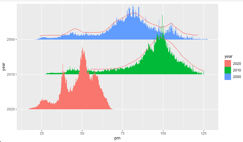
Data can be downloaded from here
- PM is the concentration of PM2.5,
- pop is the number of exposed individuals at the corresponding concentration
- year
Then draw the number of people corresponding to different pm values for different years.
library(tidyverse)
library(ggridges)

pm_ua  <- readxl::read_excel("pm_ua_pop.xlsx")

pm_ua  %>%
  mutate(year = factor(year, levels = c("2020", "2010", "2000"))) %>%
  ggplot() +
  geom_density_ridges(
    aes(x = pm, y = year, height = pop, fill = year),
    size = 0,
    stat = 'identity'
  )
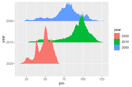
But I hope the graphics are smoother. I thought for a long time and used a foolish method, but it seems too unscientific and occupying too much memory.
d <- pm_ua %>%
    uncount(pop)


d %>%
  mutate(year = factor(year, levels = c("2020", "2010", "2000"))) %>%
  ggplot() +
  geom_density_ridges(
    aes(x = pm, y = year, fill = year),
    stat = "density_ridges"
  )
Is there a better way to ask for advice? thanks

