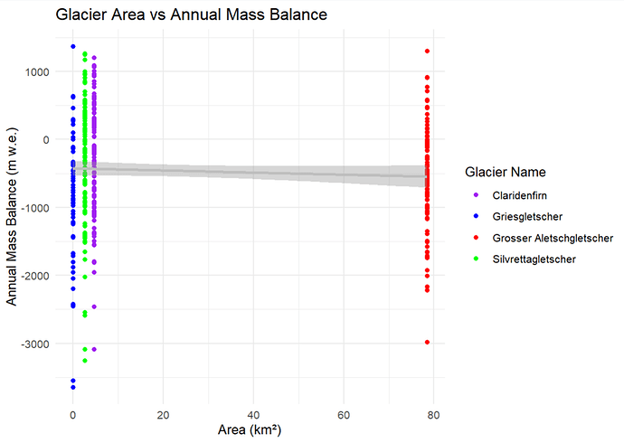
It appears to be repeated observations of four glaciers. The rows of dots look pretty vertical, so either the area of each glacier is constant or it changes very little over the sample. The repeated observations of each glacier do show considerable variation in annual mass balance (whatever that its). The not quite horizontal gray line is probably the plot of a linear regression of mass balance on area, and the gray shaded region is a confidence interval for the predicted mass balance given the area.
Thanks a lot. So is where the grey line the average?
The gray line predicts average mass balance as a (linear) function of area. It has a slight downward slope, so apparently annual mass balance decreases (a little) as area increases.
Hi @tadayon, maybe try to add geom_jitter() because you have many points.
thanks a lot makes sense
This topic was automatically closed 90 days after the last reply. New replies are no longer allowed.
If you have a query related to it or one of the replies, start a new topic and refer back with a link.
