What do I binge next? An overview of the top IMDb TV shows - Table Contest Submission

What do I binge next? An overview of the top IMDb TV shows

Authors: Cédric Scherer
Affiliations: Freelancer / IZW Berlin

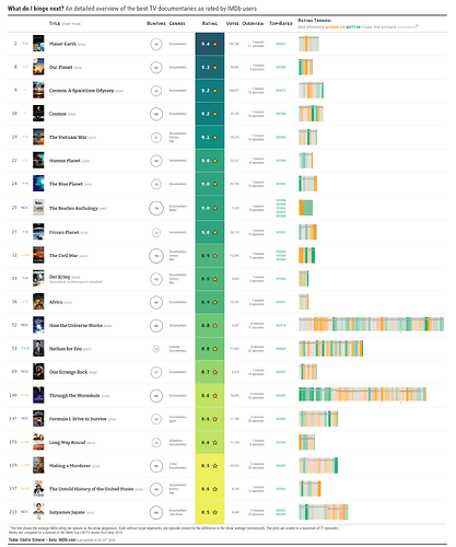
Abstract: The table shows relevant details of the top 250 TV shows as rated by IMDb users. I focussed on displaying the details I and my friends care about: of course the ranking and overall rating but additionally the runtime per episode, genres, number of seasons and episodes, ID of the best episodes. But most importantly—the trend of ratings as the TV show progresses.

To visualize the runtime I decided to use a restrained, grey-toned, area-scaled circle. The normalized trends in episode ratings are visualized as stripes similar to the famous "warming stripes" by Ed Hawkins. In addition, a line indicates the average rating per season on a range from 1 to 10.

Full Description: The table shows relevant details of the top 250 TV shows as rated by IMDb users. I focussed on displaying the details I and my friends care about: of course the ranking and overall rating but additionally the runtime per episode, genres, number of seasons and episodes, ID of the best episodes. But most importantly—the trend of ratings as the TV show progresses.

Visualizations: To visualize the runtime I decided to use a restrained, grey-toned, area-scaled circle. The normalized trends in episode ratings are visualized as stripes similar to the famous "warming stripes" by Ed Hawkins. In addition, a line indicates the average rating per season on a range from 1 to 10.

Data: The data is a mixture of scraped data using a modified Python script (ranks, ratings, votes, year) and data downloaded from the IMDb dataset interface (title basics: original title, genre, runtime). The data was cleaned (e.g. correct wrong runtimes, title spellings etc) and missing entries filled. (However, some series are returned as having 1 season only but have several actually and I didn't find a good workaround yet.)

Varieties: Since the Top 250 TV Shows table is quite long (by definition), I also provide versions for the Top 100 and Top 50, respectively. I also found it interesting to look at particular genres in isolation and provide exemplary versions for the genres Documentary, Animation, Comedy, Drama, and Action.

Here is an example showing the best documentaries of the top 250 TV shows:


Table Type: static-print
Submission Type: Single Table Example
Table: https://cedricscherer.netlify.app/files/IMDb_Top250.png
Repo: GitHub - z3tt/Rstudio_TableContest_2020: 📺 Table showing an "Overview and Series Trends of the Best TV Shows on IMDb" – My Contribution to the Rstudio Table Contest 2020
RStudio Cloud:
DT package used:
gt package used: true
reactable package used:
flextable package used:
huxtable package used:
kableExtra package used:
Other packages: reticulate, dplyr, tidyr, readr, magrittr, here, glue, pkgconfig
5 Likes

This is a great table! Just out of curiosity - did rendering the table took awfully long because of the 250 individual ggplot objects?

Also, (a bit pedantic) I guess there might be small typo in the title: "A detailed overview..." instead of "An detailed overview...".

Hey, thanks for your feedback! I had several issues when epxorting the table (see here) which seem to only partly be related to the many ggplots (actually those are 500, the runtime column contains ggplots as well).

Thanks for spotting the type, going to fix it (guess I added "detailed" later and missed it...)

Wow! Looks like exporting the table turned out to be a real headache :stuck_out_tongue_closed_eyes:

So, was is this final attempt (from your github code) which worked successfully:
gtsave(imdb_table, "IMDb_Top250.png", vwidth = 2600, vheight = 18000, zoom = 2, delay = 10)

I also faced similar issues when trying to save a png version of my gt table (the fonts did not render correctly and emojis not showing up) but luckily since my table had much fewer rows, it rendered perfectly in HTML.

No, none of these worked without issues. The current workaround is opening the local output in Chrome and using the GoFullPage app to make an at least okay-ish webshot without losing ayn plots, emojis or font setting. Would prefer less blurry trend stirpes but all other things didn't work out so I am going to live with that for now. I am not sure it is a simple "too-many-rows" issues since I had the same problems with the Top 50 version as well (this is why I added this in the first place). Going to give it a try today with an even shorter table. I actually think it's the size of the ggplots showing the trend stripes per se.

Ah... I see. Do please let me know if you get around to finding a fix for this. Would be interested to know what finally worked.

Also, looking at the trend line more closely, I guess you are calculating a rolling average of each show’s rating here? If so, for “Cosmos” shouldn’t the trend line have started at a lower height and then moved up when the higher rated episodes start? Might also be that I’m misinterpreting the plot here...

I'll let you know in case I find a solution!
It's in the note below the table, not an rolling average but average per seaon. Each jump to higher/lower values marks a new season.

Thanks again!

Sorry my bad. Didn't notice the note in the table. Average over the entire season makes sense. On hindsight, rolling averages would have created unwanted variance.

Yes, I think so. Also I was interested in season ratings which is a common measure on IMDb.
The tables are now updated with a correction of the typo in the title and the latest data from yesterday.

I exported a 10 row table and in the html file only the runtime plots but none of the other images are contained (neither the trend stripes as ggplots nor the poster images). Exporting to png worked without losing any ggplots so here it seems it is due to memory limits or smt similar.

1 Like