Visualizing A Changing Canada
Authors: Lawrence Pilch
Working with Shiny <1 year
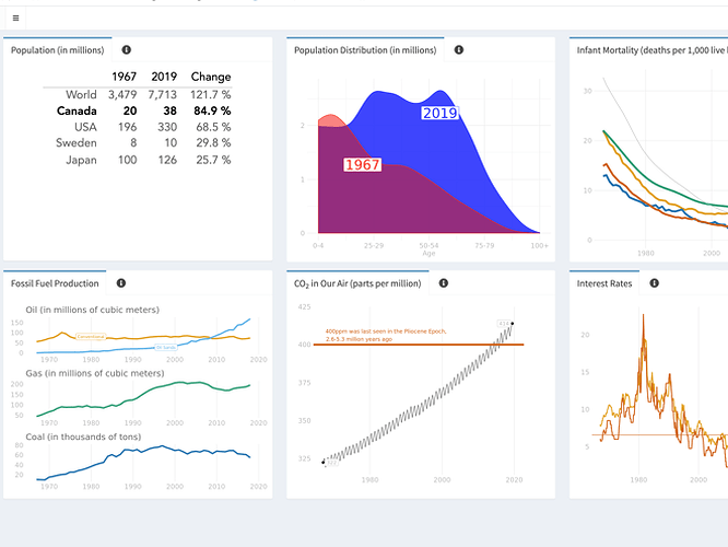
Abstract: Seeing change is hard, especially if it happens slowly. To visualize how Canada has changed over the years I created a dashboard-like view of six broad indicators. To put each statistic in context, I included other countries, or average or historical values for comparison. Each box has an info tab that has some suggested years to try along with some of my observations and links for further exploration.
Full Description: For comparison countries I selected:
USA
- Canada’s closest neighbour and largest trading partner by far. The country Canada most often compares itself to.
Sweden
- Everyone looks to Scandinavia to see the result of a society with a larger social safety net made possible through higher taxes.
Japan
- A modern, technologically advanced but culturally different country. Japan served as a role model for hyper-growth to the four Asian tigers: South Korea, Singapore, Taiwan, and Hong Kong.
OECD
- To minimize the criticism of cherry picking countries let’s look at a bundle. Conveniently, there is a group of developed countries, nicknamed the rich nations’ club, that fits well here. The Organization for Economic Cooperation and Development (OECD) was founded in 1961 with 20 countries and now numbers 36.
The dashboard looks at six areas:
Population
How population growth relates to economic growth is a heavily debated topic in economics. It’s important because economic growth ties directly to our standard of living. Two third’s of Canada’s population growth is from immigration. Read why this is great news here.
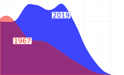
Population Distribution
It’s not just population that factors into a country’s standard of living. It’s how the ages are distributed. If everyone is old, who is working, paying taxes and funding social services? Be sure to check out the info tab here to see the birth of the boomer generation.
Infant Mortality
The infant mortality rate is the number of children who die before the age of one for every one thousand live births. It’s one number that is often used to serve as a proxy for the health of the population as a whole.
Energy
The Canada dashboard gives an historical look at Canada’s production of oil, coal and natural gas. In fact, it shows data going back to 1925 which you probably haven’t seen before. Thanks to the super sleuthing efforts of a librarian at Statistics Canada in Ottawa I dusted off the digital files to show Canada’s early days in the energy sector.
CO2
Climate change is the defining issue of our time and CO2 is a major contributor. Thus, CO2 is an obvious admission to the Canada dashboard.
Interest Rates
Canadian banks set their own prime rate, theoretically independently of one another. However they are all basing their rate on the Bank of Canada’s policy interest rate or overnight rate.
The goal of the Bank of Canada when it comes to setting their overnight rate is keeping inflation under control.
Interestingly, the level of employment is not an official concern of the Bank of Canada’s monetary policy. Whereas with the Federal Reserve, America’s central bank, employment gets a mention in word, if not always in spirit.
Final Thoughts on a Quantified World
I ran across some cautionary advice when trying to understand complex things through numbers alone. These authors expand on the famous quote, “Not everything that counts can be counted.”
We have implemented policies that focus narrowly on one value of meaning: We emphasize GDP and efficiency, those things that we can measure, leaving behind the value of those that are harder to quantify - like community, happiness friendships, pride, and integration.
— Chris Arnade; Dignity: Seeking Respect in Back Row America; 2019
The original blog post in full can be found here: https://lpdata.me/post/a-changing-canada/
Category: Other
Keywords: Visualization, Dashboard
Shiny app: https://ixodid.shinyapps.io/canada_dashboard_on_shinyapps/
Repo: https://github.com/ixodid198/canada_dashboard_on_shinyapps.io
RStudio Cloud: Posit Cloud
Thumbnail:

Full image:
