Hello, can i visualize the non-numeric data in 3D form or some other way to see the relationships, difference between the stages (T1, T2, T3,T4) and etc. ?
Thanks
Although you have categorical (non-numeric) values you can somehow convert these to numerical values. E.g. for the pathologic_m, pathologic_n, pathologic_t you could remove the M, N, T and have numbers you could use e.g. for correlation analysis or so.
It's up to you to know that these values actually encode a numerical relationship, in a way that N2 > N1 > N0...
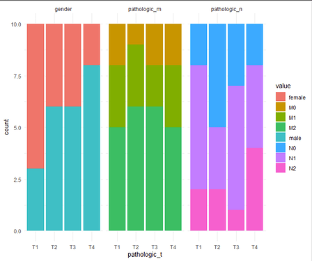
Another approach would be to count the occurences of each entry, resulting in numbers, e.g. N0 is 15 times in T1 and 12 times in T2 with N1 8 times in T1 and 20 times in T2, then showing / comparing these numbers.
# generate some demo data
df = tibble(
      "pathologic_t" = rep(c("T1", "T2", "T3", "T4"), each = 10),
      "pathologic_m" = sample(c("M0", "M1", "M2"),40, replace = TRUE),
      "pathologic_n" = sample(c("N0", "N1", "N2"),40, replace = TRUE),
      "gender" = sample(c("male", "female"),40, replace = TRUE)
      )

# modify
df2 = df %>%
  # convert to long
  pivot_longer(-pathologic_t,
               names_to = "readout",
               values_to = "value") %>%
  # count the number of each measurement
  group_by(pathologic_t, readout, value) %>%
  summarise(count = n(),
            .groups = "keep")

# plot
ggplot(df2, aes(x = pathologic_t,
               y = count,
               fill = value)) +
  geom_col() +
  theme_minimal() +
  facet_wrap(~ readout)
Thank you very much! ![]()
This topic was automatically closed 7 days after the last reply. New replies are no longer allowed.
If you have a query related to it or one of the replies, start a new topic and refer back with a link.

