Greetings,
Using corrplot, is there a way to see both the r and p values in a single plot?
Jason
Greetings,
Using corrplot, is there a way to see both the r and p values in a single plot?
Jason
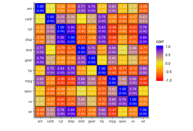
I haven't used corrplot in a while and can't remember how to do that, but this type of plot isn't that hard to whip up in ggplot. For example, the code below generates the appropriate data frame and then plots the correlations and p-values. In the first example, I've plotted only the numbers, but you can also plot markers with sizes and fill colors mapped to the correlations and/or p-values or map a value to the fill color in geom_tile.
library(tidyverse)

# Function to get correletions and p.values in a "long" data frame
corr.data = function(data) {

  # Get correlations
  cor.vals = cor(data)

  # Get p-values
  cor.p = cor.mtest(data, conf.level = 0.95)$p
  rownames(cor.p) = rownames(cor.vals)
  colnames(cor.p) = colnames(cor.vals)

  cbind(rowvars=rownames(cor.vals), data.frame(cor.vals)) %>%
    gather(colvars, corr, -rowvars) %>%
    left_join(cbind(rowvars=rownames(cor.p), data.frame(cor.p)) %>%
                gather(colvars, p.value, -rowvars))
}
# Create plot
corr.data(mtcars) %>%
  ggplot(aes(colvars, fct_rev(rowvars))) +
    geom_tile(colour="grey70", fill=NA) +
    geom_text(aes(label=sprintf("%1.2f", corr)), position=position_nudge(y=0.2),
                      size=3, colour="grey20") +
    geom_text(aes(label=paste0("(",sprintf("%1.2f", p.value),")")), position=position_nudge(y=-0.2),
                      colour="grey20", size=2.5) +
    labs(x="",y="") +
    theme_classic() +
    coord_fixed()
Or, with the tile fill mapped to correlation:
corr.data(mtcars) %>%
  ggplot(aes(colvars, fct_rev(rowvars))) +
  geom_tile(colour="grey20", aes(fill=corr), size=0.5) +
  #geom_point(aes(size=p.value, colour=cut(abs(corr), c(0, 0.01, 0.05, 1), include.lowest=TRUE)), pch=15) +
  geom_text(aes(label=sprintf("%1.2f", corr)), position=position_nudge(y=0.2),
            size=3, colour="white") +
  geom_text(aes(label=paste0("(",sprintf("%1.2f", p.value),")")), position=position_nudge(y=-0.2),
            size=2.5, colour="white") +
  scale_fill_gradient2(low="red", mid="yellow2", high="blue", midpoint=0, limits=c(-1,1)) +
  scale_size_continuous(range=c(8,12)) +
  labs(x="",y="") +
  theme_classic() +
  coord_fixed()
Well, it's a bit busy, but hopefully this gives you an idea of what's possible.

Editorial comment: Recent articles on pitfalls of p-values and null-hypothesis significance testing: here, here, and here.
Thanks!
This is exactly what I was wanting to do with my data.
After some trial and error, I figured out how to use this with my data.
At the moment, I'm working on a grant application and looking at some pilot data. Being an #rstatsnewbie I am completely open to, and would appreciate, any suggestions on any of the various ways I might show this visually with RStudio.
Thanks for the links about p-values and significance testing.
Cheers,
Jason
I noticed this code uses ggplot. Being new to RStudio, I’ve seen a lot of references to ggplot2, is there any real differences between the two? Or, are they the same package and the code just uses ggplot?
ggplot2 is the name of the package ggplot() it's the name of a function that is part of that package.
R has two main graphics systems: "base" and "grid". The corrplot package and function uses base graphics. The ggplot2 package (as well as the lattice package) uses grid graphics. The two graphics sytems are quite different and difficult to encompass in a short answer like this. Although ggplot2 uses the grid graphics system, ggplot is a self-contained approach to graphics. To use ggplot you need to learn this approach and don't need to worry about the underlying grid graphics aspects unless you later decide you want to create extension packages or get into the weeds and hack your plots.
For some additional information on graphics in R:
Thanks. This is helpful information.
Cheers,
Jason
This topic was automatically closed 7 days after the last reply. New replies are no longer allowed.
If you have a query related to it or one of the replies, start a new topic and refer back with a link.