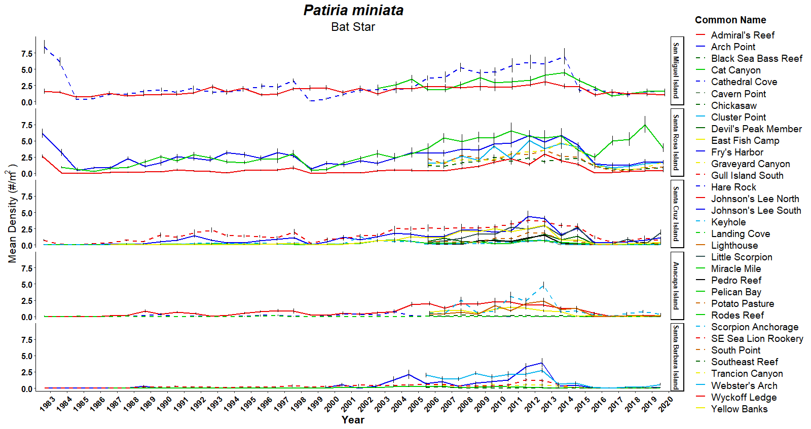
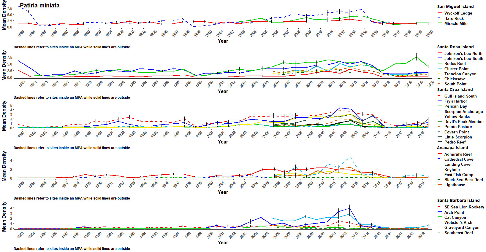
I am plotting a facet_grid for species density data. The facet levels are each an Island, and the line plots are each a site at that Island. I would like the legend to display each islands unique sites next to the appropriate facet level. I was able to achieve this using the cowplot package, but it looks sloppy compared to facet_grid() . The code I have here is adapted from a shiny app that I am developing that allows the user to select the species for this plot. The output looks like
. The cowplot output looks like:the facet_grid() code :
library(tidyverse)
library(ggplot2)
library(glue)

ggplot() +
  geom_line(data = oneMbySite,
            aes(x = Date, y = MeanDensity_sqm, group = SiteName, color = SiteName, linetype = SiteName),
            size = 1) +
  scale_x_date(date_labels = "%Y", date_breaks = '1 year',
               expand = c(0.01, 0)) +
  geom_errorbar(data = oneMbySite,
                aes(x = Date, ymin = MeanDensity_sqm - StandardError, ymax = MeanDensity_sqm + StandardError),
                width = 0.25,
                color = "black") +
  labs(title = glue("{unique(oneMbySite$ScientificName)}"),
       subtitle = glue("{unique(oneMbySite$CommonName)}"),
       color = "Common Name",
       linetype = "Common Name",
       x = "Year",
       y = expression("Mean Density (#/m"^"2"~")")) +
  facet_grid(rows = vars(IslandName), scales = "fixed") +
  scale_color_manual(values = SiteColor, guide = guide_legend(ncol = 1)) +
  scale_linetype_manual(values = SiteLine) +
  theme_classic() +
  theme(legend.position = "right",
        legend.title = element_text(size = 14, vjust = .5, face = "bold"),
        legend.text = element_text(size = 14, vjust = .5),
        plot.title = element_text(hjust = 0.5, size = 22, face = "bold.italic"),
        plot.subtitle = element_text(hjust = 0.5, size = 18),
        plot.caption = element_text(hjust = 0, size = 12, face = "bold"),
        axis.title = element_text(size = 16, face = "bold"),
        axis.text.y = element_text(size = 12, face = "bold", color = "black"),
        axis.text.x = element_text(angle = 45, hjust = 1, vjust = 1, size = 12, face = "bold",  color = "black"),
        strip.text = element_text(size = 10, colour = "black", angle = 90, face = "bold"))
the cowplot code :
out <- by(data = oneMbySite, INDICES = oneMbySite$IslandName, FUN = function(m) {
  m <- droplevels(m)
  m <- ggplot() +
    geom_line(data = m,
              aes(Date, MeanDensity_sqm, group = SiteName, colour = SiteName, linetype = SiteName),
              size = 1) +
    scale_x_date(date_labels = "%Y", date_breaks = '1 year',
                 expand = c(0.01, 0)) +
    geom_errorbar(data = m,
                  aes(x = Date, ymin = MeanDensity_sqm - StandardError,
                      ymax = MeanDensity_sqm + StandardError),
                  width = 0.25,
                  color = "black") +
    labs(color = m$IslandName,
      linetype = m$IslandName,
      caption = "Dashed lines refer to sites inside an MPA while solid lines are outside",
      x = "Year",
      y = "Mean Density") +
    scale_color_manual(values = SiteColor, breaks = as.character(m$SiteName)) +
    scale_linetype_manual(values = SiteLine, breaks = as.character(m$SiteName)) +
    theme_classic() +
    theme(legend.position = "right",
          legend.justification = c(0,0.5),
          legend.background = element_rect(),
          legend.title = element_text(size = 14, colour = "black", face = "bold"),
          legend.text = element_text(size = 13, colour = "black", face = "bold"),
          plot.title = element_text(hjust = 0.5, size = 22, face = "bold.italic"),
          plot.subtitle = element_text(hjust = 0.5, size = 16),
          plot.caption = element_text(hjust = 0, size = 12, face = "bold"),
          axis.title = element_text(size = 16, face = "bold"),
          axis.text.y = element_text(size = 12, face = "bold"),
          axis.text.x = element_text(angle = 45, hjust = 1, vjust = 1, size = 12, face = "bold"),
          strip.text = element_text(size = 12, colour = "black", angle = 90, face = "bold"))

})
do.call(cowplot::plot_grid, c(out, ncol = 1, align = 'v',
                              labels = as.character(oneMbySite$ScientificName),
                              label_size = 20
))
The filtered data is stored her:
Data
I would like to keep the look of the top graph and the legend of the second graph. Is this possible?

