Hi there,
I have built a composite indicator (CI) using the package COINr6, where:
• for normalization I use rank-normalization;
• for aggregation I use the geometrical mean (one aggregation level);
• weights are considered equals.
I am currently performing an uncertainty analysis on the CI. I vary aggregation method and weights. I use this code:
nspecs <- data.frame(AgLevel = 2, NoiseFactor = c(0.5))
SAspecs <- list(
aggregate = list(agtype = c("arith_mean", "geom_mean")),
weights = list(NoiseSpecs = nspecs,
Nominal = "Original"))
SAresults <- sensitivity(RESMQL, v_targ = "Res",
SA_specs = SAspecs,
N = 1000,
SA_type = "UA")
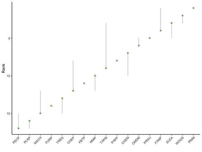
When I plot the results using "plotSARanks(SAresults)" I obtain a graph where the points (indicating the median values) are located in between the confindence intervals. This resemble textbook uncertainty analysis output: Composite Indicator Development and Analysis in R with COINr (Becker 2022, Section 14.4.3).
However, if I re-run the code above a second time, I obtain a quite different graph, as follows. Actually, the confidence intervals are the same, but the median values are not located in between anymore, but at the far ends of the confidence intervals. Why is this happening? What does it depend on? And which of the two graphs is the correct one to be used?
Thanks for your help!
best,
Elena
