Hi, I have the dataset named as "mydata" which looks as follows:
Address MonthAvg
1'00-SV 6.1
2'00-SV 5.8
3'00-SV 21.00
21'00-SV 13.00
It has over 1000 of rows. P.S: Address is in character form and MonthAvg is in numeric form, while plotting a graph it gives me an error "Error in plot.window(...) : need finite 'xlim' values". & I don't want to convert Address to numeric. Is there any other way of plotting either scatter or ggplot.
A few paths for you to explore:
No package needed
d <- data.frame(Address = c("1'00-SV", "2'00-SV", "3'00-SV", "21'00-SV"),
MonthAvg = c(6.1, 5.6, 21, 13))
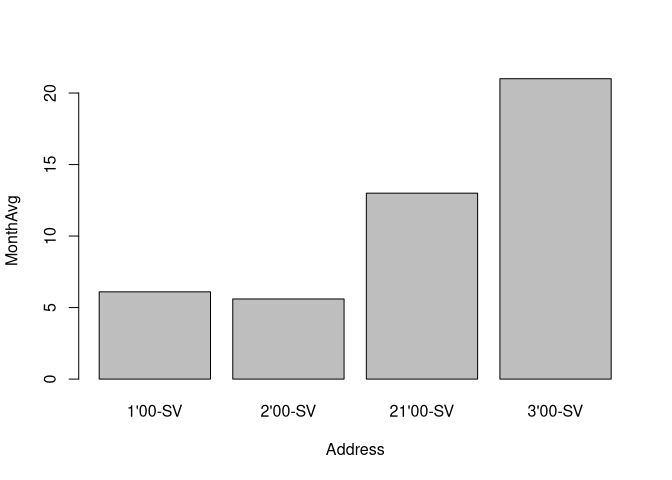
barplot(MonthAvg ~ Address, data = d)
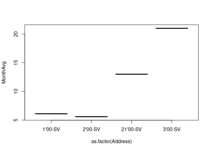
plot(MonthAvg ~ as.factor(Address), data = d)
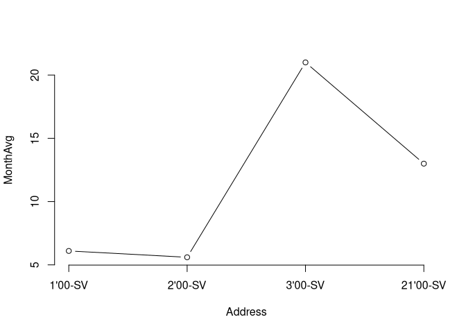
plot(MonthAvg ~ I(1:nrow(d)), data = d, axes = FALSE, xlab = "Address", type = "b")
axis(side = 2)
axis(side = 1, at = 1:nrow(d), labels = d$Address)
Using package {ggplot2} from tidyverse
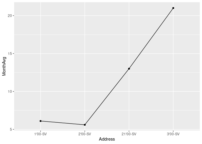
library(tidyverse)

d %>%
  ggplot() +
    aes(y = MonthAvg, x = Address, group = "") +
    geom_point() +
    geom_line()
Created on 2019-10-23 by the reprex package (v0.3.0)
1 Like
What are you trying to show? Charts are like sentences. Using a correct chart for your data types is like using correct grammar. But a good chart, like a good sentence, also communicates an idea.
I am trying to show monthly consumption by different addresses, but there are a lot of addresses.
If this is what you want, then I guess the best would be to represent the value on a map.
Do you have geographic coordinates for your addresses?
2 Likes
Yes, I have them as 57.03 degree N, 10.00 degree E
That's not helping, we would need a different coordinate for each address...
This topic was automatically closed 21 days after the last reply. New replies are no longer allowed.