Hello. I am pretty new to R and trying to learn charting better. So your request gave me something to work on. I hope I got the reprex posted right.
I copied the data example you provided and pasted it into an excel file, which I then read into R as a data frame named 'datatable'. I transformed 'datatable' from a wide to a long format. This put the columns you want to plot into one variable and the values into another. To get the line to plot right I changed the x axis to a continuous variable. Then when I plotted it out I relabeled the tick values with the text.
Hope this helps.
Amy
library(tidyverse)
library(dplyr)
library(ggplot2)
library(readxl)

#Read in the data
#I copied the example data into excel
datatable <- read_excel("C:/Users/.../Desktop/datatable.xlsx")

datatable3<-datatable%>%
  gather(key="GoldType", value="Value", -AXISGOLD)%>% #restructures from wide to long
  mutate(axis1=recode(AXISGOLD, "highest 20%"=1, "2"=2, "middle 20%"=3, "4"=4, "lowest 20%"=5))
    #changes x axis variable to continuous

datatable3%>%ggplot(aes(axis1, Value))+
  geom_line(aes(linetype=GoldType))  +
  scale_x_continuous(breaks=c(1,2,3,4,5),
                     labels=c("highest 20%", "2", "middle 20%", "4", "lowest 20%"))
                      #changes the x axis tick labels
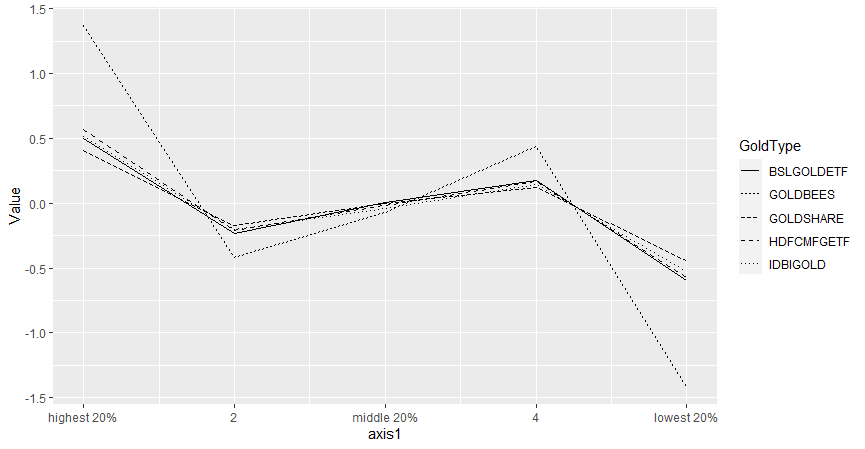
exhibit_5 <-d3%>%
gather(key="TICKER", value="Value", -AXISGOLD)%>% #restructures from wide to long
mutate(axis1=recode(AXISGOLD, "highest 20%"=1, "2"=2, "middle 20%"=3, "4"=4, "lowest 20%"=5)) #changes x axis variable to continuous
exhibit_5%>%ggplot(aes(axis1, Value))+
geom_line(aes(linetype=TICKER)) +
scale_x_continuous(breaks=c(1,2,3,4,5),
labels=c("highest 20%", "2", "middle 20%", "4", "lowest 20%")) #changes the x axis tick labels