I have data containing two biomarker trajectories over a 6 month period. I would like to plot each subjects' trajectories on the same graph to identify interesting joint trajectory profiles then create a grid of subject graphs using something like facet_wrap(~subj_id) or cowplot::plot_grid().
Currently there does not seem to be any support for two independent y axes. It should be a simple thing but I cannot seem to figure out how to create a secondary axis for biomarker_B using ggplot2. Clearly there is a push against secondary axes and other statisticians argue against plotting in this way. Nevertheless, I think it still has its uses so should be a ggplot2 feature. This is currently supported in plotly and other packages. Love to get some insight on how to do this in ggplot2.
library(tidyverse)
library(magrittr)

df <- tibble(
  subj_id = c(rep(1,7), rep(2, 7)),
  time = c(c(0:6),c(0:6)),
  biomarker_A = runif(14, 0, 100),
  biomarker_B = runif(14, 0, 10000)
)

df %>%
  ggplot() +
    geom_line(aes(x = time, y = biomarker_A)) +
    geom_line(aes(x = time, y = biomarker_B)) +
    facet_wrap(~subj_id)
library(tidyverse)
library(magrittr)
#>
#> Attaching package: 'magrittr'
#> The following object is masked from 'package:purrr':
#>
#> set_names
#> The following object is masked from 'package:tidyr':
#>
#> extract
df <- tibble(
subj_id = c(rep(1,7), rep(2, 7)),
time = c(c(0:6),c(0:6)),
biomarker_A = runif(14, 0, 100),
biomarker_B = runif(14, 0, 10000)
)
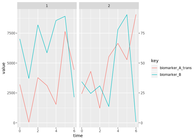
df1 <- df %>%
# need the reverse transformation as what will be used in `sec_axis`.
mutate(biomarker_A_trans = biomarker_A * 100) %>%
gather(key, value, biomarker_A:biomarker_A_trans) %>%
filter(key != "biomarker_A")
df1 %>%
ggplot() +
geom_line(aes(x = time, y = value, group = key, color = key)) +
facet_wrap(~subj_id) +
scale_y_continuous(sec.axis = sec_axis(~ ./100))