Hello
I'm a beginner at R and ggplot2.
I'm practicing on the diamonds dataset using this code
library(ggplot2)
library(dplyr)

avg_diam <- diamonds %>%
  group_by(cut) %>%
  summarise(avg_price=mean(price))
ggplot(data = avg_diam, mapping = aes(x=cut, y=avg_price, fill=cut))+
  geom_bar(stat = 'identity')
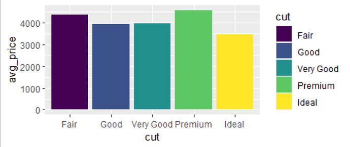
The chart that I'm getting is like this
The chart shows that the average price of the fair cut is more than the ideal cut.
Is that true or am I doing something wrong?
Looks correct. Note that there are not that many fair ones in comparison to the other groups.
diamonds %>%
  group_by(cut) %>%
  summarise(mean = mean(price),
            count = n())

# A tibble: 5 × 3
  cut        mean count
  <ord>     <dbl> <int>
1 Fair      4359.  1610
2 Good      3929.  4906
3 Very Good 3982. 12082
4 Premium   4584. 13791
5 Ideal     3458. 21551
system
Closed
3
This topic was automatically closed 7 days after the last reply. New replies are no longer allowed.
If you have a query related to it or one of the replies, start a new topic and refer back with a link.
