I have a Shiny app that I'm building that uses the below code:
library(shiny)
library(shiny)
library(tidyverse)
library(dplyr)
library(ggimage)

ui <- fluidPage(

    # Application title
    titlePanel("DFS Player Correlation"),

    # Sidebar with a slider input for number of bins
    sidebarLayout(
        sidebarPanel(
            sliderInput(inputId = "week",
                        label = "Select weeks",
                        min = 1,
                        max = 17,
                        value = c(1, 17)
            ),
            sliderInput(inputId = "szn",
                        label = "Select years",
                        min = 2014,
                        max = 2020,
                        value = c(2014, 2020),
                        sep = ""),
            sliderInput(inputId = "min_games",
                        label = "Minimum games played",
                        min = 1,
                        max = 20,
                        value = 4),
            fluidRow(
                column(6, selectInput(inputId = "website",
                                      label = "Select DFS platform",
                                      choices = c("DraftKings", "FanDuel"), selected = "DraftKings")),
                column(6, selectInput(inputId = "team",
                                      label = "Select team",
                                      choices = c("ARI", "ATL", "BAL", "BUF", "CAR", "CHI", "CIN", "CLE",
                                                  "DAL", "DEN", "DET", "GB", "HOU", "IND", "JAX",
                                                  "KC", "LAC", "LAR", "LV", "MIA", "MIN", "NE", "NO",
                                                  "NYG", "NYJ", "PHI", "PIT", "SEA", "SF", "TB", "TEN", "WAS"), selected = "ARI"))),
            tags$hr(),
            p(strong("Player comparison correlation graph selection")),
            fluidRow(
                column(6, uiOutput(outputId = "player1UI")),
                column(6, uiOutput(outputId = "player2UI")))),

        mainPanel(
            plotOutput("cor_plot", height = "600px")
        )
    )
)

server <- function(input, output) {


    base_data <- reactive({data <- read_csv(url(paste0("https://raw.githubusercontent.com/samhoppen/NFL-Analysis/main/Data/2020%20",input$website,"%20Weekly%20Scores.csv")))})

    player_filter <- reactive({
        start_szn <- min(as.numeric(input$szn))
        end_szn <- max(as.numeric(input$szn))
        start_wk <- min(as.numeric(input$week))
        end_wk <- max(as.numeric(input$week))

        player_filter <- base_data() %>%
            filter(Team == input$team,
                   year == end_szn) %>%
            group_by(player) %>%
            summarize(games = n()) %>%
            filter(games >= as.numeric(input$min_games)) %>%
            select(player)})

    correlation_data <- reactive({
        start_szn <- min(as.numeric(input$szn))
        end_szn <- max(as.numeric(input$szn))
        start_wk <- min(as.numeric(input$week))
        end_wk <- max(as.numeric(input$week))

        base_data() %>%
            dplyr::filter(Team == input$team,
                   week >= start_wk,
                   week <= end_wk,
                   year >= start_szn,
                   year <= end_szn) %>%
            select(player, DKP, week, year) %>%
            arrange(desc(player)) %>%
            subset(player %in% player_filter()$player) %>%
            pivot_wider(names_from = player, values_from = DKP) %>%
            select(-c("week", "year"))

    })

    output$player1UI <- renderUI({selectInput("player1",
                                              paste0("Player 1"),
                                              c("Select player" ="", player_filter()$player))


            })

    output$player2UI <- renderUI({selectInput("player2",
                                              paste0("Player 2"),
                                              c("Select player" ="", player_filter()$player))


    })


    output$matrix_plot <- renderPlot({
        req(input$player1, input$player2)
        player1 <- as.(input$player1)
        player2 <- names(input$player2)

        ggplot(data = correlation_data()) +
            geom_smooth(aes(x = player1, y = player2),
                        method = "loess",
                        se = F)
    })
}

shinyApp(ui = ui, server = server)
I'm trying to get it to produce the following graph:
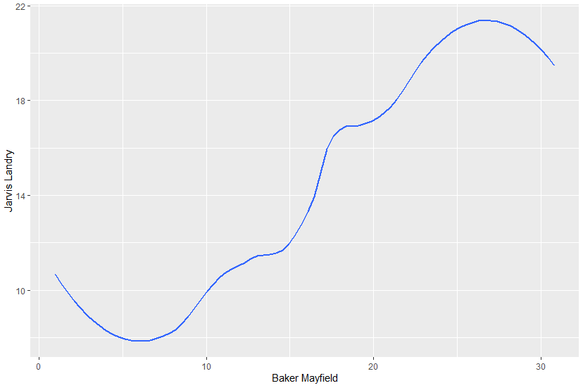
The apparent issue is that the X and Y aesthetics are NFL player names with spaces. In a normal ggplot I set the x aesthetic to Baker Mayfield and the y aesthetic to Jarvis Landry using backticks but Shiny isn't reading it that way. Any suggestions on how to fix this?