Hello. I'm having a bit of trouble with a visualisation, and i'm about as far from an expert as it gets when it comes to R. Any help would be much apreciated.
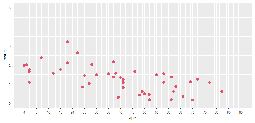
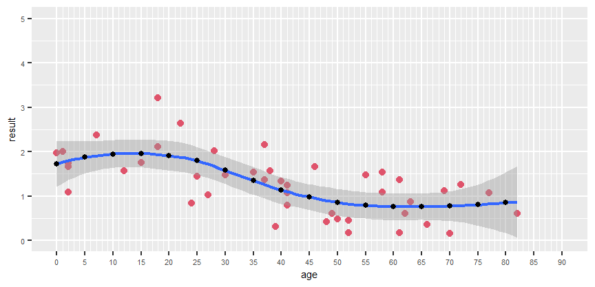
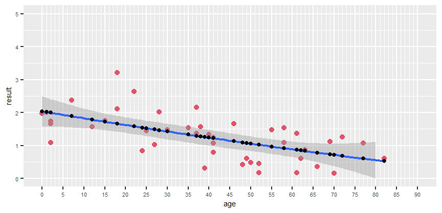
I have a set of data (3 actually) from experiments. Each has a set of values, and the ages of the experimental subjects. I have written a bit of code to help me visualise it in ggplot, and fit linear regression line. What is imporant, is that the x axis has to go from 0 to 90 showing each value even the ones for which i have no data. I probably should also note, that these values are averages, i actually have 3 values for each experiment, and i also wrote code to visualise in a boxplot dotplot form.
The problem is the following. I need to fit a non linear regression, and i need to know the equation for the regression line. This however seems to be difficult wihile maintaining the x axis as it is.
Here is my data and my code. Can anyone tell me what to do or how to get started? Thank you in advance!
library(ggplot2)
library(viridisLite)
library(tidyverse)
library(hrbrthemes)
library(viridis)
library(ggpubr)
library(nlme)
Fm_exp <- c(1.7434966, 1.0801409, 2.1167605, 3.2129330, 0.8309916, 2.0122389, 1.3666220, 1.3371467, 1.2490870, 1.6673520, 1.4810615, 1.0926890, 1.3596734, 0.6096441, 1.0759678)
H_1_exp <- c(1.9647631, 2.0084605, 1.5687817, 1.7500143, 2.6373049, 1.5306398, 2.1639198, 1.5670949, 1.0784589, 0.5986551, 0.1743043, 1.5402163, 0.8649401, 1.1173467, 1.2587116, 0.6119319)
T_1_exp <- c(1.6659381, 2.3747060, 1.4414554, 1.0302188, 1.4732338, 0.3131557, 0.7873363, 0.4274292, 0.4767390, 0.4514687, 0.1773119, 0.3509829, 0.1494075)
Ages_Hlty_Fm <- c(2, 2, 18, 18, 24, 28, 37, 40, 41, 46, 55, 58, 61, 62, 77)
Ages_Hlty_Ml <- c(0, 1, 12, 15, 22, 35, 37, 38, 41, 49, 52, 58, 63, 69, 72, 82)
Ages_Hlty_Mix <- c(2, 7, 25, 27, 30, 39, 41, 48, 50, 52, 61, 66, 70)
df_pre_1 <- data.frame(result=c(Fm_exp,H_1_exp,T_1_exp))
d_pre_2 <- c(Ages_Hlty_Fm,Ages_Hlty_Ml,Ages_Hlty_Mix)
df <- cbind(df_pre_1, age = factor(d_pre_2, levels = c(0:90)))
p <- ggplot(data = df, aes(x=age, y=result)) +
geom_point(data = df, aes(x=age, y=result), color="2", size=2) +
scale_x_discrete(drop = F) +
theme(text = element_text(size = 7)) +
ylim(0,5) +
p