Trouble with time series dates

I would like to create a time series of dissolved oxygen levels over time at three different depths. Currently, I have my dates as a column in excel. When I run the data set through autoplot() I end up with four graphs consisting of time, top, middle, and bottom. I would like to have the top, middle and bottom graphs with time on the x axis.

TomDO<- ts(Tom_Frost_Dissolved_Oxygen)
autoplot(TomDO, ts.geom = 'ribbon', fill = 'blue')

Data: Tom_Frost_Dissolved_Oxygen

Top     Middle  Bottom   Date
12.55   13.39   9.55    3/9/15
6.8     6.55    0.36    3/31/15
7.22    6.64    6.01    4/13/15
5.94    5.78    5.58    4/29/15
7.01    6.41    6.29    5/11/15
6.76    5.96    4.07    5/26/15
3.22    2.68    1.8     6/8/15
6.08    5.88    3.44    6/23/15
5.02    4.34    4.25    7/20/15
3.07    2.6     2.3     8/3/15
3.9     3.62    3.23    8/17/15
8.97    8.53    6.54    8/31/15
6.96    5.94    5.06    9/14/15
3.87    3.78    2.81    9/28/15
4.1     3.99    3.9     10/12/15
5.04    4.91    4.77    10/26/15
8.77    8.61    8.6     3/8/16
9.12    9.22    9.09    3/22/16
8.78    8.87    8.6     4/4/16
7.78    7.67    6.9     5/2/16
5.83    5.3     4.78    5/31/16
4.56    4.52    4.46    6/14/16
6.6     6.02    0.28    6/27/16
10.82   10.02   4.31    7/11/16
6.79    5.05    3.61    7/25/16
6.45    4.78    3.83    8/8/16
3.27    2.6     2.57    8/22/16
5.3     5.16    5.15    9/6/16
5.66    4.74    4.23    9/19/16
4.79    4.65    4.47    10/3/16
7.27    7.23    6.75    10/17/16
6.15    6.05    5.89    10/31/16
6.96    6.73    6.42    11/14/16
10.19   10.16   9.93    3/9/17
7.66    7.48    7.16    3/20/17
6.67    6.46    6.46    4/3/17
7.04    6.82    5.88    4/17/17
7.94    7.83    7.85    5/1/17
5.56    5.43    2.12    5/15/17
4.15    3.99    3.67    5/30/17
6.41    6.06    4.3     6/12/17
8.83    8.07    6.74    6/26/17
8.57    7.68    7.37    7/10/17
11.62   9.2     5.27    7/24/17
13.58   11.69   9.15    8/21/17
9.6     9.54    9.12    9/5/17
8.71    7.46    6.6     9/18/17
6.13    5.75    4.97    10/5/17
6.36    5.93    5.37    10/16/17
6.88    6.89    6.74    11/13/17
11.61   10.82   10.09   3/7/18
6.47    6.62    6.17    4/2/18
7.14    7.1     7.04    4/16/18
8.33    8.12    6.36    4/30/18
5.79    5.25    4.3     5/29/18
13.28   11.39   7.01    6/14/18
7.82    7.34    5.92    6/25/18
11.12   9.08    8.21    7/9/18
7.68    3.8     2.68    7/23/18
6.55    5.24    4.04    8/6/18
2.53    2.18    2.08    8/20/18
11.63   11.38   9.76    9/4/18
6.02    5.83    5.17    9/17/18
9.66    9.28    8.73    10/1/18
8.01    7.95    7.91    10/29/18
9.31    8.88    1.43    5/13/19
6.66    6.02    5.8     5/29/19
5.31    4.82    3.9     6/10/19
1.9     1.13    0.16    7/8/19
2.05    1.4     0.28    7/11/19
6.72    5.49    2.57    7/22/19
13.65   4.29    3.81    8/5/19
0.69    0          0    8/19/19
12.8    7.5     2.33    8/22/19
3.83    3.45    3.08    9/4/19
7.57    5.36    3.77    9/16/19
9.33    9.02    8.41    9/30/19
11.63   11.58   11.45   10/14/19
9.82    9.65    8.89    11/14/19
It looks like your Date object is formatted as character, and anything you do to plot it along the x-axis is going to be sorted by month number, which is probably not what you want.

Use ymd in the lubridate package to convert Date, first

The example you give isn't directly runable, (see reprex) so I can't say for certain if this works.

Date conversion

Try something like the following to convert the "Date" column to a Date class.

library(lubridate)

TomDO<- ts(Tom_Frost_Dissolved_Oxygen)
# Convert to Date class
TomDO$Date <- mdy(TomDO$Date)

autoplot(TomDO, ts.geom = 'ribbon', fill = 'blue')

Pivot the data longer

Maybe autoplot is getting messed up by the catgorical nature of the columns. Let's convert the data to a longer format. To do this it used to be melt or gather, but now it's pivot_longer.

library(tidyr)
library(tibble)
library(dplyr)

TomDO <- tribble(~Top, ~Middle, ~Bottom, ~Date,
        12.55,   13.39,   9.55,    "3/9/15",
        6.8,     6.55,    0.36,    "3/31/15",
        7.22,    6.64,    6.01,    "4/13/15",
        7.22,    6.64,    6.01,    "4/13/15")
# Date class conversion
TomDO$Date <- mdy(TomDO$Date)
# Make long format data
pivoted_df <- pivot_longer(TomDO, cols=c("Top", "Middle", "Bottom"), names_to="Layer")
# plot!
autoplot(pivoted_df, ts.geom="ribbon")
# Error: Objects of type tbl_df/tbl/data.frame not supported by autoplot.

Huh... what kind of object is TomDO?

autoplot(ts(pivoted_df), ts.geom="ribbon")
# Error: Objects of type mts/ts/matrix not supported by autoplot.

Reproducible example needed.

Well.... we tried some thing and found some errors. Can you provide a reproducible example?

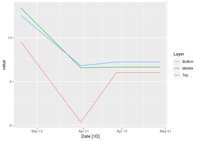
Building on @grosscol's answer, you need to make the object a class for which there is an autoplot() method, and load a package that provides that method.

The simplest approach is to use a tsibble object -- like a tribble but for time series.

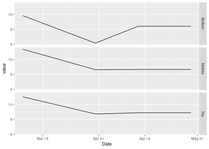
Alternatively, you can just use ggplot to create the graph yourself, without using autoplot().

Both approaches are shown below.

library(tidyverse)
library(tsibble, warn.conflicts = FALSE)
library(feasts, warn.conflicts = FALSE)
#> Loading required package: fabletools
library(lubridate, warn.conflicts = FALSE)

TomDO <- tribble(~Top, ~Middle, ~Bottom, ~Date,
                12.55,   13.39,   9.55,    "3/9/15",
                6.8,     6.55,    0.36,    "3/31/15",
                7.22,    6.64,    6.01,    "4/13/15",
                7.22,    6.64,    6.01,    "4/29/15")

# Make long format data
pivoted_df <- pivot_longer(TomDO, cols=c("Top", "Middle", "Bottom"), names_to="Layer") %>%
 mutate(Date = mdy(Date)) %>%
 as_tsibble(index=Date, key=Layer)

# autoplot
pivoted_df %>% autoplot(value)


# ggplot with facets
pivoted_df %>%
  ggplot(aes(x=Date, y=value)) +
    geom_line() +
    facet_grid(Layer ~ .)

Created on 2020-01-14 by the reprex package (v0.3.0)

3 Likes

This topic was automatically closed 21 days after the last reply. New replies are no longer allowed.