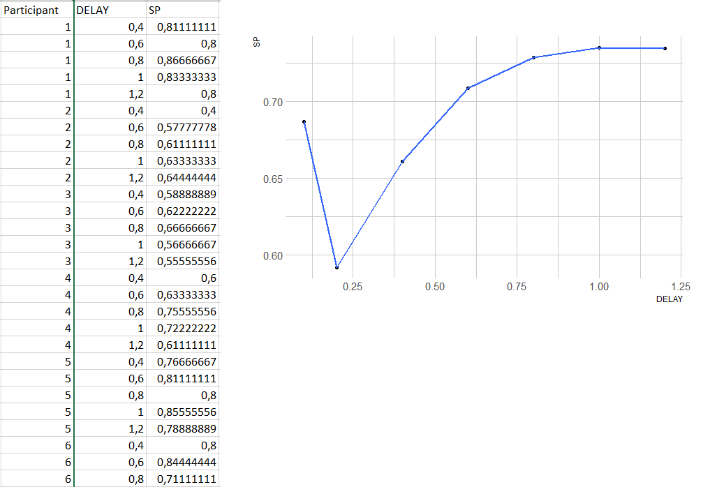
I want to plot a variable called 'SP', according to different conditions nested in a variable called 'DELAY'. Each of my participants got a SP score for each DELAY conditions.
-
Here is a sample of my data & the plot I get :
-
Here is my code :
ggplot(dataSP) + aes(x = DELAY, y = SP) +
stat_summary(fun = mean, geom = "point") +
stat_summary(fun = mean, geom = "smooth") +
theme_ipsum()
Now, I would like to smooth the line (I tried a lot of things but the function smooth doesn't seem to work), and to add confidence intervals . I think I don't succeed in doing any of it because of the way I aggregate the data to construct the plot, but after hours of searching it was the only way I got a plot that looked like that...
I really tried a lot of things for hours but I am really a beginner with R. Would anyone have an idea of how to smooth my plot and add confidence intervals please ? Thank you !
