Jire23
1
Hi I'm very new to using R so I know this is a basic/silly question, but I've been struggling with it for a few days!
I'm creating mosaic plots with my data and I'm struggling to figure out how to change different design features of these plots.
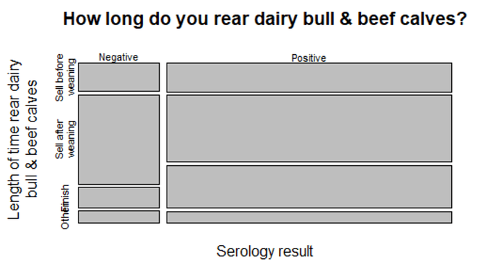
This is the code I used to create the plot below:
mosaicplot(~ factor(S1, labels = c("Negative", "Positive")) +
             factor(Q2b_g, labels = c("Sell before\nweaning", "Sell after\nweaning","Finish","Other")),
           data = Q_2bg, xlab = "Serology result", ylab = "Length of time rear dairy\nbull & beef calves",
           main = "How long do you rear dairy bull & beef calves?")
I'd like to reduce the size of all of the text on the figure and I've searched for code online and have not been able to find anything that works!
I have seen suggestions on forums to input this:
labeling = vcd::labeling_border(rot_labels = c(45, 45))
But when I added this into my code it didn't work, and other than that I have not found any other suggestions!
Any help would be much appreciated! 
We need a reproducible example (reprex)
Jire23
3
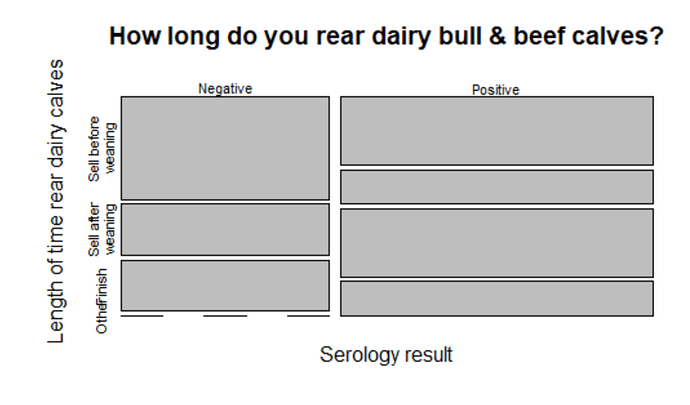
Hopefully this will suffice!
library(ggplot2)

df1 <- data.frame(serology = c(1,1,0,1,1,0,0,1,1,0),
                  Q2b = c("A","C","A","B","D","C","B","C","A","A"))

mosaicplot(~factor(serology, labels = c("Negative","Positive")) +
             factor(Q2b, labels = c("Sell before\nweaning","Sell after\nweaning","Finish","Other")),
           data = df1, xlab = "Serology result", ylab = "Length of time rear dairy calves",
           main = "How long do you rear dairy bull & beef calves?")
And this is the plot from the code:
system
Closed
4
This topic was automatically closed 21 days after the last reply. New replies are no longer allowed.
If you have a query related to it or one of the replies, start a new topic and refer back with a link.
![]()

