Hello,
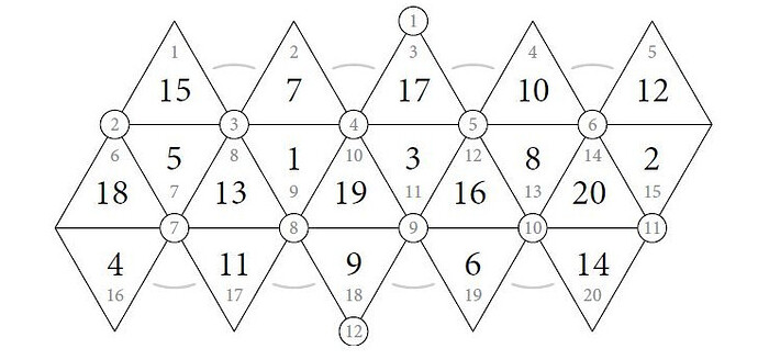
I am hoping to find an efficient and easy way to draw my custom "plot". Essentially, I want to draw a diagram like shown in R and I want to be able to colour in each triangle based on a frequency value freq in my dataframe in df_lookup
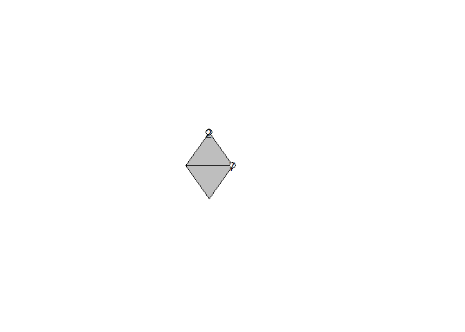
You will see in my toy example I have created 18 and 4 with the circled 2 and 7 included. Is there no easier way to mass generate the grid of triangles like this and colour them based on their frequency?
In the reprex you will see I provided some data for plotting and some values to to lookup with that need to determine the colour/heatmap
library(grid)

#1 Creating df
x <- c(.4, .45, .5, .4, .45, .5)

y <- c(.5, .6, .5, .5 , .4, .5)

id <- rep(1:3, each=2)

df <- data.frame(x,y,id)

#2 Look up df
df_lookup <- data.frame(id = c(1,2),
                       freq = c(1,10))


# 3 Drawing grid
grid.path(x, y, gp=gpar(fill="grey"))


grid.circle(0.5,0.5,0.01)
grid.text(label = "7",
          x = 0.5,
          y = 0.5,
          just = "center",
          check.overlap = TRUE)

grid.circle(0.45,0.6,0.01)
grid.text(label = "2",
          x = 0.45,
          y = 0.6,
          just = "center",
          check.overlap = TRUE)

Created on 2021-07-16 by the reprex package (v2.0.0)
