Transfer one legend at bottom and one at left

Hi,
I appreciate if someone can help in arranging one legend (Shape) at the bottom (Fraction) while one remain at the left.
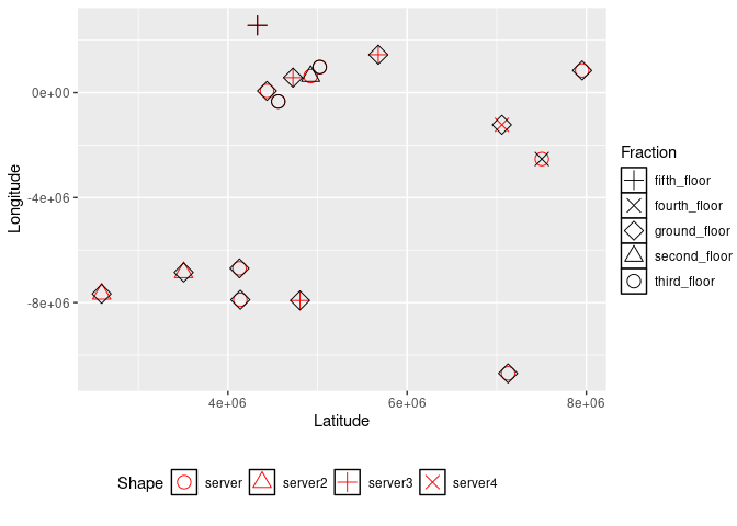
Thank you :blush:

my data and code are here:

data <- read.table(text = "proxy Longitude Latitude fraction variable values count Shape
A 845076.8133 7952906.509 ground_floor server 5 2 3
B 628213.526 4922672.854 second_floor server 3 38 6
C -7893548.463 4138071.5 ground_floor server 9 1 20
G -7669834.187 2590343.455 ground_floor server2 12 1 1
E -10699192.16 7126643.172 ground_floor server 14 1 19
F 64789.72751 4435533.366 ground_floor server 16 2 9
G -338124.8274 4561495.29 third_floor server 15 5 8
H -2531015.267 7503498.634 fourth_floor server 22.1 1 64
I 975533.7618 5024220.061 third_floor server 24.8 36 5
j -7920520.004 4804023.573 ground_floor server3 27.5 5 22
k -6697659.731 4128488.631 ground_floor server 30.2 9 35
D -6852811.697 3505961.577 ground_floor server2 32.9 6 2
G 1444849.581 5678072.381 ground_floor server3 35.6 6 4
B 2561971.64 4329459.255 fifth_floor server3 38.3 43 10
F -1225583.899 7057209.131 ground_floor server4 41 4 18
D 571523.8736 4726135.588 ground_floor server3 43.7 3 7
", header = TRUE)
library(tidyverse)
library(ggnewscale)

data <- data %>%
  mutate(variable = factor(variable),
    fraction = factor(fraction))


ggplot(data) + 
  aes(x = Latitude, y = Longitude) +
  geom_point(aes(shape=variable),color = "red", fill = "white", size = 4) +
  scale_shape_manual(name = "Shape", values = unique(data$variable)) +
  ggnewscale::new_scale("shape")+
  geom_point(aes(shape=fraction),color = "black", fill = "white", size = 4) +
  scale_shape_manual(name = "Fraction", values = unique(data$fraction)) +
  theme(legend.key = element_rect(fill = "white", color = "black"))

Hi @SPratap
According to this 2021 SO post, your problem cannot be solved with ggplot functions. patchwork doesn't seem to help either, you need to do some work with cowplot:
https://stackoverflow.com/questions/68497565/different-legend-positions-on-plot-with-multiple-legends

From what I have seen, using the cowplot package is likely the easiest way to rearrange the legends on the plot. This is usually done by using get_legend to assign multiple legends based on different factors, but since you are using ggnewscale with both scales based around shape, the only solution I have found is to separately create the two plots first and using get_legend on each one before creating the plot using ggnewscale.

In the example below, I create the two separate plots to get the two legends separately, while also specifying the shape legend to be horizontal instead of vertical. After that, I create the plot that you originally provided without the legend and assign it to both_plots. Finally, using the plot_grid function from cowplot, I stitch the plot and the two legends together so that the fraction legend appears next to the plot and the shape legend appears below it.

data <- read.table(text = "proxy Longitude Latitude fraction variable values count Shape
A 845076.8133 7952906.509 ground_floor server 5 2 3
B 628213.526 4922672.854 second_floor server 3 38 6
C -7893548.463 4138071.5 ground_floor server 9 1 20
G -7669834.187 2590343.455 ground_floor server2 12 1 1
E -10699192.16 7126643.172 ground_floor server 14 1 19
F 64789.72751 4435533.366 ground_floor server 16 2 9
G -338124.8274 4561495.29 third_floor server 15 5 8
H -2531015.267 7503498.634 fourth_floor server 22.1 1 64
I 975533.7618 5024220.061 third_floor server 24.8 36 5
j -7920520.004 4804023.573 ground_floor server3 27.5 5 22
k -6697659.731 4128488.631 ground_floor server 30.2 9 35
D -6852811.697 3505961.577 ground_floor server2 32.9 6 2
G 1444849.581 5678072.381 ground_floor server3 35.6 6 4
B 2561971.64 4329459.255 fifth_floor server3 38.3 43 10
F -1225583.899 7057209.131 ground_floor server4 41 4 18
D 571523.8736 4726135.588 ground_floor server3 43.7 3 7
", header = TRUE)
library(tidyverse)
library(ggnewscale)
library(cowplot)

data <- data %>%
  mutate(variable = factor(variable),
         fraction = factor(fraction))

shape_plot <- ggplot(data) + 
  aes(x = Latitude, y = Longitude) +
  geom_point(aes(shape=variable),color = "red", fill = "white", size = 4) +
  scale_shape_manual(name = "Shape", values = unique(data$variable)) +
  theme(legend.direction="horizontal",
        legend.key = element_rect(fill = "white", color = "black"))

shape_legend <- get_legend(shape_plot)

fraction_plot <- ggplot(data) + 
  aes(x = Latitude, y = Longitude) +
  geom_point(aes(shape=fraction),color = "black", fill = "white", size = 4) +
  scale_shape_manual(name = "Fraction", values = unique(data$fraction)) +
  theme(legend.key = element_rect(fill = "white", color = "black"))

fraction_legend <- get_legend(fraction_plot)

both_plots <- ggplot(data) + 
  aes(x = Latitude, y = Longitude) +
  geom_point(aes(shape=variable),color = "red", fill = "white", size = 4) +
  scale_shape_manual(name = "Shape", values = unique(data$variable)) +
  ggnewscale::new_scale("shape")+
  geom_point(aes(shape=fraction),color = "black", fill = "white", size = 4) +
  scale_shape_manual(name = "Fraction", values = unique(data$fraction)) +
  theme(legend.position = "none")

plot_grid(both_plots, fraction_legend, shape_legend, 
          rel_widths = c(0.5, 0.1, 0.1),
          rel_heights = c(0.5, 0.1, 0.1),
          legend.justification = "center")

image

It is probably a bit tedious to create the two plots just to extract the legends, but due to the use of ggnewscale in the original plot, this was the easiest way that I could imagine it being done.

2 Likes

This topic was automatically closed 7 days after the last reply. New replies are no longer allowed.

If you have a query related to it or one of the replies, start a new topic and refer back with a link.