I am trying to plot the total number of cumulative cases for COVID-19 using this Canadian dataset
I am trying to plot using provinces "Canada" with date on the X-Axis and Number of cases on the Y-Axis. I wrote a .R script however when the plot generates either there is too many dates or the plot does not show correctly. How can I modify this to show the graph correctly?
I used the filter function to filter all the cases in Canada however would there be a better way to calculate total cumlative number of cases?
@FJCC If I wanted to illustrate the dates like this on the x-axis, how could I modify this? I've updated the script however the data points do not show. As-well, it seems that many of the data points (dates) are not in chronological order?
Hi @martin.R, I did notice that the script labeled as mutate(date = dmy(date)), however this did not show the plot correctly. When I tried this, rather than showing all the dates at the bottom there was just 5 lables. Jan, Feb, Mar, April, May. I am looking to show all the dates.
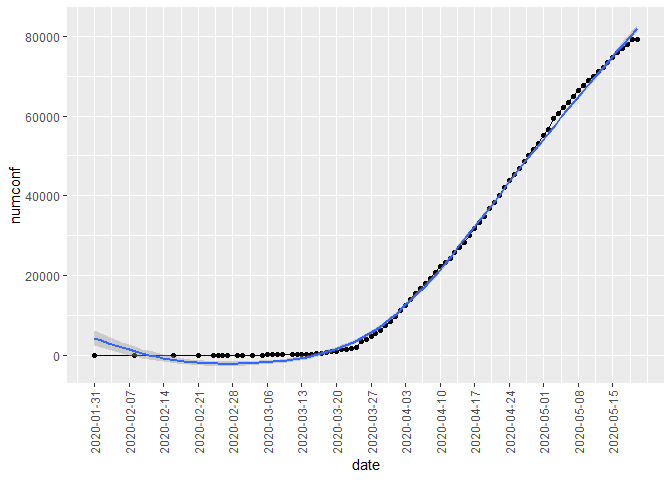
Here is an example of having a date on the x axis for every 7 days. You can decrease that to every day if you want by setting by = 1 in the seq.Date function, but I think that will be very hard to read.
library(dplyr, warn.conflicts = FALSE)
library(lubridate)
#>
#> Attaching package: 'lubridate'
#> The following objects are masked from 'package:dplyr':
#>
#>     intersect, setdiff, union
#> The following objects are masked from 'package:base':
#>
#>     date, intersect, setdiff, union
library(ggplot2)
data <- read.csv("~/R/Play/covid19.csv",header=T)

data2 <- filter(data, data$prname == "Canada") %>%
  mutate(date = dmy(date))

data2 %>%
  ggplot(aes(x=date, y=numconf)) +
  geom_point() +
  geom_line() +
  geom_smooth() +
  scale_x_date(breaks = seq.Date(from = as.Date("2020-01-31"),
                                     to = as.Date("2020-05-20"), by = 7)) +
  theme(axis.text.x = element_text(angle = 90, vjust = 0.5, hjust = 0.5))
#> `geom_smooth()` using method = 'loess' and formula 'y ~ x'