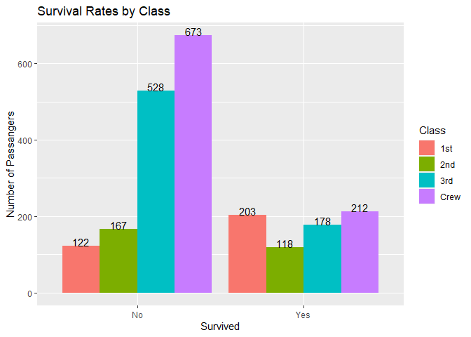
How do I resize the y-axis to give precise number of the counts?
graph <- ggplot(survival, aes(x = Survived, fill = Class)) +
geom_bar(position = position_dodge())+
labs(y="Number of Passangers",
title = "Survival Rates by Class")
graph
Can you please show your data? You can post the output of
dput(survival)
or if that is too big, try
dput(head(survival, 10))
Please put a line with three back ticks just before and just after the output that you paste.
```
your output here
```
structure(list(Class = structure(c(1L, 2L, 3L, 4L, 1L, 2L, 3L,
4L, 1L, 2L, 3L, 4L, 1L, 2L, 3L, 4L, 1L, 2L, 3L, 4L, 1L, 2L, 3L,
4L, 1L, 2L, 3L, 4L, 1L, 2L, 3L, 4L), .Label = c("1st", "2nd",
"3rd", "Crew"), class = "factor"), Survived = structure(c(1L,
1L, 1L, 1L, 1L, 1L, 1L, 1L, 1L, 1L, 1L, 1L, 1L, 1L, 1L, 1L, 2L,
2L, 2L, 2L, 2L, 2L, 2L, 2L, 2L, 2L, 2L, 2L, 2L, 2L, 2L, 2L), .Label = c("No",
"Yes"), class = "factor"), Sex = structure(c(1L, 1L, 1L, 1L,
2L, 2L, 2L, 2L, 1L, 1L, 1L, 1L, 2L, 2L, 2L, 2L, 1L, 1L, 1L, 1L,
2L, 2L, 2L, 2L, 1L, 1L, 1L, 1L, 2L, 2L, 2L, 2L), .Label = c("Male",
"Female"), class = "factor"), Age = structure(c(1L, 1L, 1L, 1L,
1L, 1L, 1L, 1L, 2L, 2L, 2L, 2L, 2L, 2L, 2L, 2L, 1L, 1L, 1L, 1L,
1L, 1L, 1L, 1L, 2L, 2L, 2L, 2L, 2L, 2L, 2L, 2L), .Label = c("Child",
"Adult"), class = "factor"), Freq = c(0, 0, 35, 0, 0, 0, 17,
0, 118, 154, 387, 670, 4, 13, 89, 3, 5, 11, 13, 0, 1, 13, 14,
0, 57, 14, 75, 192, 140, 80, 76, 20)), row.names = c(NA, -32L
), class = "data.frame")
I think you want to use the Freq column to determine your y values and use geom_col() instead of geom_bar.
ggplot(survival, aes(x = Survived, y = Freq, fill = Class)) +
  geom_col(position = position_dodge())+
  labs(y="Number of Passengers",
       title = "Survival Rates by Class")
Thanks , and
what of adding the figures on the bars? How do I do that?
My original code for plotting makes a deceptive plot because it over plots the different subsets of survived and you could only see the tallest element. Each apparent bar is the over plotting of every combination of Female/Male and Adult/Child. In the following code, I first sum up all of the subsets for each combination of survived and Class and then plot the data with labels showing the exact values.
survival <- structure(list(Class = structure(c(1L, 2L, 3L, 4L, 1L, 2L, 3L,
                                               4L, 1L, 2L, 3L, 4L, 1L, 2L, 3L, 4L, 1L, 2L, 3L, 4L, 1L, 2L, 3L,
                                               4L, 1L, 2L, 3L, 4L, 1L, 2L, 3L, 4L),
                                             .Label = c("1st", "2nd", "3rd", "Crew"),
                                             class = "factor"),
                           Survived = structure(c(1L, 1L, 1L, 1L, 1L, 1L, 1L,1L, 1L, 1L, 1L, 1L, 1L, 1L, 1L,
                                                 1L, 2L, 2L, 2L, 2L, 2L, 2L, 2L, 2L, 2L, 2L, 2L, 2L, 2L, 2L,
                                                 2L, 2L),.Label = c("No", "Yes"), class = "factor"),
                           Sex = structure(c(1L, 1L, 1L, 1L, 2L, 2L, 2L, 2L, 1L, 1L, 1L, 1L, 2L, 2L, 2L, 2L, 1L, 1L,
                                             1L, 1L, 2L, 2L, 2L, 2L, 1L, 1L, 1L, 1L, 2L, 2L, 2L, 2L),
                                           .Label = c("Male", "Female"), class = "factor"),
                           Age = structure(c(1L, 1L, 1L, 1L, 1L, 1L, 1L, 1L, 2L, 2L, 2L, 2L, 2L, 2L, 2L, 2L, 1L, 1L, 1L, 1L,
                                             1L, 1L, 1L, 1L, 2L, 2L, 2L, 2L, 2L, 2L, 2L, 2L),
                                           .Label = c("Child", "Adult"), class = "factor"),
                           Freq = c(0, 0, 35, 0, 0, 0, 17, 0, 118, 154, 387, 670, 4, 13, 89, 3, 5, 11, 13, 0, 1, 13, 14, 0,
                                    57, 14, 75, 192, 140, 80, 76, 20)),
                      row.names = c(NA, -32L), class = "data.frame")


library(ggplot2)
library(dplyr)
#>
#> Attaching package: 'dplyr'
#> The following objects are masked from 'package:stats':
#>
#>     filter, lag
#> The following objects are masked from 'package:base':
#>
#>     intersect, setdiff, setequal, union
SummarySurvival <- survival %>% group_by(Class, Survived) %>% summarize(Total = sum(Freq))
#> `summarise()` regrouping output by 'Class' (override with `.groups` argument)
SummarySurvival
#> # A tibble: 8 x 3
#> # Groups:   Class [4]
#>   Class Survived Total
#>   <fct> <fct>    <dbl>
#> 1 1st   No         122
#> 2 1st   Yes        203
#> 3 2nd   No         167
#> 4 2nd   Yes        118
#> 5 3rd   No         528
#> 6 3rd   Yes        178
#> 7 Crew  No         673
#> 8 Crew  Yes        212
ggplot(SummarySurvival, aes(x = Survived, y = Total, fill = Class)) +
  geom_col(position = position_dodge())+
  geom_text(aes(label = Total), position = position_dodge(width = 0.9), vjust = 0) +
  labs(y="Number of Passangers",
       title = "Survival Rates by Class")

Created on 2021-04-29 by the reprex package (v0.3.0)
Thank you. It went just fine
If your question's been answered (even if by you), would you mind choosing a solution? (See FAQ below for how).
Having questions checked as resolved makes it a bit easier to navigate the site visually and see which threads still need help.
Thanks
This topic was automatically closed 21 days after the last reply. New replies are no longer allowed.
If you have a query related to it or one of the replies, start a new topic and refer back with a link.