Overview
I am conducting a time series analysis using an ARIMA model, and I would like to visualise the Mean Absolute Percentage Error (MAPE) in a plot (see below)
I am currently following this tutorial:
Issues
-
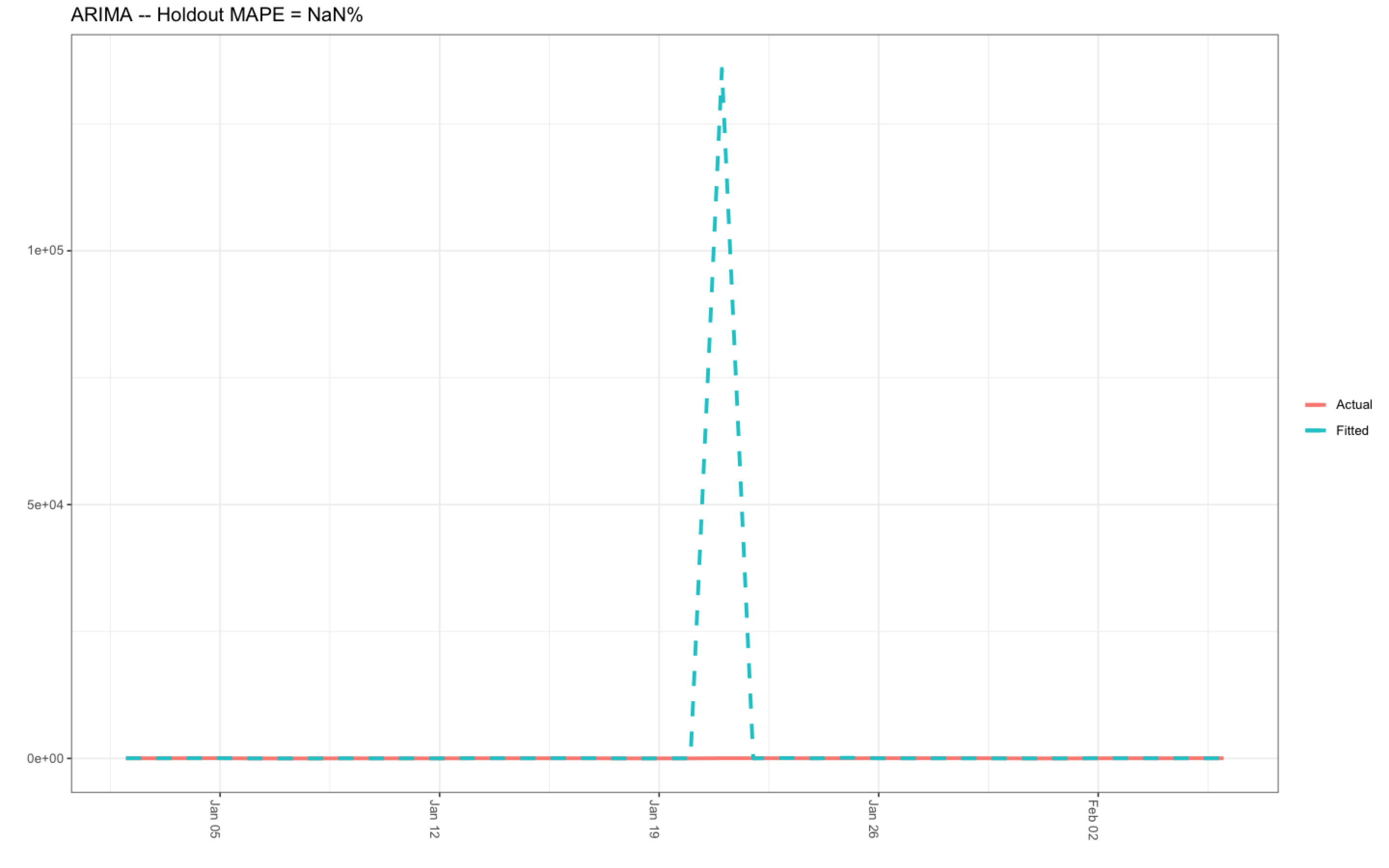
I have successfully run the R-code; however, the value produced by the object MAPE (see R-code below) is not a number, showing an Arima Holdout MAPE value of NaN %, which is definitely incorrect:
MAPE 1 NaN -
The numerical range of the y-axis on the ARIMA MAPE plot (see below) is spurious, ranging from zero to 10,0000 i.e., 0e+00 to 1e+5 (which is obviously incorrect), and, the date range on the x-axis is wrong because the date range for my data is 2015-2017. As a consequence, I have inputted the date range of 2015-2017 into both ts() and window() functions. The existence of this spurious data range is also responsible for the strange spike exhibited by the fitted data in the ARIMA MAPE plot below.
-
Moreover, the column named 'Date' produced by the object d4 (see R-code below) exhibits the year 1970 (see below), which does not make sense considering this is not the date range I inputted into my models:-
          #These values are produced by the object d4
                 Fitted    Actual        Date
           1  3.592659e+01     36     1970-01-02
           2  2.798055e+01     28     1970-01-03
           3  3.897144e+01     39     1970-01-04
           4  4.596831e+01     46     1970-01-05
           5  5.008207e+00      5     1970-01-06
           6  1.009074e-03      0     1970-01-07
           7  1.007765e-03      0     1970-01-08
           8  2.194326e+01     22     1970-01-09
           9  9.985120e+00     10     1970-01-10
          10  1.497379e+01     15     1970-01-11
          11  7.992608e+00      8     1970-01-12
          12  3.292665e+01     33     1970-01-13
          13  3.320180e+01     33     1970-01-14
          14  2.568558e+01     29     1970-01-15
The dates on the x-axis should follow the same format as the column called 'Year (below)', which is produced when you run the BSTS_new_df object.
                 Year     Month        Frequency
         1  2015-01-01   January             36
         2  2015-02-01  February             28
         3  2015-03-01     March             39
         4  2015-04-01     April             46
         5  2015-05-01       May              5
If anyone can please help me solve these issues, I would like to express my deepest appreciation.
Many thanks in advance.
R-code
        #Set seed
         seed(45L)

       ##Open packages for the time series analysis

       library(lubridate)
       library(bsts)
       library(dplyr)
       library(ggplot2)
       library(ggfortify)

        ##Change the Year column into YY/MM/DD format for the first of every month per year
         BSTS_df$Year <- lubridate::ymd(paste0(BSTS_df$Year, BSTS_df$Month,"-01"))

        ##Order the Year column in YY/MM/DD format into the correct sequence: Jan-Dec
         allDates <- seq.Date(
                           min(BSTS_df$Year),
                            max(BSTS_df$Year),
                            "month")

        ##Produce and arrange the new data frame ordered by the first of evey month in YY/MM/DD format
        BSTS_new_df <- BSTS_df %>%
                  right_join(data.frame(Year = allDates), by = c("Year")) %>%
                  dplyr::arrange(Year) %>%
                  tidyr::fill(Frequency, .direction = "down")

        ##Create a time series object
       myts_Arima <- ts(BSTS_new_df$Frequency, start=c(2015, 1), end=c(2017, 12), frequency=12)

       ##Upload the data into the windows() function
       Arima_Window <- window(myts_Arima, start=c(2015, 01), end=c(2017, 12))

      ### Fit the ARIMA model
        arima <- arima(log10(x+.001),
                     order=c(0, 1, 1),
                     seasonal=list(order=c(0,1,1), period=12))

        ### Actual versus predicted
          d4 <- data.frame(c(10^as.numeric(fitted(arima)), # fitted and predicted
                      10^as.numeric(predict(arima, n.ahead = 12)$pred)),
                      as.numeric(BSTS_df$Frequency), #actual values
                      as.Date(time(BSTS_df$Year)))

               ##Name the columns
               names(d4) <- c("Fitted", "Actual", "Date")

               ### MAPE (mean absolute percentage error)
                MAPE <- dplyr::filter(d4, lubridate::year(Date)>2017) %>%
                             dplyr::summarise(MAPE=mean(abs(Actual-Fitted)/Actual))

               ##Open a plotting window
               dev.new()

             ### Plot actual versus predicted
             ggplot(data=d4, aes(x=Date)) +
             geom_line(aes(y=Actual, colour = "Actual"), size=1.2) +
             geom_line(aes(y=Fitted, colour = "Fitted"), size=1.2, linetype=2) +
             theme_bw() + theme(legend.title = element_blank()) +
             ylab("") + xlab("")
             geom_vline(xintercept=as.numeric(as.Date("2015-12-01")), linetype=2) +
             ggtitle(paste0("ARIMA -- Holdout MAPE = ", round(100*MAPE,2), "%")) +
             theme(axis.text.x=element_text(angle = -90, hjust = 0))
ARIMA MAPE Plot
Data frame - BSTS_df
              structure(list(Year = c(2015, 2015, 2015, 2015, 2015, 2015, 2015,
             2015, 2015, 2015, 2015, 2015, 2016, 2016, 2016, 2016, 2016, 2016,
             2016, 2016, 2016, 2016, 2016, 2016, 2017, 2017, 2017, 2017, 2017,
             2017, 2017, 2017, 2017, 2017, 2017, 2017), Month = structure(c(5L,
             4L, 8L, 1L, 9L, 7L, 6L, 2L, 12L, 11L, 10L, 3L, 5L, 4L, 8L, 1L,
            9L, 7L, 6L, 2L, 12L, 11L, 10L, 3L, 5L, 4L, 8L, 1L, 9L, 7L, 6L,
            2L, 12L, 11L, 10L, 3L), .Label = c("April", "August", "December",
            "February", "January", "July", "June", "March", "May", "November",
             "October", "September"), class = "factor"), Frequency = c(36,
               28, 39, 46, 5, 0, 0, 22, 10, 15, 8, 33, 33, 29, 31, 23, 8, 9,
              7, 40, 41, 41, 30, 30, 44, 37, 41, 42, 20, 0, 7, 27, 35, 27,
               43, 38)), row.names = c(NA, -36L), class = "data.frame")