Time representation - Two axis plot

Hi ,

I have a df like this one and what I would like to do is a histogram with I guess 2 axes.
I want to represent the evolution of my value depending on the Time.
I don't really know what is the best representation so if you have idea I ready to hear about ! But I was thinking to plot in Y my value, in X my station and in the second Y axis (so on the right side, in front of the Y axis on the left).
Basically, I want to see how my value change depending of the sampling time

df <- tribble(
  ~station, ~Time, ~Period, ~Value, 
  "A1", 01:14:56, night, 0.548
  "A2", 14:25:02, day, 0.264
  "A3", 09:17:29, night, 0.658
  "A4", 11:36:10, day, 0.367
  "A5", 05:42:48, night, 0.691
  "A6", 21:03:51, night, 0.472
  "A7", 16:14:39, night, 0.326
)

Thank you very much !
This might be personal preference, but as a general rule I really try to avoid dual axes plots. Blog posts like this explain why, but the TL;DR version is that scaling between the Y axes can make the graph confusing and less informative, or potentially misleading.

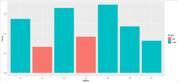
So I think that leaves you with two different things here - The first would be to just use day and night in the Period column as a grouping variable.

library(tibble)
library(ggplot2)

df <- tribble(
    ~station, ~Time, ~Period, ~Value, 
    "A1", '01:14:56', 'night', 0.548,
    "A2", '14:25:02', 'day', 0.264,
    "A3", '09:17:29', 'night', 0.658,
    "A4", '11:36:10', 'day', 0.367,
    "A5", '05:42:48', 'night', 0.691,
    "A6", '21:03:51', 'night', 0.472,
    "A7", '16:14:39', 'night', 0.326,
)

df %>% 
    ggplot(aes(x = station, y = Value, fill = Period)) + 
    geom_col(position = 'dodge')

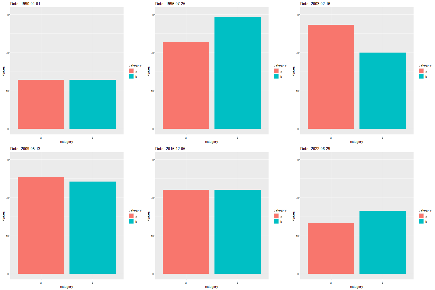
Your other option, if your dataset is big enough, would be to use motion to capture the passage of time - gganimate is a great package for this. For example, you could do something like this (this is a dummy dataset, but illustrates the point well).

library(gganimate)
library(ggplot2)
library(tidyr)
library(dplyr)
library(lubridate)
df <- tibble::tibble(
    'dt' = seq.Date(from = as.Date('1990-01-01'), to = today(), length.out = 10000),
    'category' = rep(c('a', 'b'), 5000),
    'values' = runif(10000)
)

df %>% 
    ggplot(aes(x = category, y = values)) + 
    geom_col(aes(fill = category)) + 
    labs(title = 'Date: {frame_time}') +
    transition_time(dt)

animation

1 Like

Thanks a lot for these ideas and for the "gganimate" idea, maybe I can do something with that !
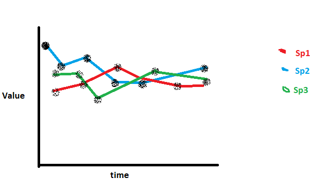
But I was thinking about a other representation.. How can I do if I want like :

  • select my top 3 species (depending on "Value"
  • Plot Y = Values ; X = Time and Point/Line representation my top 3 species and the evolution of Values depending on time ?
df <- tribble(
    ~station, ~Time, ~Period, ~Value, Species, 
    "A1", '01:14:56', 'night', 0.548, Ciu
    "A1", '01:14:56', 'night', 0.429, Hut
    "A1", '01:14:56', 'night', 0.527, Sol
    "A1", '01:14:56', 'night', 0.369, Cau
    "A2", '14:25:02', 'day', 0.316, Cau
    "A2", '14:25:02', 'day', 0.254, Po
    "A2", '14:25:02', 'day', 0.264, Sol
    "A2", '14:25:02', 'day', 0.371, Ciu
    "A3", '09:17:29', 'night', 0.658, Sol
    "A3", '09:17:29', 'night', 0.458, Po
    "A3", '09:17:29', 'night', 0.613, Cau
    "A3", '09:17:29', 'night', 0.542, Hay
    "A4", '11:36:10', 'day', 0.367, Po
    "A4", '11:36:10', 'day', 0.325, Cau
    "A4", '11:36:10', 'day', 0.294, Ciu
    "A5", '05:42:48', 'night', 0.691, Sol
    "A5", '05:42:48', 'night', 0.784, Cau
    "A6", '21:03:51', 'night', 0.472, Sol
    "A6", '21:03:51', 'night', 0.502, Hay
    "A6", '21:03:51', 'night', 0.431, Hut
    "A7", '16:14:39', 'night', 0.326, Sol
    "A7", '16:14:39', 'night', 0.305, Ciu
    "A7", '16:14:39', 'night', 0.336, Cau
    "A7", '16:14:39', 'night', 0.285, Hut
)

image

have like something like this if it's doable..
Very sorry for this ugly representation aha

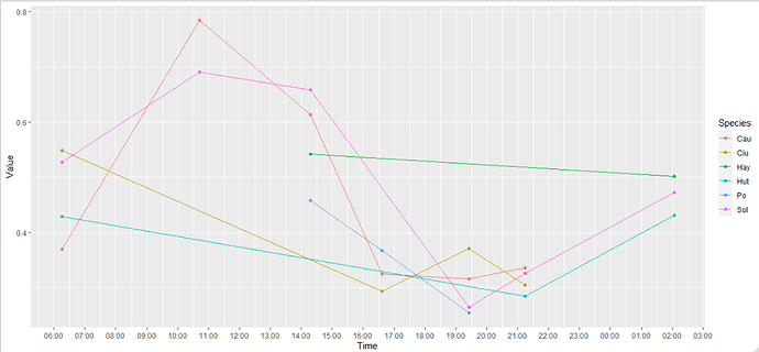
This should do the trick for you:

library(dplyr)
library(ggplot2)
library(tibble)
library(lubridate)

df <- tribble(
    ~station, ~Time, ~Period, ~Value, ~Species, 
    "A1", '01:14:56', 'night', 0.548, 'Ciu',
    "A1", '01:14:56', 'night', 0.429, 'Hut',
    "A1", '01:14:56', 'night', 0.527, 'Sol',
    "A1", '01:14:56', 'night', 0.369, 'Cau',
    "A2", '14:25:02', 'day', 0.316, 'Cau',
    "A2", '14:25:02', 'day', 0.254, 'Po',
    "A2", '14:25:02', 'day', 0.264, 'Sol',
    "A2", '14:25:02', 'day', 0.371, 'Ciu',
    "A3", '09:17:29', 'night', 0.658, 'Sol',
    "A3", '09:17:29', 'night', 0.458, 'Po',
    "A3", '09:17:29', 'night', 0.613, 'Cau',
    "A3", '09:17:29', 'night', 0.542, 'Hay',
    "A4", '11:36:10', 'day', 0.367, 'Po',
    "A4", '11:36:10', 'day', 0.325, 'Cau',
    "A4", '11:36:10', 'day', 0.294, 'Ciu',
    "A5", '05:42:48', 'night', 0.691, 'Sol',
    "A5", '05:42:48', 'night', 0.784, 'Cau',
    "A6", '21:03:51', 'night', 0.472, 'Sol',
    "A6", '21:03:51', 'night', 0.502, 'Hay',
    "A6", '21:03:51', 'night', 0.431, 'Hut',
    "A7", '16:14:39', 'night', 0.326, 'Sol',
    "A7", '16:14:39', 'night', 0.305, 'Ciu',
    "A7", '16:14:39', 'night', 0.336, 'Cau',
    "A7", '16:14:39', 'night', 0.285, 'Hut'
)

df %>% 
    mutate(
        Time = as.POSIXct(strptime(Time, format = '%H:%M:%S'))
    ) %>% 
    ggplot(
        aes(
            x = Time,
            y = Value,
            color = Species,
            group = Species
        )
    ) + 
    geom_line() +
    geom_point() + 
    scale_x_datetime(
        labels = scales::date_format(format = '%H:%M'),
        date_breaks = '1 hour'
    )

This topic was automatically closed 21 days after the last reply. New replies are no longer allowed.

If you have a query related to it or one of the replies, start a new topic and refer back with a link.