Time Course Inspector
Authors: Maciej Dobrzynski, Marc-Antoine Jacques
Working with Shiny more than 1 year
Abstract: Interactive visualisation and clustering of time series
Full Description: Time Course Inspector (TCI) is a software for visualization, analysis and clustering of time-series. The driving philosophy is to provide a simple, yet flexible GUI to perform various time-series analyses without any programming knowledge. TCI is written as an R shiny web app which provides a reactive, fast and customizable framework to produce elegant visualizations.
The screencast with an overview of the app's functionality and processing of the test-case-1 dataset can be found here.
If you just wish to give the app a quick try without installing it, you can access a running instance at shinyapps.io. Bear in mind that your experience using this instance might be sluggish and that the number of uses per month is limited. For a quick trial, we rather recommend to run the app directly from GitHub as described in sections below.
TCI has been applied for analysis of times series measurements of fluorescent biosensors and published here and here. However, the app can be used to analyse and cluster any kind of time series data!
The starting point of the app is a plain spreadsheet in comma-separated values format (CSV) that contains the dataset to analyze. TCI embeds a module for simple preprocessing of the data (normalization, missing values handling...), various visualizations, common statistics report, spectral decomposition, a flexible module for hierarchical clustering and cluster validation. All modules are documented with tooltips and Learn More sections to guide users through the UI and assist them with the analysis.
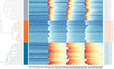
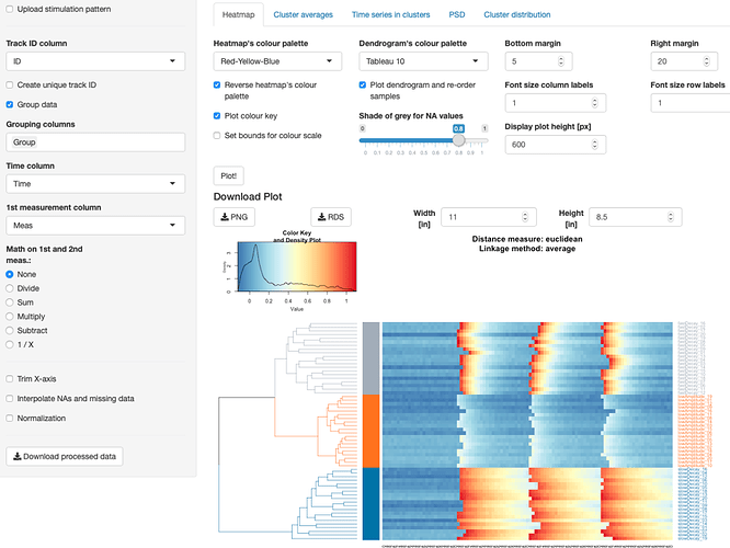
TCI aims to identify unique dynamic patterns present in a collection of univariate time-series. The resulting clusters can then be inspected to visualise the types of time series represented in each cluster. In addition, the distribution of clusters acroos the groups can be visualized to understand which dynamics or trends were over/under-represented in each group. The results of clustering are displayed as heatmaps with time series arranged in rows and time points shown in columns. The arrangement of clusters in the heatmap is illustrated by the dendrogram. The UI allows to cut the dendrogram at a desired level and to highlight major tree branches. This is useful to plot cluster averages and time series within such clusters in other tabs of that module. If grouping is present in the dataset, it is possible to plot the fraction of time series from different clusters per group as a stacked bar plot.
The project is open-source and free to use under GPL3 license. Feedbacks and contributions from the users are greatly encouraged!
Category: Research
Keywords: data analysis, time series, statistical analysis, clustering, data exploration
Shiny app: https://macdobry.shinyapps.io/tcourse-inspector/
Repo: GitHub - dmattek/shiny-timecourse-inspector: An R/Shiny web app for visualisation, analysis and clustering of time-series.
RStudio Cloud: Posit Cloud
Thumbnail:

Full image:
