Students Gender Subjects
1 0 6
2 1 7
3 0 6
4 0 5
5 0 4
6 0 5
7 1 5
8 0 7
9 1 8
10 0 6
11 1 5
12 0 7
13 0 6
14 0 6
15 0 6
16 0 7
17 1 6
18 1 6
19 1 5
20 1 8
21 1 8
22 1 8
23 1 8
24 0 8
25 0 6
Please be aware of the site's homework policy:
Ditto on the homework policy and request for a reprex.
And with that in mind, check out ggplot's barplot. In the aesthetics, you can have both the x-axis and fill refer to your Gender variable.
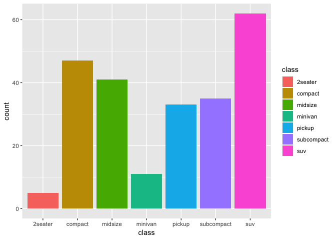
Using the example there with the mpg dataset built into ggplot2,
library(ggplot2)
ggplot(mpg, aes(x=class, fill=class)) + geom_bar()
Created on 2019-10-04 by the reprex package (v0.3.0)
This topic was automatically closed 21 days after the last reply. New replies are no longer allowed.