Hi all,
I would like to build a nice graph for my weather data. I have 13-months daily records for:
- minimum temperature
- mean temperature
- maximum temperature
- rainfall.
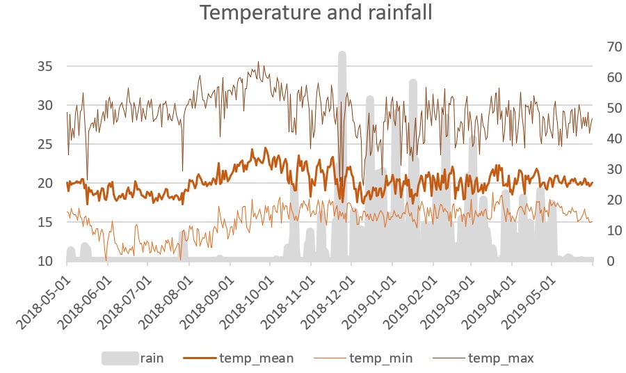
I would like to have a graph similar to this one (see below) where there are 3 lines for each temperature category and a monthly sum of rainfall. Ideally, on the x-axis I would like the month the be written in letters.
I am quite lost on how to do that on R e.g. which package allows me to do that/ with which syntax/ do I need to format my data for that etc.
Thanks in advance for your help ![]()