Hello,
I want to compare 6 climate models to my observations via a Taylor diagram in R using the plotrix package.
library('plotrix')
Y1 <- read.csv('File.csv', header = T, row.names = 1 )
ref = c(mean(Y1$Z1),sd(Y1$Z1))
model1 = c(mean(Y1$X1),sd(Y1$X1))
model2 = c(mean(Y1$X2),sd(Y1$X2))
model3 = c(mean(Y1$X3),sd(Y1$X3))
model4 = c(mean(Y1$X4),sd(Y1$X4))
model5 = c(mean(Y1$X5),sd(Y1$X5))
model6 = c(mean(Y1$X6),sd(Y1$X6))
crs = c('red', 'orange', 'blue', 'red', 'orange', 'blue')
taylor.diagram(ref, model1, pch = 1, col = crs[1], normalize = F, pos.cor=TRUE)
taylor.diagram(ref, model2, pch = 2, col = crs[2], normalize = F, add = T)
taylor.diagram(ref, model3, pch = 0, col = crs[3], normalize = F, add = T)
taylor.diagram(ref, model4, pch = 16, col = crs[4], normalize = F, add = T)
taylor.diagram(ref, model5, pch = 17, col = crs[5], normalize = F, add = T)
taylor.diagram(ref, model6, pch = 15, col = crs[6], normalize = F, add = T)
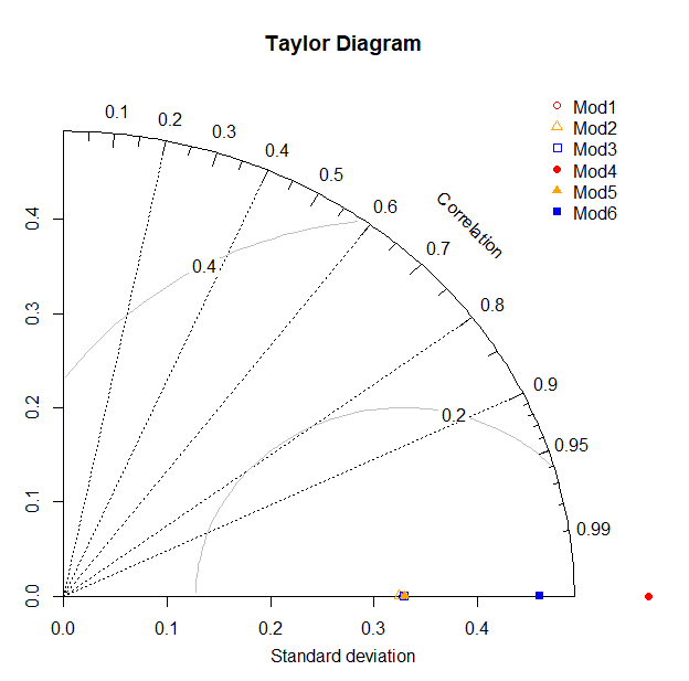
[enter image description here][1]
legend('topright', legend = c('Mod1', 'Mod2', 'Mod3', 'Mod4', 'Mod5', 'Mod6'),
pch = c(1, 2, 0, 16, 17, 15,18), col = crs, bty = 'n')
and this is the plot I obtain. What did I do wrong?