Tampa Bay Water Quality Dashboard
Authors: Marcus Beck
Working with Shiny more than 1 year
Abstract: This application synthesizes a 45 year record of water quality data from Tampa Bay, Florida, USA. Information from this application informs the management of environmental resources for the region under direction of the Tampa Bay Estuary Program.
Full Description: Tampa Bay (Florida, USA) was designated an "estuary of national significance" by Congress in 1990, paving the way for development of a long-term blueprint for bay restoration through the Tampa Bay National Estuary Program (TBEP). TBEP coordinates the overall protection and restoration of the bay with assistance and support from its many formal and informal partners.
Light availability to seagrass is the guiding paradigm for TBEP's Nitrogen Management Strategy. Because excessive nitrogen loads to the bay generally lead to increased algae blooms (higher chlorophyll-a levels) and reduce light penetration to seagrass, an evaluation method was developed to assess whether load reduction strategies are achieving desired water quality results (i.e. reduced chlorophyll-a concentrations and increased water clarity).
This Shiny dashboard is a modern implementation of historical methods to report on water quality conditions in Tampa Bay. These methods synthesize a long-term monitoring dataset collected since 1975 to report on annual water quality conditions in the Bay. Year to year algae abundance (measured as chlorophyll-a concentrations) and visible light penetration through the water column (secchi disk depth visibility) have been identified as critical water quality indicators in Tampa Bay. Tracking the attainment of targets for these indicators provides the framework for developing and initiating bay management actions.
The different tabs on the dashboard can be used to view the long-term trends in water quality for each bay segment and individual monitoring stations.
-
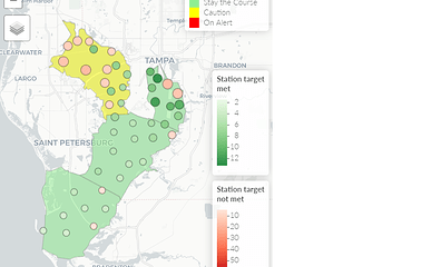
ATTAINMENT MATRICES: This tab shows the overall report card for the bay as management action categories. Separate matrices for chlorophyll and light attenuation exceedances for major bay segments are also shown. An interactive map is provided that shows attainment outcomes by year for individual stations in the bay.
-
SEGMENT ANNUAL TRENDS: This tab shows time series of annual chlorophyll and light attenuation averages for each bay segment. Blue lines on each plot show management targets or thresholds that define exceedance categories used to create the management action categories. In between the chlorophyll and light attenuation plots is the attainment matrix outcomes that are specific to each segment. The top row in the matrix shows the attainment outcome for chlorophyll, the bottom row shows the attainment outcome for light attenuation, and the middle row shows the overall management attainment outcome that combines information from both the chlorophyll and light attenuation outcomes.
-
SEGMENT SEASONAL TRENDS: This tab shows the seasonal distributions by bay segment for chlorophyll and light attenuation. Each boxplot shows the monthly distribution of observations across all available years in the dataset. The jittered points overlaid on the boxplots show the individual values for a specific year and the large red point shows the current year. Each observation can be clicked to view the observed phytoplankton cell counts for the selected year/month bay segment combination.
-
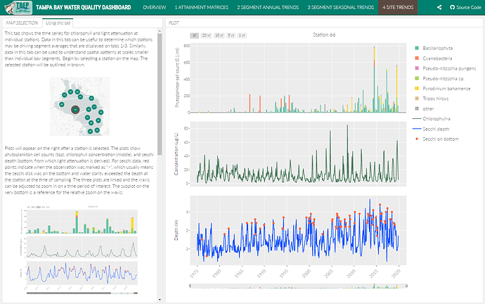
SITE TRENDS: This tab shows the time series for chlorophyll and light attenuation at individual stations (as compared to segment averages in the other tabs). Stations can be selected by clicking on the location in the map. Phytoplankton cell counts can also be viewed as quarterly sums across the period of record.
Category: Research
Keywords: environment, reporting, score card, water quality
Shiny app: https://shiny.tbeptech.org/wq-dash/
Repo: GitHub - tbep-tech/wq-dash: water quality reporting dashboard
RStudio Cloud: Posit Cloud
Thumbnail:
Full image:

