Hi Rstudio community,
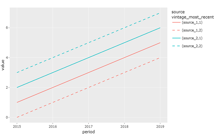
I'm attempting to use ggplot2 to create a chart similar to the following:
The intention of this chart is to present the most recently available vintage of values for each source with a solid line. In this case, a vintage_most_recent value of "1" indicates the most recent vintage. Older vintages should use different line types, but the line types should be the same if their vintage_most_recent values is the same (all 1's should use the same line type, all 2's the same line type, etc). The color assigned for each source should also stay the same across vintages.
The main issue is that in place of the 1's and 2's (vintage_most_recent), I would prefer to have the vintage dates. Is it possible to achieve this while meeting the requirements I mentioned above? Thanks for any insight.
Code:
library(tidyverse)
library(ggplot2)
library(plotly)


test_data <- read.csv("test_data.csv") %>% mutate(vintage_most_recent = as.character(vintage_most_recent))


test_plot <- ggplot(data = test_data, aes(x = period, y = value, color = source, linetype = vintage_most_recent)) + geom_line()

ggplotly(test_plot)
test_data:
| source | vintage | period | value | vintage_most_recent |
|---|---|---|---|---|
| source_1 | 2/1/2023 | 2015 | 1 | 1 |
| source_1 | 2/1/2023 | 2016 | 2 | 1 |
| source_1 | 2/1/2023 | 2017 | 3 | 1 |
| source_1 | 2/1/2023 | 2018 | 4 | 1 |
| source_1 | 2/1/2023 | 2019 | 5 | 1 |
| source_1 | 1/1/2023 | 2015 | 0 | 2 |
| source_1 | 1/1/2023 | 2016 | 1 | 2 |
| source_1 | 1/1/2023 | 2017 | 2 | 2 |
| source_1 | 1/1/2023 | 2018 | 3 | 2 |
| source_1 | 1/1/2023 | 2019 | 4 | 2 |
| source_2 | 3/1/2023 | 2015 | 2 | 1 |
| source_2 | 3/1/2023 | 2016 | 3 | 1 |
| source_2 | 3/1/2023 | 2017 | 4 | 1 |
| source_2 | 3/1/2023 | 2018 | 5 | 1 |
| source_2 | 3/1/2023 | 2019 | 6 | 1 |
| source_2 | 2/1/2023 | 2015 | 3 | 2 |
| source_2 | 2/1/2023 | 2016 | 4 | 2 |
| source_2 | 2/1/2023 | 2017 | 5 | 2 |
| source_2 | 2/1/2023 | 2018 | 6 | 2 |
| source_2 | 2/1/2023 | 2019 | 7 | 2 |
