Hello everyone,
I would like to create a barplot via ggplot2 with stacked subgroups. To make the different groups more distinct, I would like to add stripe patters in different angles to each subgroup. So far, I was able to apply the pattern in the bars to my satisfaction, but the legend does not seem to play along.
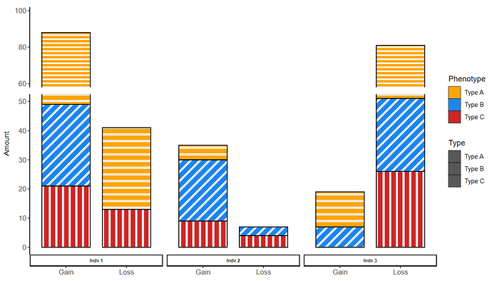
This is what I get with my code:
As you can see, by applying stripe patterns in aes(), an additional legend is created besides the one already existing. But I would like to show the stripe pattern + color in the original one (the one titled as "Phenotype"). What further confuses me is that the additional legend does not contain the applied stripe pattern but is simply grey for all "Types".
My Questions are:
- Is it possible to have pnly one legend that properly represents the bar color + pattern?
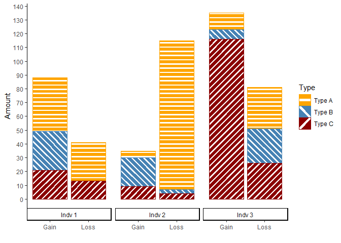
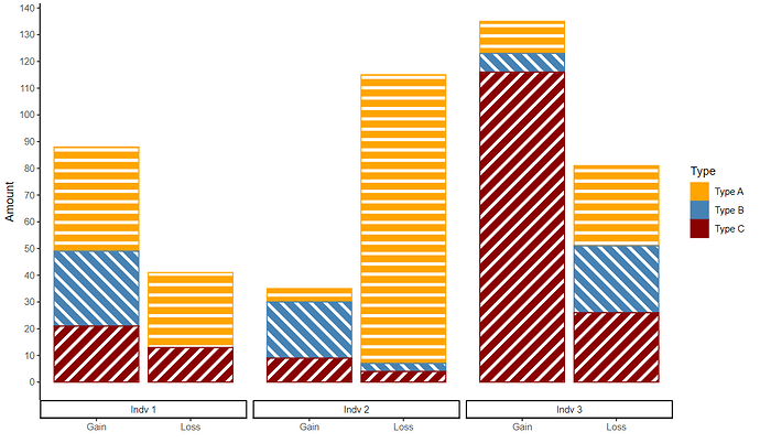
- How can I manually adjust the stripe angle? Lets say I want the blue stripes to have a 135° angle instead 90° (so that the stripes go from top-left to bottom-right instead of vice versa)? I know that this should be possible by assigning angles maually, but I was not able to figure out how.
Here is my Code:
library(ggplot2)
library(ggbreak) #for axis scale break
library(ggpattern) #for bar pattern filling#example data
cData <- structure(list(Individual = c("Indv 1", "Indv 2", "Indv 3", "Indv 1", "Indv 2", "Indv 3", "Indv 1", "Indv 2", "Indv 3",
"Indv 1", "Indv 2", "Indv 3", "Indv 1", "Indv 2", "Indv 3", "Indv 1", "Indv 2", "Indv 3"),
Change = c("Gain", "Gain", "Gain", "Gain", "Gain", "Gain", "Gain", "Gain", "Gain",
"Loss", "Loss", "Loss", "Loss", "Loss", "Loss", "Loss", "Loss", "Loss"),
Type = c("Type A", "Type A", "Type A", "Type B", "Type B", "Type B", "Type C", "Type C", "Type C",
"Type A", "Type A", "Type A", "Type B", "Type B", "Type B", "Type C", "Type C", "Type C"),
Value = c(39L, 5L, 12L, 28L, 21L, 7L, 21L, 9L, 116L, 28L, 108L, 30L, 0L, 3L, 25L, 13L, 4L, 26L),
Stripe_Angle = c(25L, 25L, 25L, 135L, 135L, 135L, 90L, 90L, 90L, 25L, 25L, 25L, 135L, 135L,
135L, 90L, 90L, 90L)), row.names = c(NA, -18L), class = "data.frame")#create plot
ggplot(cData, aes(fill=Type, y=Value, x=Change, width=0.8)) +#use ggpattern function for line pattern
geom_bar_pattern(stat = "identity",
position = "stack",
pattern_color = "white",
color = "black",
aes(pattern_angle = Stripe_Angle,
pattern_color = white)) +#further layout definitions including axis break
scale_y_continuous(breaks=round(seq(0, 50, by=10),50)) +
scale_y_break(breaks = c(50,60), scales = 0.5, ticklabels = c(60,80,100), space = 0.1, expand = TRUE) + #break axis scale for higher values
facet_grid(cols=vars(Individual), switch = "x", scales = "free", space = "free") + #switch overarching group lable from top to bottom
theme(strip.placement = "outside") + #create overarching group lable
labs(x = "", y = paste("Amount")) + #y lable
scale_y_continuous(breaks=seq(0, 50, 10), limits = c(0, 100)) + #add more tick lables betwenn 0 an 50
scale_fill_manual("Phenotype", values = c("Type A"="orange", "Type B"="dodgerblue2", "Type C"="firebrick3")) + #define bar colors
theme_classic() +
theme(axis.text = element_text(size = 10),
axis.title = element_text(size = 10),
strip.text.x = element_text(size = 6.5, face = "bold"),
axis.title.y = element_text(margin = margin(t = 0, r = -7, b = 0, l = 0)))


