Strange PDF rendering of plot created with ggplot2 and gridExtra when deploying to shinyapps.io

Hi! I want to share a strange behavior I experience with the contents of a PDF generated in a Shiny app.

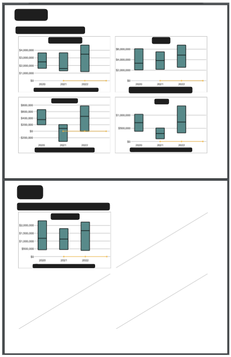
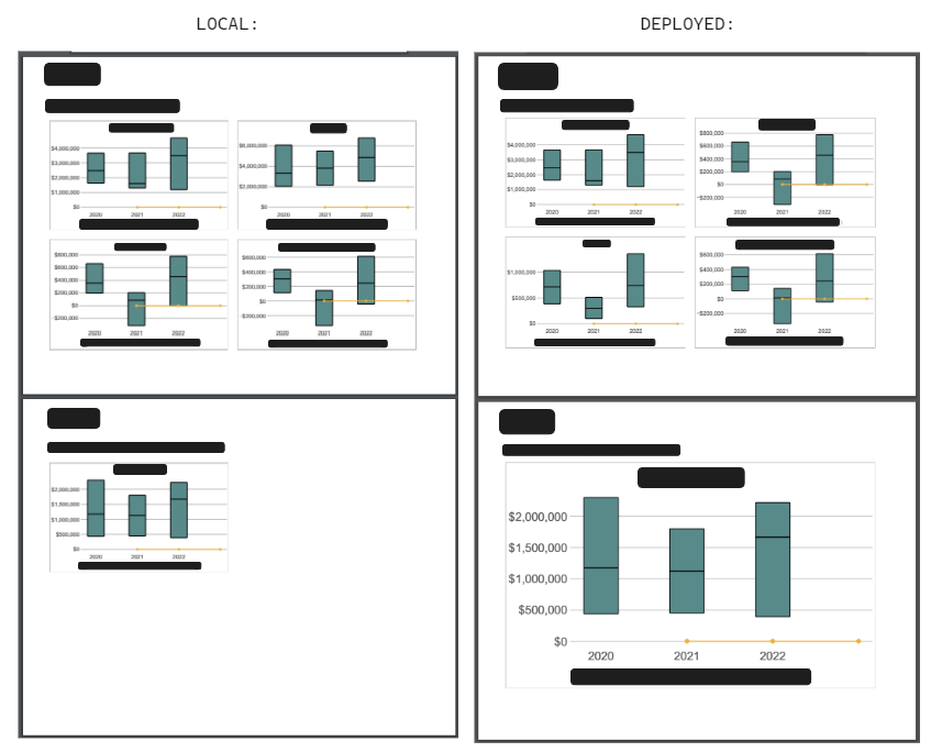
In the following image you can see what the same code outputs locally vs deployed (I have manually added black rectangles to hide sensitive information):

Details

I'm using gridExtra package (v 2.3) to display up to four charts created with ggplot2 (v 3.5.1) with some additional "blank space" between them. The blank space is generated with "empty charts". This is the code I'm using to add the charts to the PDF:

      # Proxy around chart spacing
      blank_space <- ggplot2::ggplot() +
        ggplot2::theme(panel.background = ggplot2::element_rect(fill = "white"))

      output_chart <- gridExtra::grid.arrange(
        gridExtra::arrangeGrob(
          charts[["p1"]], blank_space, charts[["p2"]],
          blank_space, blank_space, blank_space,
          charts[["p3"]], blank_space, charts[["p0"]],
          nrow = 3, ncol = 3,
          # height/width is close to fig.asp option defined in report.Rmd
          widths = c(20, 1, 20), heights = c(12, 1, 12)
        )
      )

      # print() was showing undesired string below charts
      grid::grid.draw(output_chart)

In pages where there are 2 or more charts, the behavior is the same both locally and in the deployed version.
For some reason, on the deployed version, when there is a single chart to be displayed, the chart occupies the full page, which is not expected.

What is even more strange is that adding "empty chart placeholders" with non-white borders displays the charts correctly. I attach some code below that generates these placeholder charts:

      chart_placeholder <- ggplot2::ggplot() +
        ggplot2::geom_abline(slope = 1, intercept = 0, color = "grey") +
        ggplot2::theme(panel.background = ggplot2::element_rect(fill = "white", color = "grey"))

      charts <- NULL

      charts$p0 <- chart_placeholder
      charts$p1 <- chart_placeholder
      charts$p2 <- chart_placeholder
      charts$p3 <- chart_placeholder

If the border color is "white", the chart occupies the full page in the deployed version.

Any help is appreciated! This is my sessionInfo:

R version 4.4.0 (2024-04-24 ucrt)
Platform: x86_64-w64-mingw32/x64
Running under: Windows 11 x64 (build 22631)

Matrix products: default


locale:
[1] LC_COLLATE=English_United States.utf8  LC_CTYPE=English_United States.utf8    LC_MONETARY=English_United States.utf8
[4] LC_NUMERIC=C                           LC_TIME=English_United States.utf8    

time zone: America/Buenos_Aires
tzcode source: internal

attached base packages:
[1] stats     graphics  grDevices datasets  utils     methods   base     

other attached packages:
[1] shiny_1.8.1.1   benchmark_0.0.1

loaded via a namespace (and not attached):
 [1] gtable_0.3.5          xfun_0.44             bslib_0.7.0           ggplot2_3.5.1         shinyjs_2.1.0        
 [6] vctrs_0.6.5           tools_4.4.0           generics_0.1.3        curl_5.2.1            tibble_3.2.1         
[11] fansi_1.0.6           AzureCosmosR_1.0.0    pkgconfig_2.0.3       desc_1.4.3            shinyalert_3.1.0     
[16] lifecycle_1.0.4       farver_2.1.2          compiler_4.4.0        stringr_1.5.1         tinytex_0.51         
[21] munsell_0.5.1         fontawesome_0.5.2     ggstance_0.3.7        golem_0.4.1           waiter_0.2.5         
[26] httpuv_1.6.15         shinyWidgets_0.8.6    htmltools_0.5.8.1     sass_0.4.9            yaml_2.3.8           
[31] AzureAuth_1.3.3       AzureRMR_2.4.4        later_1.3.2           pillar_1.9.0          jquerylib_0.1.4      
[36] tidyr_1.3.1           rsconnect_1.3.0       openssl_2.2.0         cachem_1.1.0          mime_0.12            
[41] tidyselect_1.2.1      digest_0.6.35         stringi_1.8.4         dplyr_1.1.4           purrr_1.0.2          
[46] labeling_0.4.3        rprojroot_2.0.4       fastmap_1.2.0         grid_4.4.0            colorspace_2.1-0     
[51] cli_3.6.2             magrittr_2.0.3        bsicons_0.1.2         pkgbuild_1.4.4        utf8_1.2.4           
[56] withr_3.0.0           scales_1.3.0          promises_1.3.0        rappdirs_0.3.3        httr_1.4.7           
[61] roxygen2_7.3.1        rmarkdown_2.27        config_0.3.2          gridExtra_2.3         askpass_1.2.0        
[66] AzureGraph_1.3.4      memoise_2.0.1         kableExtra_1.4.0      evaluate_0.23         knitr_1.47           
[71] shinycssloaders_1.0.0 viridisLite_0.4.2     rlang_1.1.3           Rcpp_1.0.12           xtable_1.8-4         
[76] glue_1.7.0            xml2_1.3.6            renv_1.0.3            pkgload_1.3.4         attempt_0.3.1        
[81] svglite_2.1.3         rstudioapi_0.16.0     jsonlite_1.8.8        R6_2.5.1              systemfonts_1.1.0    
[86] fs_1.6.4  

Hi Iván,

I just have a clarifying question since you didn't include code or output for the single-page chart or output for the version with chart placeholders.

Does that mean you're using this code?

output_chart <- gridExtra::grid.arrange(
        gridExtra::arrangeGrob(
          charts[["p1"]], blank_space, blank_space,
          blank_space, blank_space, blank_space,
          blank_space, blank_space, blank_space,
          nrow = 3, ncol = 3,
          # height/width is close to fig.asp option defined in report.Rmd
          widths = c(20, 1, 20), heights = c(12, 1, 12)
        )
      )

Hi! Thanks for your comment! I will clarify!

In the "local" version of the app, the code

      output_chart <- gridExtra::grid.arrange(
        gridExtra::arrangeGrob(
          charts[["p1"]], blank_space, charts[["p2"]],
          blank_space, blank_space, blank_space,
          charts[["p3"]], blank_space, charts[["p0"]],
          nrow = 3, ncol = 3,
          # height/width is close to fig.asp option defined in report.Rmd
          widths = c(20, 1, 20), heights = c(12, 1, 12)
        )
      )

works "as-is" regardless of the amount of elements in charts. What I mean by this is that when we have a single "valid" chart (i.e. charts[["p1"]]), the remaining charts[[...]] calls evaluate to NULL, and they are properly displayed anyways!

In other words, when there is a single chart in a page the code above is the same as:

      output_chart <- gridExtra::grid.arrange(
        gridExtra::arrangeGrob(
          charts[["p1"]], blank_space, NULL,
          blank_space, blank_space, blank_space,
          NULL, blank_space, NULL,
          nrow = 3, ncol = 3,
          # height/width is close to fig.asp option defined in report.Rmd
          widths = c(20, 1, 20), heights = c(12, 1, 12)
        )
      )

which works locally.

As an additional note, the code I showed is part of a for loop and the "number of charts" is generated before. This might provide additional context:

     charts <- NULL

      for (row in 1:nrow(measures_in_page)) {
        measure_data <- measures_in_page[row, ]

        charts[[measure_data$plot_label]] <- create_chart_function(arg1, arg2 )

      }

      # Proxy around chart spacing
      blank_space <- ggplot2::ggplot() +
        ggplot2::theme(panel.background = ggplot2::element_rect(fill = "white"))

      output_chart <- gridExtra::grid.arrange(
        gridExtra::arrangeGrob(
          charts[["p1"]], blank_space, charts[["p2"]],
          blank_space, blank_space, blank_space,
          charts[["p3"]], blank_space, charts[["p0"]],
          nrow = 3, ncol = 3,
          # height/width is close to fig.asp option defined in report.Rmd
          widths = c(20, 1, 20), heights = c(12, 1, 12)
        )
      )

      grid::grid.draw(output_chart)

Let me know if I need to further clarify!

1 Like

Thanks, this is very helpful. Instead of using blank_space, you can use NULL for the interstitial space between plots, and using NULL for the corners might be why the deployed version interprets the gridExtra() output as a single plot.

Have you tried this instead?

output_chart <- gridExtra::grid.arrange(
        gridExtra::arrangeGrob(
          charts[["p1"]], NULL, blank_space,
          NULL, NULL, NULL,
          blank_space, NULL, blank_space,
          nrow = 3, ncol = 3,
          # height/width is close to fig.asp option defined in report.Rmd
          widths = c(20, 1, 20), heights = c(12, 1, 12)
        )
      )

I have also tried that approach, but it only works with "non-empty" charts. What I mean by that is that if I make the borders "non-white" (for example, grey) they are displayed as I expect. The moment I change the borders to white, the charts "disappear" in the deployed version (which results in a full-page chart). Again, the difference is only shown in the deployed version. "Local" app works well both in the NULL scenario and the "empty chart in the corner" scenario.

I think I will create a repex app (which I will deploy to shinyapps as well) that will leverage a button that generates the report with the charts with some mock data.

1 Like

Two more questions (for now): What happens if you replace color = "grey" in chart_placeholder by alpha = 0 and set the color and fill of panel.background to white, like this?

chart_placeholder <- ggplot2::ggplot() +
        ggplot2::geom_abline(slope = 1, intercept = 0, alpha = 0) +
        ggplot2::theme(panel.background = ggplot2::element_rect(fill = "white", color = "white"))

Also, I noticed you had set the color of both geom_abline() and panel_background to grey, but I don't know what the effect would be if you only set the color of panel_background to white while keeping geom_abline() visible.

I tried setting alpha = 0, but got the same unexpected results (i.e. locally I see a chart with proper dimensions but in the deployed version, the chart occupies the full page). It seems that any instance of an "empty" chart is ignored only in the deployed version (which is what I find really weird).

On the other hand, if I make the geom_abline visible (keeping the rest "white"), I do get the same results both locally and in the deployed version:

Additional FYI: I tried changing the widths and heights arguments but the resulting chart is not sized the same dimensions (even if I use the unit function). For that reason, I'm trying to understand what would cause the report to behave differently in the deployed version.

OK, in the meantime, then, here's hack that may be good enough until the right solution comes along:

chart_placeholder <-
  ggplot2::ggplot() +
  ggplot2::geom_point(aes(1:2,1:2), size = 0, alpha = 0.1) +
  ggplot2::theme(
    panel.background = ggplot2::element_rect(fill = "white", color = "white"),
    text = element_blank(),
    line = element_blank()
  )

That's awesome! Now it looks as expected in the deployed version. Thank you very much!

I still don't understand what is going on under the hood, though. Do you know what is the difference between this last solution in comparison with the others?

1 Like

My guess is that the deployment process somehow reinterprets images by cropping them to exclude any background color that extends beyond a core area of non-background color. By supplying images that are anchored by very faint points in the corners, you prevent the cropping, whereas the human reader may not detect those six non-background color points.

I'd be curious to understand why deployment does, but in the meantime, maybe folks here who are more familiar with shiny could explain what's going on.

This topic was automatically closed 7 days after the last reply. New replies are no longer allowed.

If you have a query related to it or one of the replies, start a new topic and refer back with a link.