Staff and Project Visualization
Authors: Joseph Edgerton
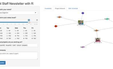
Abstract: The first tab has a dynamic table and the second tab has a dynamic network diagram, both changing after each click of the update button for each person's information.
Full Description: Two visualizations used in tandem, a table and a network diagram, will help managers and employees understand the general availability, projects, and stress each person has.
Newsletters, update emails, and calendar apps provide mostly static information that is not always visually appealing or easy to understand at a quick glance. This app attempts to take this dry, sometimes text-heavy information and make it more visual.
A table is used to present all of the information that someone may like to know about another staff member: availability, projects, stress, and comments. The network diagram appeals to people's desire for creating connections and focuses on the projects shared between staff (along with some annotations for availability).
Even though this app is small, lacking detail, and still not fully complete, it offers a view into how someone can view an organization and its members in a more visual manner.
Keywords: Project management, management tool, staff organization, network
Shiny app: https://joseph-edgerton.shinyapps.io/2020_R_IAN_larger_app/?_ga=2.134940529.1207242959.1620952287-1542996985.1618982678
Repo: 2020_R_IAN_larger_app/IAN_newsletter_shiny_app.R at main · Joseph-Edgerton/2020_R_IAN_larger_app · GitHub
RStudio Cloud: Posit Cloud
Thumbnail:
Full image:
