Hi there,
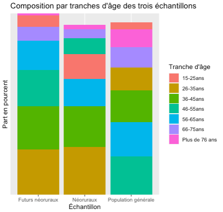
I want to create a simple stacked barplot from a dataframe which is composed as followed:
- It has 3 columns named "Tranche d'âge" (age category), "Part en pourcent" (percentage share) and "Échantillon" (sample).
- I have 3 samples of people (general population, "future neorural people" and "neorural ppl"
- For each of these groups, I have their composition according to the age category. So for instance, 3.94% of my general population is aged 15-25 years old, 6.59% of the future neorural ppl are aged 15-25, etc.
I would like to create a barplot in which the x-axis is composed of the three population groups, the y-axis is a 0 to 100 axis expressing the % rate, and each bar is color-filled according to the age category.
This is what I have achieved to get so far, using the following code:
ggplot(TAP_age, aes(x = Échantillon, y = `Part en pourcent`, fill = `Tranche d'âge`)) +
  geom_bar(stat = "identity") +
  scale_y_discrete(expand = c(0,0), breaks = seq(0,100, by = 10)) +
  ggtitle("Composition par tranches d'âge des trois échantillons")

It's getting close to what I want but I still have the following issues:
- I don't understand why all bars are not the same size (they should all represent 100% of the according group).
- I want the y-axis to have ticks (every 10% for instance) and my attempts to achieve this (using the scale_y_continuous function) have failed so far.
- I want the color blocks to be aligned, so that the reader can easily compare the three groups.
- I want to customize the colors but do not know how to do it with the syntax I used. This is less necessary but I want it to be pretty

Any help would be appreciated, thank you in advance!