I have a dataframe in R :
| x1 | x2 | x3 | |
|---|---|---|---|
| a | 40 | 38 | 45 |
| b | 5 | 5 | 3 |
| c | 3 | 6 | 2 |
| d | 2 | 1 | 1 |
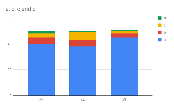
I would like to create a stacked bar plot like shown:

How should I do? Please note that its a dataframe
I have a dataframe in R :
| x1 | x2 | x3 | |
|---|---|---|---|
| a | 40 | 38 | 45 |
| b | 5 | 5 | 3 |
| c | 3 | 6 | 2 |
| d | 2 | 1 | 1 |
I would like to create a stacked bar plot like shown:

How should I do? Please note that its a dataframe
I recommend transforming your data into long format and assigning factors to a, b, c, and d:
library(tidyverse)

# Recreating the original dataset

x1 <- c(40, 5, 3, 2)
x2 <- c(38, 5, 6, 1)
x3 <- c(45, 3, 2, 1)

df <- as.data.frame(cbind(x1, x2, x3))
cat <- c("a", "b", "c", "d")
rownames(df) <- cat

# Transforming to long format and assigning factors

df_new <- cbind(df, cat)
df_long <- df_new %>%
  gather(`x1`, `x2`, `x3`,
         key = "cat",
         value = "X") %>%
  mutate(xlev = cat) %>%
  mutate(value = X) %>%
  mutate(categ = rep(c("a", "b", "c", "d"), 3)) %>%
  mutate(categ = factor(categ))  %>%
  select(xlev, value, categ)

head(df_long)
#>   xlev value categ
#> 1   x1    40     a
#> 2   x1     5     b
#> 3   x1     3     c
#> 4   x1     2     d
#> 5   x2    38     a
#> 6   x2     5     b
(Disclaimer - the above code is pretty messy; I'm not the best with gather()!)
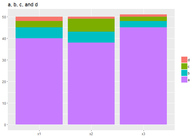
Then, use ggplot2() with geom_col() to create the stacked bar graph:
plot1 <- ggplot(data = df_long, aes(x = xlev, y = value, fill = fct_rev(categ))) +
  geom_col(aes(y = value)) +
  ggtitle("a, b, c, and d") +
  theme(legend.title = element_blank(),
        axis.title = element_blank())
plot1

Created on 2018-09-18 by the reprex package (v0.2.0).
The rest is cosmetic - you can set the fill colors using scale_fill_manual() or possibly apply a palette that's different than the default. The background color can be set with adding panel.background = element_blank() to the theme() statement.
I hope this helps!