Stacked barplot from dataset

Hi i'm trying to plot my dataset as a stacked barplot something like shown here:
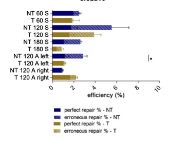
Im struggling to find any decent tutorials on this as most simply start by creating their own data from scratch and dont have large one to begin with. My dataset looks something like this:

ODN Perfect_HDR Erroneous_HDR Other_Edits
1 AS24 1.22 0.00 15.37
2 AS24 0.32 0.00 24.36
3 AS24 0.00 0.30 14.00
4 AS24 0.24 0.00 15.60
5 AS24 0.70 0.00 26.98
6 AS24 2.14 2.06 29.08

Its primarily the Perfect_HDR and Erroneous_HDR data i want stacked together. Are there any good tutorials for this out there?
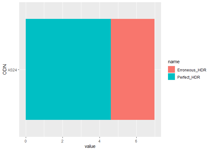
With ggplot you can plot a stacked column chart and then flip it on its side. Something like this. Adding error bars is a little more tricky since you need to calculate the top and bottom of the errorbars yourself.

library(dplyr)
library(ggplot2)
library(tidyr)

df <- tibble::tribble(
    ~ODN, ~Perfect_HDR, ~Erroneous_HDR, ~Other_Edits,
  "AS24",         1.22,              0,        15.37,
  "AS24",         0.32,              0,        24.36,
  "AS24",            0,            0.3,           14,
  "AS24",         0.24,              0,         15.6,
  "AS24",          0.7,              0,        26.98,
  "AS24",         2.14,           2.06,        29.08
  )

# usually easier to plot pivot_longer format
df <- df %>%
  pivot_longer(cols = c("Perfect_HDR", "Erroneous_HDR"))

ggplot() +
  geom_col(data = df, mapping = aes(x = ODN, y = value, fill = name), position = "stack") +
  coord_flip()


Created on 2020-11-10 by the reprex package (v0.3.0)