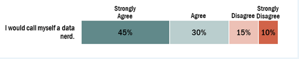
I am trying to produce a stacked bar graph in percentage similar to this:
 . However, I want to stack 3 different questions in one bar graph. Anyone with an idea. I am new to R.
Q71	Q72	Q73
5	5	5
5	5	5
4	4	5
4	5	5
4	4	5
5	3	4
5	5	5
5	5	5
2	3	3
5	5	5
1      2    1
1      3     2
ccEFFECT <- solardata$Q7_1
ccEFFECT [ccEFFECT == -99] <- NA

ccEFFECTS<- factor(ccEFFECT , labels = c("Strongly Disagree", "Disagree", "Neither Agree nor Disagree", "Agree", "Strongly Agree"))
levels(ccEFFECTS )# how many levels of a categorical variable
str(ccEFFECTS )
summary (ccEFFECTS )

length(na.omit(ccEFFECTS ))
length(ccEFFECTS )
ccEFFECTfrequency <- table (ccEFFECTS ) #frequency
ccEFFECTfrequency
#percentages
ccEFFECT_PERCENTAGE=prop.table(table(ccEFFECTS)) * 100
ccEFFECT_PERCENTAGE
Q2EFFECT<- solardata$Q7_2
Q2EFFECT [Q2EFFECT == -99] <- NA

Q2EFFECTS<- factor(Q2EFFECT , labels = c("Strongly Disagree", "Disagree", "Neither Agree nor Disagree", "Agree", "Strongly Agree"))
levels(Q2EFFECTS )# how many levels of a categorical variable
str(Q2EFFECTS )
summary (Q2EFFECTS )

length(na.omit(Q2EFFECTS ))
length(Q2EFFECTS )
Q2EFFECTfrequency <- table (Q2EFFECTS ) #frequency
Q2EFFECTfrequency
#percentages
Q2EFFECT_PERCENTAGE=prop.table(table(Q2EFFECTS)) * 100
Q2EFFECT_PERCENTAGE

barplot(Q2EFFECT_PERCENTAGE)