I am trying to replicate this kind of plot using ggplot.
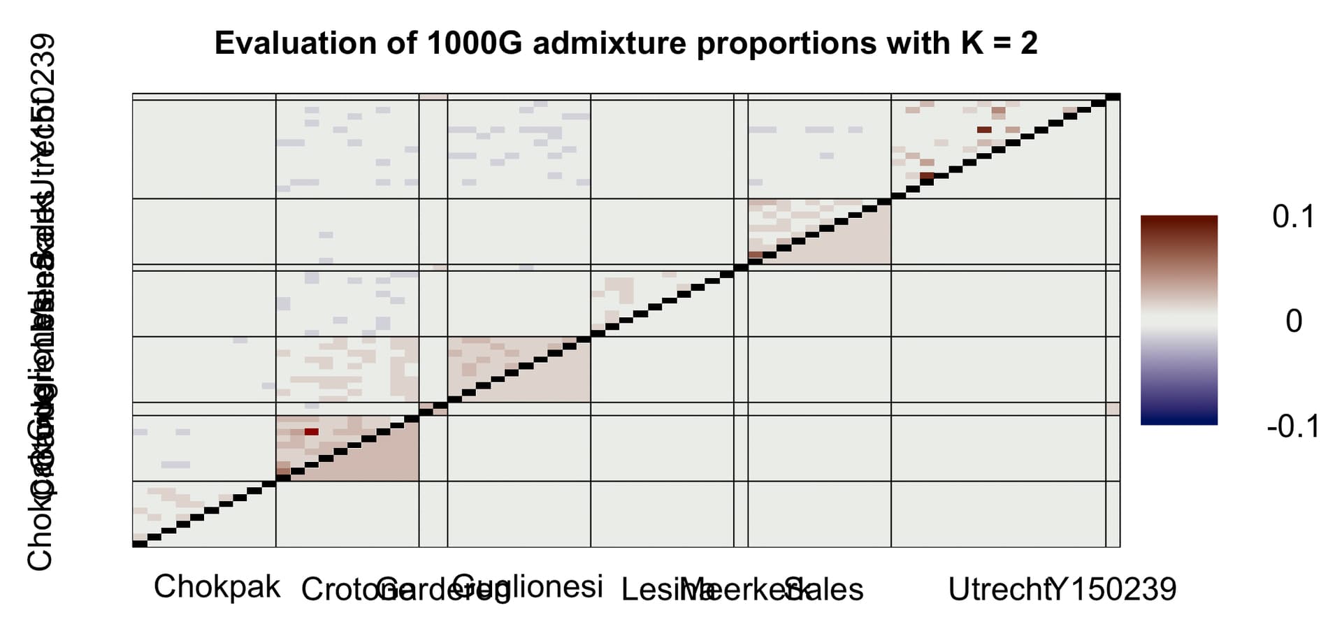
To achieve that, I need to have only the diagonal tiles as triangles. I have a single data frame with two batches of data.
df$Triangle == "Individual" (top triangle)
df$Triangle == "Population" (bottom triangle)
Here is my current code:
# Defines colour palette and breaks ~
color_palette <- c("#001260", "#EAEDE9", "#601200")
nHalf <- 4
Min <- -.1
Max <- .1
Thresh <- 0

rc1 <- colorRampPalette(colors = color_palette[1:2], space = "Lab")(nHalf)
rc2 <- colorRampPalette(colors = color_palette[2:3], space = "Lab")(nHalf)
rampcols <- c(rc1, rc2)
rampcols[c(nHalf, nHalf+1)] <- rgb(t(col2rgb(color_palette[2])), maxColorValue = 256)

rb1 <- seq(Min, Thresh, length.out = nHalf + 1)
rb2 <- seq(Thresh, Max, length.out = nHalf + 1)[-1]
rampbreaks <- c(rb1, rb2)

Ind_Plot <-
  ggplot() +
  geom_tile(data = subset(fulldf, Triangle == "Individual"), aes(Ind_1, Ind_2, fill = as.numeric(Value)), colour = "#000000")  +
  scale_x_discrete(expand = c(0, 0)) +
  scale_y_discrete(expand = c(0, 0)) +
  scale_fill_gradientn(colors = rampcols, breaks = rampbreaks, limits = c(-.1, .1)) +
  facet_grid(K ~ CHRType, scales = "free", space = "free") +
  theme(panel.background = element_rect(fill = "#ffffff"),
        panel.border = element_blank(),
        panel.grid.major = element_blank(),
        panel.grid.minor = element_blank(),
        panel.spacing = unit(1, "lines"),
        legend.position = "right",
        legend.key = element_blank(),
        legend.background = element_blank(),
        legend.margin = margin(t = 0, b = 0, r = 15, l = 15),
        legend.box = "vertical",
        legend.box.margin = margin(t = 20, b = 30, r = 0, l = 0),
        axis.title = element_blank(),
        axis.text.x = element_text(color = "#000000", size = 16, face = "bold", angle = 45, vjust = 1, hjust = 1),
        axis.text.y = element_text(color = "#000000", size = 16, face = "bold"),
        axis.ticks = element_line(color = "#000000", linewidth = .3),
        strip.text = element_text(colour = "#000000", size = 24, face = "bold", family = "Optima"),
        strip.background = element_rect(colour = "#000000", fill = "#d6d6d6", linewidth = .3),
        axis.line = element_line(colour = "#000000", linewidth = .3)) +
  guides(fill = guide_legend(title = "", title.theme = element_text(size = 16, face = "bold"),
                             label.theme = element_text(size = 15), reverse = TRUE))

Mean_Plot <-
  ggplot() +
  geom_tile(data = subset(fulldf, Triangle == "Population"), aes(Population_1, Population_2, fill = as.numeric(Value)), colour = "#000000")  +
  scale_x_discrete(limits = rev, expand = c(0, 0)) +
  scale_y_discrete(limits = rev, expand = c(0, 0)) +
  scale_fill_gradientn(colors = rampcols, breaks = rampbreaks, limits = c(-.1, .1)) +
  facet_grid(K ~ CHRType, scales = "free", space = "free") +
  theme(panel.background = element_rect(fill = "#ffffff"),
        panel.border = element_blank(),
        panel.grid.major = element_blank(),
        panel.grid.minor = element_blank(),
        panel.spacing = unit(1, "lines"),
        legend.position = "right",
        legend.key = element_blank(),
        legend.background = element_blank(),
        legend.margin = margin(t = 0, b = 0, r = 15, l = 15),
        legend.box = "vertical",
        legend.box.margin = margin(t = 20, b = 30, r = 0, l = 0),
        axis.title = element_blank(),
        axis.text.x = element_text(color = "#000000", size = 16, face = "bold", angle = 45, vjust = 1, hjust = 1),
        axis.text.y = element_text(color = "#000000", size = 16, face = "bold"),
        axis.ticks = element_line(color = "#000000", linewidth = .3),
        strip.text = element_text(colour = "#000000", size = 24, face = "bold", family = "Optima"),
        strip.background = element_rect(colour = "#000000", fill = "#d6d6d6", linewidth = .3),
        axis.line = element_line(colour = "#000000", linewidth = .3)) +
  guides(fill = guide_legend(title = "", title.theme = element_text(size = 16, face = "bold"),
                             label.theme = element_text(size = 15), reverse = TRUE))
You can download a dummy data from here.
Does anyone know if it is possible to replicate this behaviour in ggplot?
Many thanks in advance, George.