Split ploty into categories

Hi all the below code is working fine. But there is a need to split the plot into 2 as per categories in Cat column (A and B)

Can we split the graphs here

goals <- data.frame(Year = c(2017, 2018, 2019, 2017, 2018, 2019, 2017, 2018, 2019 ), 
                    Number= c(47, 35, 40, 49, 32, 31, 51, 49, 44 ),
                    Week = c(1,1,1, 2, 2, 2, 11,11,11),
                    Cat = c("A","B","A", "B", "A", "B", "A","B","A")
)
goals <- goals[order(goals[,"Week"],goals[,"Year"]),]
goals$Week <- as.factor(goals$Week)
goals$Year <- as.factor(goals$Year)

goals1 <- data.frame(Year = c(2017, 2018, 2019, 2017, 2018, 2019, 2017, 2018, 2019), 
                    Number1= c(46, 45, 45, 65, 32, 56, 32, 12, 43 ),
                    Week = c(1,1,1, 2, 2, 2, 11,11,11),
                    Cat = c("A","B","A", "B", "A", "B", "A","B","A")
)
goals1 <- goals1[order(goals1[,"Week"],goals1[,"Year"]),]
goals1$Week <- as.factor(goals1$Week)
goals1$Year <- as.factor(goals1$Year)


# df <- tibble::tibble(Date, Values)
# df2 <- tibble::tibble(Date2, Values2)

testfunction <- function(x, y, x2, y2) {
  x <- enquo(x)
  y <- enquo(y)
  x2 <- enquo(x2)
  y2 <- enquo(y2)
  plot_ly(goals, x = x, y = y, type = "scatter", mode = "lines",color = ~Year)%>% 
    add_trace(x = x2, y = y2, data = goals1,yaxis = "y2", line = list(width = 2, dash = 'dash'))%>%
    layout(yaxis2 = list(overlaying = "y", side = "right")) %>% layout(hovermode = 'compare')
}
testfunction(Week, Number, Week, Number1)
testfunction <- function(x, y, x2, y2,Cat) {
  local_goals <- goals %>% filter(Cat==!!Cat)
  local_goals1 <- goals1 %>% filter(Cat==!!Cat)
  x <- enquo(x)
  y <- enquo(y)
  x2 <- enquo(x2)
  y2 <- enquo(y2)
  plot_ly(local_goals, x = x, y = y, type = "scatter", mode = "lines",color = ~Year)%>% 
    add_trace(x = x2, y = y2, data = local_goals1 ,yaxis = "y2", line = list(width = 2, dash = 'dash'))%>%
    layout(yaxis2 = list(overlaying = "y", side = "right")) %>% layout(hovermode = 'compare')
}
testfunction(Week, Number, Week, Number1,Cat="A")
testfunction(Week, Number, Week, Number1,Cat = "B")

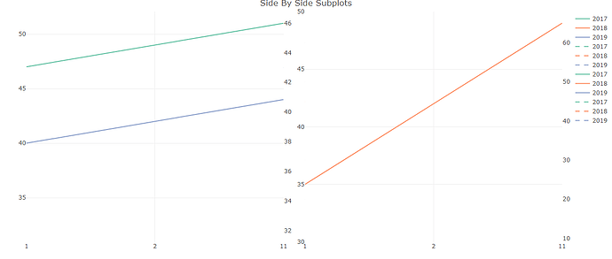
Great thanks. But I tried to put these in subplots

fig1 <- testfunction(Week, Number, Week, Number1,Cat="A")
fig2 <- testfunction(Week, Number, Week, Number1,Cat = "B")

fig <- subplot(fig1, fig2) %>% 
  layout(title = 'Side By Side Subplots')
fig

But it is creating the legends overall as shown below. Can we not create legends separately for each plot?

as far as I know a single plotly object can only have a single legend, so if you want each to have its own legend they wont be suplot but just normal plots that you show side by side.

of course the single legend can be cleaned up by showing it once rather than twice by turning it off for subplot components after the first.

umber, Week, Number1,Cat = "B")

fig <- subplot(fig1, style(fig2,showlegend=FALSE)) %>% 
  layout(title = 'Side By Side Subplots')
fig

side by side independent plots:

library(shiny)
library(plotly)
ui <- fluidPage(
  
  fluidRow(column(3,plotlyOutput("p1")),
           column(3,plotlyOutput("p2")),
           column(6,h1("side by side")))
)

server <- function(input, output, session) {
  output$p1 <- renderPlotly({
    plot_ly(economics, x = ~pop)
  })

output$p2 <- renderPlotly({
  plot_ly(economics, x = ~unemploy)
})
}

shinyApp(ui, server)

This topic was automatically closed 54 days after the last reply. New replies are no longer allowed.

If you have a query related to it or one of the replies, start a new topic and refer back with a link.