Specifying plotting settings plot(ACF(data))

I have estimated a two-intercept mixed multilevel-model using the function lme of the r-package nlme.

After that I checked for autocorrelation by visual inspection using the plot(ACF)-function.

Plotting for the first time I specified maxlag=16.

Now I have two problems: First, the maxlag parameter seems to be stuck somehow, i.e. further plots are all plotted with maxlag=16 even when maxlag is set to other values. 2. The plot is cropped at y=0.8 even if the value of lag 0 obviously is 1.

In the following I share the respective replex in hope of getting answers or inputs on how to solve these two issues.

Link to the dataset and if prefered to copy-paste to the following code-script as well:

#read.dataset:

datafclr <-read.csv("datafclr.csv", header = TRUE, sep = ",", dec = ".", fill = TRUE)

#required packages:

library("Matrix")
library("nlme")

#model-estimation:

tim2 <- lme(fixed=EERTmn ~ male + female + 
              (male:time7c)          + (female:time7c)          +                           
              (male:IERT_Cp)         + (female:IERT_Cp)         + 
              (male:IERT_Cp_Partner) + (female:IERT_Cp_Partner)-1,

            control=list(maxIter=100000), data=datafclr,                                             

            random=~male + female -1|dyade/female, correlation=corAR1(), na.action=na.omit)

summary(tim2)

#checking for autocorrelation:

plot(ACF(tim2, maxlag = 16), alpha = 0.01)

Results in the following plot:

This results in thin plot

When I change the maxlag:

plot(ACF(tim2, maxlag = 10), alpha = 0.01)

This results in the same plot however.

Many thanks in advance!

Best, Patrick

For the ACF function, the argument you're trying to use is called maxLag. The code your provided in the link is plot(ACF(tim2, maxlag = 10), alpha = 0.01). R is case sensitive, and therefore maxlag is not an argument to the ACF function and doesn't do anything to change the plot. If you switch to maxLag, the function should work as desired.

Also, for future reference, it will be easier to help you if you create a small self-contained example of your problem (known as a reproducible example or reprex) that can be pasted directly into your question, using either a small subset of your data or a built-in data set. (See here for detailed information on how to do this.) Here's an example using the built-in mtcars data frame:

library(Matrix)
library(nlme)

m1 = lme(mpg ~ wt + hp, random=~1|carb, data=mtcars)

# Default maxLag
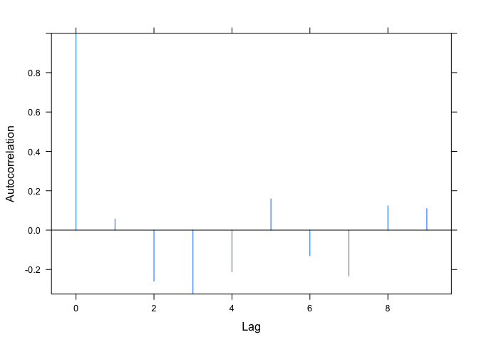
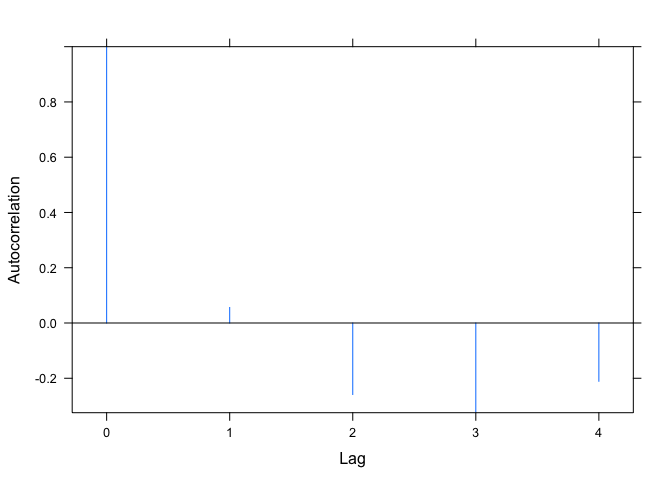
plot(ACF(m1))


# Argument is spelled incorrectly and has no effect on the plot
plot(ACF(m1, maxlag=4))


# Argument is spelled correctly
plot(ACF(m1, maxLag=4))

Created on 2018-12-09 by the reprex package (v0.2.1)

1 Like

Dear Joel

First, of all many thanks for your help that worked perfectly fine.

Sorry for the imperfect referencing I made for being new in this communitiy. Concerning your tips for better referencing: Of course I will try to heed these inputs for future referencing. In fact I already tried that by editing my post.

As you can see I added a second Issue concerning the maximum of the y-axis. May I ask if you'd knew a solution for this too?

Again, thanks a lot for your support that is very appreciated.

Kind regards, Patrick

Your second question is a bit more involved (if we continue to use ACF to get the autocorrelation function values), because the plot.ACF function hard-codes the y-axis limits to be the range of the autocorrelations. More on that in a moment. First, an easy way around this: In my example above, m1 is the model. We can directly extract the residuals with resid(m1). Then we can use the base acf function to plot their autocorrelation function. The acf function allows us to explicitly set the y-axis range, rather than hard-coding it inside the function.

acf(resid(m1), lag.max=4, ylim=c(-1,1))

If you still want to use the ACF function, we need to modify the function, plot.ACF that plots ACF objects. To see the function that plots ACF objects, run getAnywhere(plot.ACF) and the code for this function will appear in the console (see the explanatory note at the bottom for some background on why we're looking for the plot.ACF function when we actually called the plot function in our code).

Note that the second line of the function body is ylim <- range(object$ACF). A way around this is to modify the function to accept a ylim argument. Note in the code below that I've created a new function called my_plot.ACF. I've commented out the ylim line in the original function and added a new function argument ylim=c(-1.0, 1.0), so it defaults to full range, but can be changed, if desired, when calling the function.

my_plot.ACF = function (x, alpha = 0, xlab = "Lag", ylab = "Autocorrelation", 
          grid = FALSE, ylim=c(-1.0,1.0), ...) {
  object <- x
  #ylim <- range(object$ACF)
  if (alpha) {
    assign("stdv", qnorm(1 - alpha/2)/sqrt(attr(object, "n.used")))
    stMax <- max(stdv)
    ylim <- c(min(c(-stMax, ylim[1])), max(c(ylim[2], stMax)))
  }
  assign("alpha", as.logical(alpha))
  assign("grid", grid)
  xyplot(ACF ~ lag, object, ylim = ylim, panel = function(x, 
                                                          y, ...) {
    x <- as.numeric(x)
    y <- as.numeric(y)
    if (grid) 
      panel.grid()
    panel.xyplot(x, y, type = "h")
    panel.abline(0, 0)
    if (alpha) {
      llines(x, stdv, lty = 2)
      llines(x, -stdv, lty = 2)
    }
  }, xlab = xlab, ylab = ylab, ...)
}

Now we run the function. We also need to load the lattice package, since plot.ACF (and therefore our new function) use the xyplot function from lattice.

library(lattice)
my_plot.ACF(ACF(m1, maxLag=4))

Explanatory note in case you're not already familiar with generic functions, methods, and method dispatch: plot is a "generic" function. When you run the plot function, what it does depends on the type of object you pass to it. If you type plot(mtcars) you'll get a scatterplot matrix. If you type plot(lm(mpg ~ hp, data=mtcars)) you'll get several diagnostic plots for a linear regression model. If you type plot(ACF(m1)) you'll get a plot of an autocorrelation function. And so on.

plot does different things with each of these objects because each of them has a different class, specifically, "data.frame", "lm", and "ACF", respectively (for example, run class(ACF(m1)). plot itself just "dispatches" the appropriate "plot method" (the actual function that does the plotting) for each of these objects. To see what these methods are, run methods(plot). They'll all be called plot.zzz where zzz is the class of the object.. For example, note that one of the functions is plot.ACF. You can see the code for this function by typing getAnywhere(plot.ACF).
1 Like

Dear Joel

Again many thanks for your great support. Since I'm taking my master exams this week I will come back to your inputs next week.

Until then, thanks again.

Best,
Patrick

This topic was automatically closed 7 days after the last reply. New replies are no longer allowed.