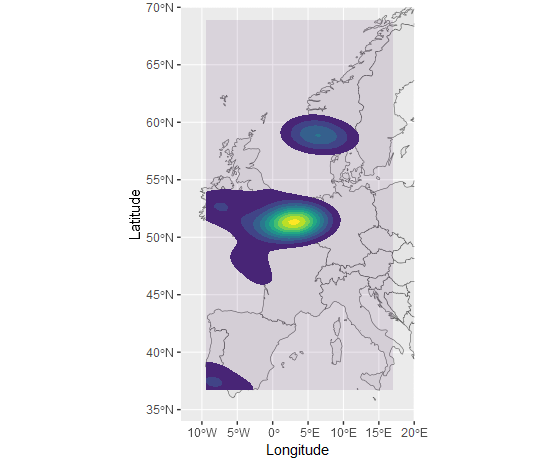
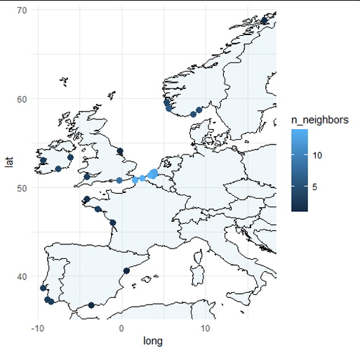
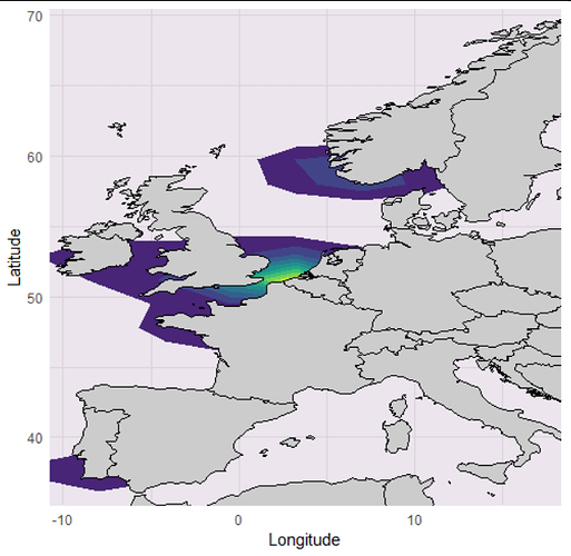
I have a data frame that consists of the columns Species, Latitude, and Longitude, with 1200 rows. I wish to map this data onto a map of Europe, for a publishable ecology paper. However, since there are so many plot points, I need to plot the data as shaded areas or solid lines of distribution, instead of individual points.
The outcome needs to be presentable enough for publication.
Any help would be extremely appreciated!
Here is a reprex of the data:
tibble::tribble(
           ~Species, ~Latitude, ~Longitude,
  "Patella vulgata",  6744266L, -522088.41,
  "Patella vulgata",  6439351L, -706878.77,
  "Patella vulgata",  6679876L,  156960.48,
  "Patella vulgata",  7369633L, -159186.87,
  "Patella vulgata",  8056069L,  -567729.4,
  "Patella vulgata",  8575482L,  -91281.98,
  "Patella vulgata",  8184711L, -374033.49,
  "Patella vulgata",  6533322L, -390731.41,
  "Patella vulgata",  6845456L, -474221.03,
  "Patella vulgata",  7198616L,   -21150.7,
  "Patella vulgata",  6559615L, -163639.65,
  "Patella vulgata",  7276935L, -399636.97,
  "Patella vulgata",  8437684L, -145828.53,
  "Patella vulgata",  7330875L, -148054.92,
  "Patella vulgata",  8388614L, -149168.12,
  "Patella vulgata",  7367691L, -159186.87,
  "Patella vulgata",  7578349L, -541012.73,
  "Patella vulgata",  7408585L, -170318.82,
  "Patella vulgata",  8228090L, -279411.92,
  "Patella vulgata",  7020079L, -468655.06
  )


