Hi,
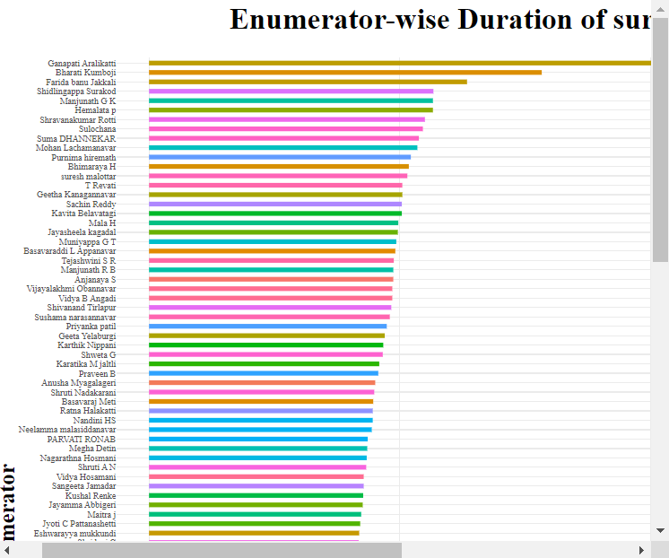
I have built a shiny app. Our team is monitoring a group of 110 people who are conducting field surveys. The bar graph in the attached image below shows the average duration of surveys taken by the enumerators. But the axis labels are quite congested. I want the labels to be adequately spaced. How can I do it? The code is shown below:
output$plot7<-renderPlotly({
    req(en_wise_duration())
    en_wise_dur<-ggplot(en_wise_duration(),aes(reorder(en_name,duration_en),duration_en))+
      geom_bar(mapping = aes(fill=en_name),width = 0.5,stat = "identity",show.legend = F)+
      theme_minimal()+
      labs(title = "Enumerator-wise Duration of surveys",
           x="Name of Enumerator",
           y="Average Duration (in minutes)")+
      coord_flip()+
      theme(plot.title = element_text(face="bold",hjust=0.5,size=20),
            text = element_text(family="a"),
            axis.title = element_text(face = "bold",size=15),
            axis.text = element_text(size = 6))
