soccer Visual Analysis Tool
Authors: Abhijit Bharali
Abstract: Soccer Visual Analysis Tool (soccerVAT) automatically generates data-oriented reports of football (soccer) matches, detailing the events of a match with the help of six different visual data segments.
Details that a coaching team would generally want before diving into nuanced video analysis, such as teamsheets & starting formations, shot data & expected goals, pass networks, progressive pass maps & team action zones, are all incorporated in soccerVAT.
Free event data from StatsBomb Open Data have been used.
Full Description: soccer Visual Analysis Tool (soccerVAT)
This application automatically generates data-oriented reports of football (soccer) matches, detailing the events of the selected match with the help of six different visual data segments, which are as follows:
- Teamsheets,
- Shots,
- Passmap - home team,
- Passmap - away team,
- Progressive passes,
- Action density.
Details that a coaching team at a professional football club generally wants such as teamsheets & starting formations, shot data & expected goals, pass networks, progressive pass maps & team action heatmaps, before diving into nuanced video analysis, are all incorporated in soccerVAT.
I have used event data from StatsBomb Open Data to build the app. Although soccerVAT uses data from the 2018 Men's World Cup, its codebase can be extended and tweaked to suit other datasets (from other providers), tournaments (other than those included in StatsBomb Open Data), etc.
Use case
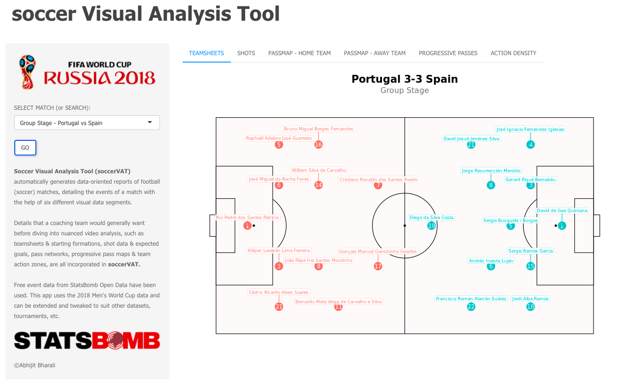
soccerVAT analyses the famous Portugal 3-3 Spain game from the 2018 FIFA World Cup (remember that Ronaldo freekick?!)
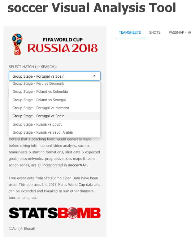
We select the match to detail and analyse from the dropdown menu.
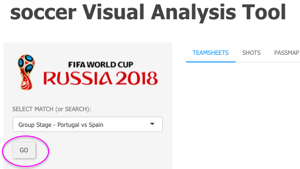
Once we have selected the game (Portugal vs Spain), clicking the "GO" button takes us to all the plots and graphs on the right panel.
The first tab shows us the tactical setups of both teams with information about the starting lineup and the formations. These seem to be basic information but having myself worked in an elite level professional club environment with experienced and successful European and South American coaching setups, I understand the value and emphasis coaches put on teamsheet information which is always the starting point for match analysis.
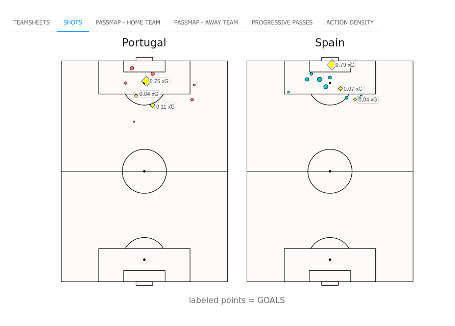
The next tab shows the shots taken in the match (excluding own goals) mapped on a pitch, segmented by teams, with labels attached to the shots that ended up being goals. The size of each dot signifies the expected goals value of the shot it represents. Bigger the dot size, higher the goal probability of that shot.
In general, expected goals models are heavily reliant on shot location hence the closer a shot is taken from goal, the higher its chances of becoming a goal. The shots visualisation in soccerVAT is not information heavy but has enough to hand the coaches a glimpse of a team's shot taking preferences.
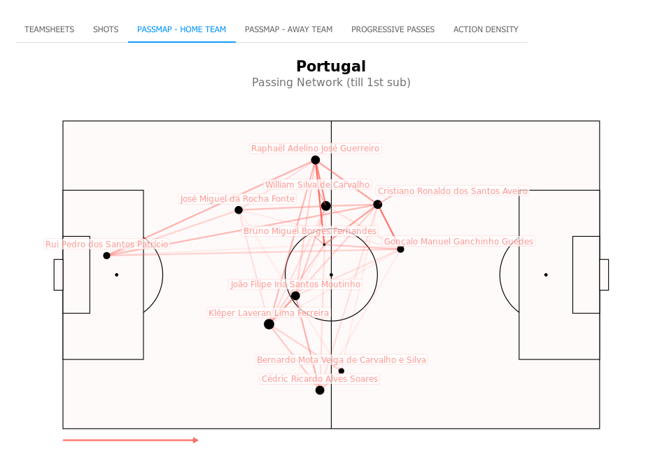
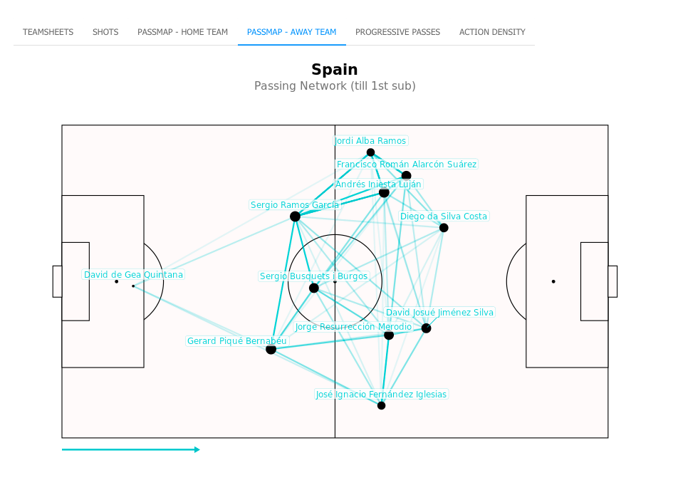
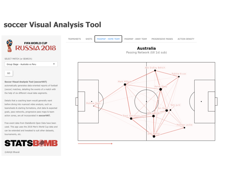
The next two tabs demonstrate the passing networks of the teams in view. A pass network provides vital information about team-level passing structures and central players in a team's playing system. Although not a perfect illustration because pass networks take information about average positions of the players and, as a result, don't fully do justice to football (soccer) as a fluid sport with constantly moving parts, nonetheless they provide a good starting point for further analysis.
The connecting lines and the dots act as networks of how a team played with the ball. The size of the lines indicates the level of chemistry (or interaction or passing frequency) between two players (example, Sergio Ramos to Gerard Pique for Spain), while the size of the dots indicate the level of involvement of a particular player (example, Bruno Fernandes' low involvement in Portugal's midfield can be seen from his little dot in the middle of Portugal's shape, indicating Spain's possession dominance, as expected).
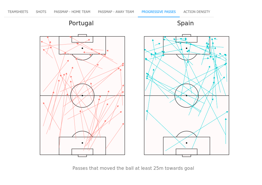
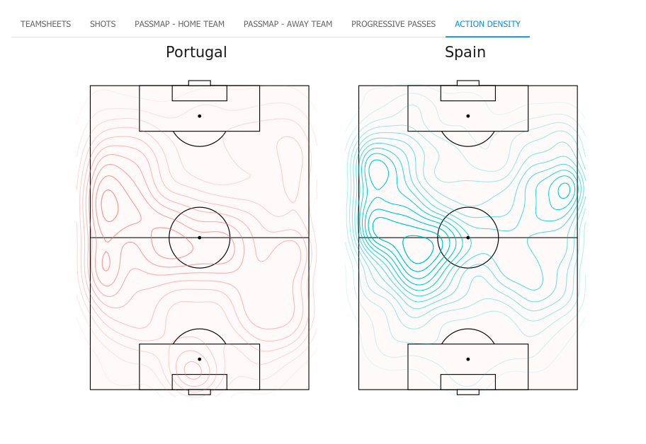
Progressive passes and team action density are showcased in the next two tabs, highlighting how and from which areas teams progressed the ball towards goal by and the zones of threat (or joy!) for a particular team. These maps are particularly relevant for coaches as they paint a top view of a match, helping them visualise in their head and form important biases before heading to video viewing.
Progressive passes are particularly important as the main objective of a defending team is to stop the supply of passes that end up in dangerous possessions. For example, in Portugal's progessive passes map, we can see a lot of those passes coming out of Portugal's own penalty box, suggesting the presence of an exit ball for their goalkeeper under pressure. To that end, coaches can prepare how to turn such a situation to their advantage and accordingly formulate a game plan.
That was a case study of analysing a particular match using soccerVAT and a dive into its various functionalities. soccerVAT is my submission to Shiny Contest 2021.
For further interaction regarding the code and the application's implementation, feel free to reach out to @abhibharali on Twitter.
Keywords: sports, soccer, football, data visualisation, ggplot, statsbombr, analysis
Shiny app: https://abhijitbharali.shinyapps.io/matchreportgenerator/
Repo: soccerVAT/app.R at main · abhjtbhrli/soccerVAT · GitHub
RStudio Cloud: Posit Cloud
Thumbnail:
Full image: