Hello @Kevser_Cifci and welcome to RStudio Community 


I spent a bit of time looking at your question and I must say it is fairly interesting. Before I share my code; however, I must say that your code to compute reinforcement is quite different from the formula you provided. Maybe I am missing something? In my code, I try to replicate the formula instead, but you can always change that part if you want.
I rewrote the entire code so I could understand the process a bit more. Also, even after thinking a lot about it, I still do not understand the role of K. My code below does not incorporate it, but I think it still captures the essence of your question. I may be wrong, please let me know what you think when you see and peruse the code.
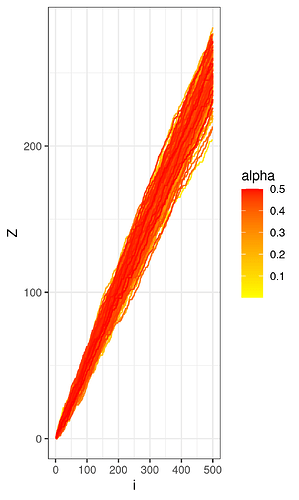
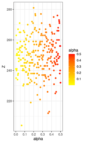
Regarding the visualizations, I made 4 of them. First, I choose a fixed value of c, then I run the process for increasing values of alpha. I do it 500 times then I plot the Zn lines by color-coding them. Yellow means a low alpha and red means a high alpha. I was expecting yellow lines to be at the bottom (resp. at the top) and red lines to be at the top (resp. at the bottom), but there is no pattern at all. This means that increasing the positive parameter alpha does not necessarily cause ants to choose right more (or less) often. Hence, the process is indeed a random walk.
As a way to show this better, I also take "a slice" of the visualization at n = 500 (represented by i in the plot above) and show it in a scatterplot. Again, there is no clear pattern.
Finally, I made two similar plots by choosing a fixed value of alpha as well as increasing values of c. The results are similar in that no pattern is apparent.
I would like to end by reiterating that the formula I used to calculate the probability is different from what you use in your code. My formula is an implementation of the formula you provided in your question.
Here is the full code:
# Load packages ----

library(dplyr)
library(ggplot2)
library(purrr)
library(stringr)
library(tibble)
library(tidyr)


# Define simulation function ----

run_simulation <- function(N, alpha, c){
  Zn <- 0
  Zi <- c()

  for(n in seq_len(N)){
    p <- (c + Zn)^alpha / ((c + Zn)^alpha + (c + n - Zn)^alpha)
    take_right <- rbinom(n = 1, size = 1, prob = p)
    Zi[n] <- take_right
    Zn <- Zn + take_right
  }

  cumsum(Zi)
}

# SIMULATE OVER ALPHA ------------------------------------

## Simulate over the alpha parameter for a fixed value of c (c = 100)

alpha_values <- seq(from = 0.001, to = 0.5, length.out = 250)

alpha_sims <- imap_dfc(
  alpha_values,
  function(alpha, i) run_simulation(N = 500, alpha = alpha, c = 100) %>% enframe(name = NULL)
) %>%
  mutate(i = seq_len(nrow(.))) %>%
  rename_with(.fn = ~ c(paste0("alpha_", alpha_values), "i")) %>%
  pivot_longer(cols = -i, names_to = "alpha", values_to = "Z") %>%
  mutate(alpha = str_remove(string = alpha, pattern = "alpha_") %>% as.numeric()) %>%
  arrange(alpha, i) %>%
  select(alpha, i, Z)


## Visualize simulations

### Line charts of the evolution of Z (Z1 -> Z500) for all values of alpha

ggplot(data = alpha_sims) +
  geom_line(mapping = aes(x = i, y = Z, group = alpha, color = alpha)) +
  scale_color_gradient(low = "yellow", high = "red") +
  theme_bw()

ggsave(filename = here::here("visualizations/kevser_cifci_1.png"))

### Comparison of Z500 for all values of alpha

alpha_sims %>%
  filter(i == 500) %>%
  ggplot(mapping = aes(x = alpha, y = Z, color = alpha)) +
  geom_point() +
  scale_color_gradient(low = "yellow", high = "red") +
  theme_bw()

ggsave(filename = here::here("visualizations/kevser_cifci_2.png"))

# SIMULATE OVER C ------------------------------------

## Simulate over the C parameter for a fixed value of alpha (alpha = 0.005)

c_values <- seq(from = 1, to = 500, length.out = 250)

c_sims <- imap_dfc(
  c_values,
  function(c, i) run_simulation(N = 500, alpha = 0.005, c = c) %>% enframe(name = NULL)
) %>%
  mutate(i = seq_len(nrow(.))) %>%
  rename_with(.fn = ~ c(paste0("c_", c_values), "i")) %>%
  pivot_longer(cols = -i, names_to = "c", values_to = "Z") %>%
  mutate(c = str_remove(string = c, pattern = "c_") %>% as.numeric()) %>%
  arrange(c, i) %>%
  select(c, i, Z)


## Visualize simulations

### Line charts of the evolution of Z (Z1 -> Z500) for all values of c

ggplot(data = c_sims) +
  geom_line(mapping = aes(x = i, y = Z, group = c, color = c)) +
  scale_color_gradient(low = "yellow", high = "red") +
  theme_bw()

ggsave(filename = here::here("visualizations/kevser_cifci_3.png"))

### Comparison of Z500 for all values of c

c_sims %>%
  filter(i == 500) %>%
  ggplot(mapping = aes(x = c, y = Z, color = c)) +
  geom_point() +
  scale_color_gradient(low = "yellow", high = "red") +
  theme_bw()

ggsave(filename = here::here("visualizations/kevser_cifci_4.png"))


