Simple question about seeing plots.

Hi all,

I'm reading in a very small .csv file to get some simple trajectory plots. There look are

t1	t2	t3	t4
5	8	12	15
7	10	14	18
6	9	13	16
8	11	15	20
10	13	17	22

The app I'm writing so far reads in the data and I simply want ggplot to give me a plot of the average value across these individuals with an overlay of the individual lines, in another color. The code chunk is

 observeEvent(input$run_button, {
    print("Button Clicked")
    req(input$outcome_variable, input$predictor_variable, input$time_indicator, input$data_file)
    
    df <- read.csv(input$data_file$datapath)
    outcome_var <- input$outcome_variable
    
    # Simplified example of creating a line plot for average outcome over time
    average_plot <- ggplot(df, aes(x = 1:ncol(df), y = df[, outcome_var])) +
      geom_line() +
      labs(title = "Average Outcome Over Time", x = "Time", y = "Outcome")
    
    # Simplified example of creating line plots for individual observations over time
    individual_plot <- ggplot(df, aes(x = 1:ncol(df), y = df[, outcome_var])) +
      geom_line(aes(group = 1:nrow(df), color = as.factor(1:nrow(df)))) +
      labs(title = "Individual Observations Over Time", x = "Time", y = "Outcome") +
      theme_minimal()
    
    # Render the plots without using print
    output$average_plot <- renderPlot({
      average_plot
    })
    output$individual_plot <- renderPlot({
      individual_plot
    })
  })
}
# Run the Shiny app
shinyApp(ui, server)

When a click the button called "Create plots", nothing shows up, but there is no error either. The

print("Button Clicked")

line was just so I could tell if it saw the Create plots button. It did. Your suggestions are welcomed.

Thank you

D
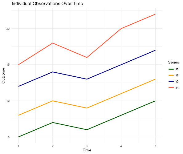
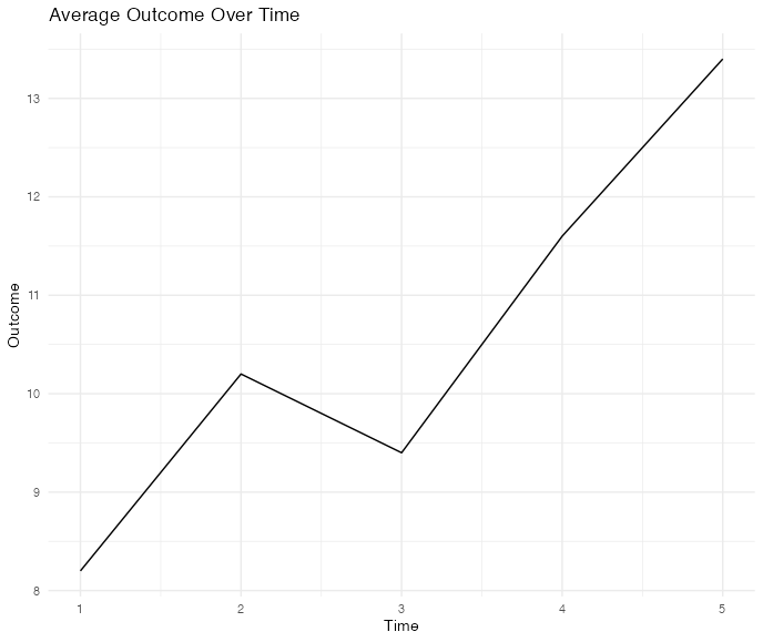
There are slicker ways to do this but I prefer to be more step-by-step

library(ggplot2)
#> Warning: package 'ggplot2' was built under R version 4.3.1
d <- data.frame(
  t1 = c(5, 7, 6, 8, 10),
  t2 = c(8, 10, 9, 11, 13),
  t3 = c(12, 14, 13, 15, 17),
  t4 = c(15, 18, 16, 20, 22)
)

d$per <- 1:dim(d)[1]
d$avg <- rowMeans(d)
individual_plot <- ggplot(d,aes(per)) +
  geom_line(aes(y = t1, color = "t1"), linewidth = 1) +
  geom_line(aes(y = t2, color = "t2"), linewidth = 1) +
  geom_line(aes(y = t3, color = "t3"), linewidth = 1) +
  geom_line(aes(y = t4, color = "t4"), linewidth = 1) +
  scale_color_manual(name = "Series",
    values = c("t1" = "darkgreen", "t2" = "orange", "t3" = "darkblue", "t4" = "tomato")) +
  labs(title = "Individual Observations Over Time", x = "Time", y = "Outcome") +
  theme_minimal()
individual_plot

d$per <- 1:dim(d)[1]
d$avg <- rowMeans(d)

average_plot <- ggplot(d,aes(per,avg)) +
  geom_line() +
  labs(title = "Average Outcome Over Time", x = "Time", y = "Outcome") +
  theme_minimal()
average_plot 

Created on 2023-10-29 with reprex v2.0.2

Thank you. The problem is not so much creating the plot as it is getting Shiny to produce it when I press "Click button" that I created in a tab panel. The tab panel works fine and it creates the UI as I want it. I'm quite a newbie when it comes to Shiny and so, I'm not sure how to get the buttons in the UI to create the output I want.
The relevant code is here and it would be great to place the plotting code that you provided in here somewhere, I just don't know where. I' assuming that it is after the comment # Run model and generate plots.

server <- function(input, output, session) {
  
  observeEvent(input$data_file, {
    req(input$data_file)
    df <- read.csv(input$data_file$datapath)
    updateSelectInput(session, "outcome_variable", choices = colnames(df))
    updateSelectInput(session, "predictor_variable", choices = colnames(df))
  })
  
  # About tab content
  output$about <- renderText({
    "blah blah blah."
    
  })
  
  output$acknowledgements <- renderText({
    "blah blah blah"
  })
  
  # Render data table
  output$data_table <- DT::renderDataTable({
    req(input$data_file)
    df <- read.csv(input$data_file$datapath)
    DT::datatable(df, options = list(pageLength = 10))
  })
  
  
  # Run model and generate plots
  observeEvent(input$run_button, {
    print("Button Clicked")
    req(input$outcome_variable, input$predictor_variable, input$time_indicator, input$data_file)
    
    df <- read.csv(input$data_file$datapath)
    outcome_var <- input$outcome_variable
    
    # Simplified example of creating a line plot for average outcome over time
    average_plot <- ggplot(df, aes(x = 1:ncol(df), y = df[, outcome_var])) +
      geom_line() +
      labs(title = "Average Outcome Over Time", x = "Time", y = "Outcome")
    
    # Simplified example of creating line plots for individual observations over time
    individual_plot <- ggplot(df, aes(x = 1:ncol(df), y = df[, outcome_var])) +
      geom_line(aes(group = 1:nrow(df), color = as.factor(1:nrow(df)))) +
      labs(title = "Individual Observations Over Time", x = "Time", y = "Outcome") +
      theme_minimal()
    
    # Render the plots without using print
    output$average_plot <- renderPlot({
      average_plot
    })
    output$individual_plot <- renderPlot({
      individual_plot
    })
  })
}
# Run the Shiny app
shinyApp(ui, server)

How are you learning shiny ?
I recommend studying from https://mastering-shiny.org/

You are not using reactivity that is at the heart of shiny-ness.
i.e. average_plot should be a reactive and not a vanilla object.

Hi @dkaplan

I put some other things you might consider in a reprex below. Mainly, you might consider making your data a reactive object so it just updates and invalidates dependencies whenever a new file is uploaded. You can still set your plotting event to be under the control of some "make plot" button, especially if the data is very large, but if it's small enough, it might be sufficient to just have it invalidate whenever the "outcome_var" input is changed.

Also, I think you might run into trouble the way you are using aes() as it uses nse. A better way might be to reference your data with the special .data pronoun. More on that here.

# Consider using fileInput or reactiveFileReader
# to create a reactive data object. So you would reference later
# as if it were a function: input_datapath() and it will be invalidated
# whenever it changes, i.e. a new file is uploaded. Also, consider
# making your data "tidy".
input_datapath <- tibble::tibble(
  t1 = c(5, 7, 6, 8, 10),
  t2 = c(8, 10, 9, 11, 13),
  t3 = c(12, 14, 13, 15, 17),
  t4 = c(15, 18, 16, 20, 22)
) |>
  tibble::rownames_to_column(var = "index") |>
  dplyr::mutate(dplyr::across(index, \(x) as.integer(x))) |>
  tidyr::pivot_longer(!c(index), names_to = "id")

dplyr::glimpse(input_datapath)
#> Rows: 20
#> Columns: 3
#> $ index <int> 1, 1, 1, 1, 2, 2, 2, 2, 3, 3, 3, 3, 4, 4, 4, 4, 5, 5, 5, 5
#> $ id    <chr> "t1", "t2", "t3", "t4", "t1", "t2", "t3", "t4", "t1", "t2", "t3"…
#> $ value <dbl> 5, 8, 12, 15, 7, 10, 14, 18, 6, 9, 13, 16, 8, 11, 15, 20, 10, 13…

input_var <- "value"

# Set your aesthetics using the .data pronoun; `aes()` uses NSE and the
# way you did it might cause some trouble for you.
ggplot2::ggplot(
  data = input_datapath,
  ggplot2::aes(x = index, y = .data[[input_var]])
) +
  ggplot2::geom_line(ggplot2::aes(color = id)) +
  ggplot2::geom_line(
    data = dplyr::summarise(
      input_datapath,
      avg = mean(.data[[input_var]]),
      .by = index
    ),
    ggplot2::aes(y = avg),
    linetype = "dashed"
  )

Created on 2023-11-06 with reprex v2.0.2.9000

Here's what that might look like in a basic shiny app:

shiny::shinyApp(
  ui = shiny::fluidPage(
    shiny::selectInput("input_var", "Variable", c("value")),
    shiny::plotOutput("plot")
  ),
  server = function(input, output, session) {
    input_datapath <- tibble::tibble(
      t1 = c(5, 7, 6, 8, 10),
      t2 = c(8, 10, 9, 11, 13),
      t3 = c(12, 14, 13, 15, 17),
      t4 = c(15, 18, 16, 20, 22)
    ) |>
      tibble::rownames_to_column(var = "index") |>
      dplyr::mutate(dplyr::across(index, \(x) as.integer(x))) |>
      tidyr::pivot_longer(!c(index), names_to = "id")

    output$plot <- shiny::renderPlot({
      shiny::req(input$input_var)
      ggplot2::ggplot(
        data = input_datapath,
        ggplot2::aes(x = index, y = .data[[input$input_var]])
      ) +
        ggplot2::geom_line(ggplot2::aes(color = id)) +
        ggplot2::geom_line(
          data = dplyr::summarise(
            input_datapath,
            avg = mean(.data[[input$input_var]]),
            .by = index
          ),
          ggplot2::aes(y = avg),
          linetype = "dashed"
        )
    })
  }
)

Hope it helps a little getting to where you want to be in you app!

This topic was automatically closed 54 days after the last reply. New replies are no longer allowed.

If you have a query related to it or one of the replies, start a new topic and refer back with a link.