simple bar plot with side by side bars - Female vs Male

Hello,

I'm new to R(2 weeks) and am having problems plotting a very simple bar plot to show gender differences in response to the same question.

Here's my code for a plot of Female responses:

brfss2013%>%

  • filter(sex == "Female")%>%
  • ggplot(brfss2013, mapping = aes(x = genhlth)) + geom_bar()

To Male responses:
brfss2013%>%

  • filter(sex == "Male")%>%
  • ggplot(brfss2013, mapping = aes(x = genhlth)) + geom_bar()

Some info on the data:

levels(factor(brfss2013$sex))
[1] "Male" "Female"

levels(factor(brfss2013$genhlth))
[1] "Excellent" "Very good" "Good" "Fair" "Poor"

And the code(which doesn't work):

ggplot(brfss2013, mapping = aes(x= genhlth, ) + geom_bar(stat = "identity", aes(fill= c("violetred4", "wheat3")), position = "dodge", width = 40)

Some additional information is there are more female then males respondants, so it is necessary to adjust for frequencies (but I guess R does it automatically).

count(brfss2013, sex == "Male")

A tibble: 3 x 2

sex == "Male" n

1 FALSE 290455
2 TRUE 201313

Can you please share a small part of the data set in a copy-paste friendly format?

In case you don't know how to do it, there are many options, which include:

  1. If you have stored the data set in some R object, dput function is very handy.

  2. In case the data set is in a spreadsheet, check out the datapasta package. Take a look at this link.

thanks for the reply.

I guess the data can be downloades here:

download.file("http://stat.duke.edu/~cr173/Sta102_Sp16/Proj/brfss2013.RData",  destfile="brfss2013.RData")

once it has downloaded, it can be loaded into R using

load("brfss2013.RData")

Andres,

I tried to use datapasta, but couldn't copy it here. But used the count command for better visualization:

count(brfss2013, sex=="Female", genhlth == "Excellent")

A tibble: 9 x 3

sex == "Female" genhlth == "Excellent" n

1 FALSE FALSE 164728
2 FALSE TRUE 35741
3 FALSE NA 844
4 TRUE FALSE 239579
5 TRUE TRUE 49740
6 TRUE NA 1136
7 NA FALSE 1
8 NA TRUE 1
9 NA NA 5

count(brfss2013, sex=="Male", genhlth == "Excellent")

A tibble: 9 x 3

sex == "Male" genhlth == "Excellent" n

1 FALSE FALSE 239579
2 FALSE TRUE 49740
3 FALSE NA 1136
4 TRUE FALSE 164728
5 TRUE TRUE 35741
6 TRUE NA 844
7 NA FALSE 1
8 NA TRUE 1
9 NA NA 5

I don't know why the code doesn't work, I think it should be simple, looked it up in several websites...

Since you are a beginner I'm going to help you build a reproducible example, is this what you are trying to do?

library(ggplot2)

sample_df <- data.frame(
   row.names = c("459594","390876","373502","102364",
                 "439107","74445","349951","173449","45159","176453","124446",
                 "72153","104390","151562","277541","75242","82618",
                 "283893","210180","135615","184308","425596","208333",
                 "155764","453314","581","95917","208835","436638","88670",
                 "386298","14239","286144","264786","122924","278140","67730",
                 "95262","54842","117777","224631","47364","147895",
                 "199988","287171","231582","242498","145111","117639","179785"),
     genhlth = as.factor(c("Very good","Good",
                           "Good",NA,"Very good","Good","Good","Fair",
                           "Very good","Excellent","Excellent","Fair","Very good",
                           "Good","Excellent","Fair","Very good","Good",
                           "Very good","Fair","Very good","Very good","Good",
                           "Good","Excellent","Poor","Very good","Very good",
                           "Excellent","Fair","Good","Very good",
                           "Very good","Fair","Excellent","Very good","Excellent",
                           "Good","Very good","Good","Excellent","Very good",
                           "Good","Very good","Good","Very good","Good",
                           "Fair","Very good","Fair")),
         sex = as.factor(c("Male","Female",
                           "Male","Female","Female","Male","Female","Male",
                           "Female","Female","Female","Female","Male","Female",
                           "Female","Female","Female","Female","Female",
                           "Female","Female","Female","Male","Male","Male",
                           "Female","Male","Male","Female","Female","Male",
                           "Female","Male","Female","Male","Female",
                           "Female","Female","Male","Male","Male","Male","Female",
                           "Female","Female","Female","Female","Male",
                           "Female","Female"))
)

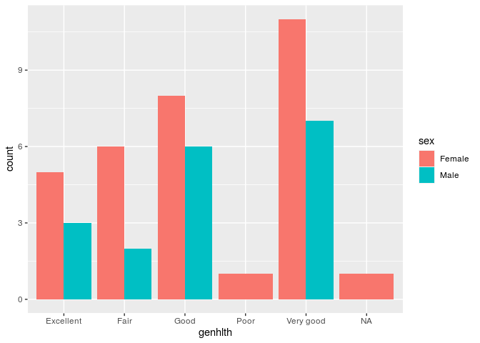
ggplot(sample_df, mapping = aes(x = genhlth)) +
         geom_bar(aes(fill = sex),
                  position = "dodge")

Created on 2020-03-05 by the reprex package (v0.3.0)

If this doesn't solve your problem, please try provide a proper REPRoducible EXample (reprex) illustrating your issue.

cheers to andresrcs for getting you off to a great start.
Consider also, that you can aggregate your data in a distinct step, and draw the plot from that aggregation. This has an advantage that when you want to share sample data to get assistance on the plot, you will find you only need to pass 100s of records rather than 10,000s and therefore sharing your actual example (but aggregated data) is feasible using dput() and copy and paste.

aggregated_df <- sample_df %>%  
  group_by(genhlth,sex) %>%
  count()

ggplot(aggregated_df, mapping = aes(x = genhlth,weight=n)) +
  geom_bar(aes(fill = sex),
           position = "dodge")

note the addition of ,weight=n in the aes call, that uses the result of aggregating with count in the new dataframe

thank you, both, for your help....

This is indeed what I wanted to do, but now I have to adjust for frequencies (since there are more female than male respondents)...

This topic was automatically closed 21 days after the last reply. New replies are no longer allowed.