Shiny ggplot output different/wrong when using group=1

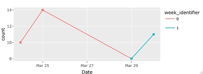
I am trying to create a ggplot line graph that has the line colored based on a grouping variable.. so one line but with different colors.

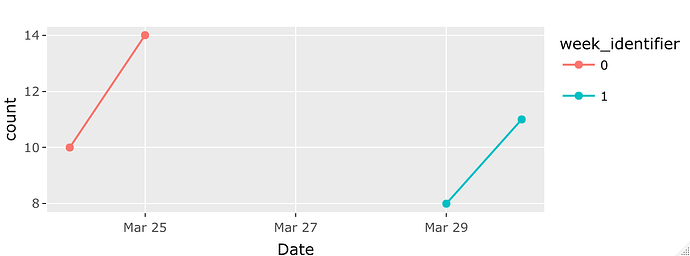
When I run the code in the console, the graph looks as expected. However, when I run the shiny app, it seems it completely ignores the group=1 argument, and splits the groups into 2 different lines.

Here is a reprex for reference:


library(shiny)
library(ggplot2)
library(plotly)
library(tidyverse)

# Define UI 
ui <- fluidPage(

    # Application title
    titlePanel("Testing Plotly and GGplot"),

    sidebarLayout(
        sidebarPanel(
        ),

        # Show a test plot
        mainPanel(
            fluidRow(
                    width = 7,
                    plotly::plotlyOutput("test_plot")
                )
        )
    )
)

# Define server logic 
server <- function(input, output) {
    
    #initialize dataframe
    test_data <- data.frame(Date = as.Date(c("2022-03-24", "2022-3-25", "2022-03-29", "2022-03-30")),
                               count = c(10, 14, 8, 11),
                               week_identifier = c("0", "0", "1", "1"))
    

    output$test_plot <- plotly::renderPlotly({
        
        a <- ggplot2::ggplot(test_data, ggplot2::aes(Date, count, color = week_identifier, group =1)) +
            ggplot2::geom_line() +
            ggplot2::geom_point()
      
        print(a)
        
        plotly::ggplotly(a) %>% 
            plotly::config(displaylogo = FALSE) %>%
            plotly::config(modeBarButtonsToRemove = c("select2d", "lasso2d"))
    })
}

# Run the application 
shinyApp(ui = ui, server = server)


It looks to me like the difference is between how ggplot2 and plotly deal with groups, rather than an issue with Shiny. In the console, the ggplot2 version looks like this for me:

Rplot154

... but in the console, the plotly version looks like this:

If you want the plotly version to connect the weeks on a continuous basis, you might consider using geom_segment instead of geom_line:

a <- ggplot2::ggplot(test_data, ggplot2::aes(Date, count, color = week_identifier)) +
      ggplot2::geom_segment(aes(xend = lead(Date), yend = lead(count))) +
      ggplot2::geom_point()

If we use the rest of your code with that, we can get a plotly version with connected points:

1 Like

Ahh, that makes sense. I overlooked the plotly piece initially. Thank you for your help!

This topic was automatically closed 54 days after the last reply. New replies are no longer allowed.

If you have a query related to it or one of the replies, start a new topic and refer back with a link.