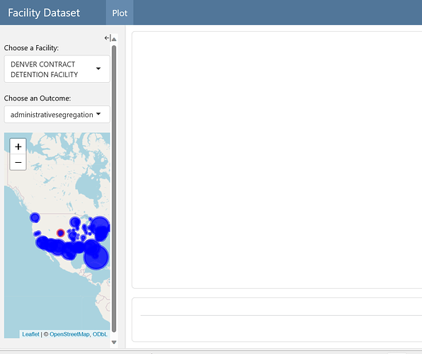
I'm trying to create a Shiny Dashboard of prison reported outcome data, made up of a ggplot and a map. For some reason, I cannot get the ggplot to show on Dashboard and the map only shows in the left panel underneath the drop-down menus. Here's the code:
---
title: "Facility Dataset"
format: dashboard
server: shiny
---

```{r}
#| context: setup
library(shiny)
library(ggplot2)
library(tidyverse)
library(leaflet)
# Load data
setwd("C:/Users/josep/OneDrive/Documents/Research/ICE Detention/Geospatial/Psychiatric")
dataset <- read.csv("thefinale(October 2022-revised)(inspection report only).csv") %>%
{.sidebar}
selectInput("facilityInput", "Choose a Facility:", choices = unique(dataset$facilitycountName))
selectInput("outcomeInput", "Choose an Outcome:", choices = names(dataset)[15:88])

leafletOutput("map")
Plot
plotOutput('plot')
#| context: server

processedData <- reactive({
  # Filter data for the selected facility
  facility_data <- dataset[dataset$facilitycountName == input$facilityInput, ]
  facility_data$date <- as.Date(paste(facility_data$Year, facility_data$monthcount, "01", sep = "-"))
  facility_data$rate <- (facility_data[[input$outcomeInput]] / facility_data$ADP) * 100  # per 100 ADP

  # Calculate the weighted average for all facilities
  dataset$weighted_outcome <- dataset[[input$outcomeInput]] * dataset$ADP
  weighted_avg <- aggregate(weighted_outcome ~ date, data = dataset, mean)
  total_ADP <- aggregate(ADP ~ date, data = dataset, mean)
  weighted_avg$rate <- (weighted_avg$weighted_outcome / total_ADP$ADP) * 100

  list(facility_data = facility_data, weighted_avg = weighted_avg)
})

# Reactive expression for map data
mapData <- reactive({
  if (is.null(input$outcomeInput)) {
    return(NULL)
  }

  # Create a dynamic expression for the outcome input
  outcomeInputExpr <- as.name(input$outcomeInput)

  # Aggregate data to get average outcome per facility
  avgData <- dataset %>%
    group_by(facilitycountName, Latitude, Longitude) %>%
    summarize(avgOutcome = mean(!!outcomeInputExpr, na.rm = TRUE), .groups = 'drop')

  avgData
})


output$Plot <- renderPlot({

  # Retrieve processed data
  dataset_processed <- processedData()

  # Plotting the trend for selected facility
  facility_plot <- ggplot() +
    geom_smooth(data = dataset_processed$facility_data, aes(x = date, y = rate), se = TRUE) +
    geom_point(data = dataset_processed$facility_data, aes(x = date, y = rate), size = 2) +
    geom_smooth(data = dataset_processed$weighted_avg, aes(x = date, y = rate), color = "red", size = 1) +
    labs(title = paste("Trend for", input$outcomeInput, "in", input$facilityInput),
         x = "Date", y = "Outcome Rate per 100 ADP") +
    scale_x_date(date_breaks = "6 month", date_labels = "%m/%Y") +
      theme(legend.position = "bottom", plot.title = element_text(hjust = 0.5), plot.subtitle =element_text(hjust = 0.5) )+
      theme(panel.grid.major = element_blank(), panel.grid.minor = element_blank(),
            panel.background = element_blank(), axis.line = element_line(colour = "black"))


  # Return the plot
  facility_plot
})


output$map <- renderLeaflet({
  map_data <- mapData()

  # Debugging: Print the first few lines of map_data to check if avgOutcome exists
  print(head(map_data))

  if (is.null(map_data)) {
    return(NULL)
  }

  leaflet(map_data) %>%
    addTiles() %>%
    addCircleMarkers(
      lng = ~Longitude, lat = ~Latitude,
      radius = ~sqrt(avgOutcome) * 2,  # Adjust for appropriate scaling
      color = ifelse(map_data$facilitycountName == input$facilityInput, "red", "blue"),
      fillColor = ifelse(map_data$facilitycountName == input$facilityInput, "red", "blue"),
      fillOpacity = 0.8,
      popup = ~paste(facilitycountName, "<br>", avgOutcome)
    )
})


output$data <- renderTable({
  processedData()$facility_data
})
Of note, the ggplot does show if I were to do a simplified shiny (I can't put a second image in, you'll have to take my word for it):
library(shiny)
library(ggplot2)
library(tidyverse)

# Load data
setwd("C:/Users/josep/OneDrive/Documents/Research/ICE Detention/Geospatial/Psychiatric")
data <- read.csv("thefinale(October 2022-revised)(inspection report only).csv") %>%
  select(-c(ADP)) %>%
  rename(ADP = ADPc) %>%
  mutate(ADP = ifelse(ADP < 0, 0, ADP))%>%
  mutate(totalsegregation=(administrativesegregation+medicalsegregation+mentalhealthsegregation+disciplinarysegregation))

# Define the UI
ui <- fluidPage(
  titlePanel("Facility Outcome Trends"),
  sidebarLayout(
    sidebarPanel(
      selectInput("facilityInput", "Choose a Facility:", choices = unique(data$facilitycountName)),
      selectInput("outcomeInput", "Choose an Outcome:", choices = names(data)[15:88])
    ),
    mainPanel(plotOutput("trendPlot"))
  )
)

# Define the server logic
server <- function(input, output) {
  output$trendPlot <- renderPlot({
    # Filter data for the selected facility
    facility_data <- data[data$facilitycountName == input$facilityInput, ]
    facility_data$date <- as.Date(paste(facility_data$Year, facility_data$monthcount, "01", sep = "-"))
    facility_data$rate <- (facility_data[[input$outcomeInput]] / facility_data$ADP) * 100  # per 100 ADP

    # Calculate the weighted average for all facilities
    data$date <- as.Date(paste(data$Year, data$monthcount, "01", sep = "-"))
    data$weighted_outcome <- data[[input$outcomeInput]] * data$ADP
    weighted_avg <- aggregate(weighted_outcome ~ date, data = data, mean)
    total_ADP <- aggregate(ADP ~ date, data = data, mean)
    weighted_avg$rate <- (weighted_avg$weighted_outcome / total_ADP$ADP)

    # Plotting the trend for selected facility
    facility_plot <- ggplot() +
      geom_smooth(data = facility_data, aes(x = date, y = rate), se = T) +
      geom_point(data = facility_data, aes(x = date, y = rate), size = 2) +
      geom_smooth(data = weighted_avg, aes(x = date, y = rate), color = "red", size = 1) +
      labs(title = paste("Trend for", input$outcomeInput, "in", input$facilityInput),
           x = "Date", y = "Outcome Rate per 100 ADP") +
          scale_fill_discrete(guide="none")+
      scale_x_date(date_breaks = "6 month", date_labels = "%m/%Y") +
      theme(legend.position = "bottom", plot.title = element_text(hjust = 0.5), plot.subtitle =element_text(hjust = 0.5) )+
      theme(panel.grid.major = element_blank(), panel.grid.minor = element_blank(),
            panel.background = element_blank(), axis.line = element_line(colour = "black"))

    # Return the plot
    facility_plot
  })
}


# Run the application
shinyApp(ui = ui, server = server)
